


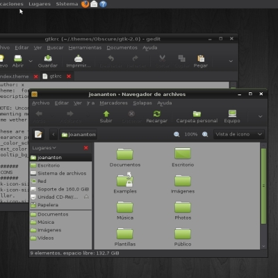
For complete installation copy Classic folder to usr/share/themes.
Feel free to comment it.


Source (link to git-repo or to original if based on someone elses unmodified work):
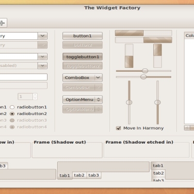
1.6: Redesign of panel
Use it with murrine svn 138


More GTK2 Themes from darkwater:
Other GTK2 Themes:


Ratings & Comments
28 Comments
I'd like to request for thin/small/compact version of your theme.
(((( I hate the gnome panel theming. Hope somebody do something for be able to modify the panel by the engine )))
Hi! Good work...! Metacity theme squared version? Please! Thanks!
Hi! Good work! Could you post a link for the wallpaper, please? I is also great. Thanks in advance, tuztigris
It is from deviant art web.
Great work!
i like your theme very much. i am using it at the moment. but i think the progressbar should get a more glossy look. the scrollbar also. i think it would look more complete because the buttons are already glossy but progressbar is still cartoonish. what do you think?
It looks so polished and clean. Thanks!
Mmm.. Now i see that compiz crashes with the new version!!. ¿What's the problem now?!!
err.. i see that other metacity themes crash too.. this can be my computer..
think this is Nvidia related, if the metacity uses pixmaps, it should be Nvidia related, as of Nvidia version 170 i think, 180.06 fixes the issue if it is nvidia in this case. kind regards MikeDK using Geforce GO 7600 256mb ram, and 177 default on ubuntu 8.10 according to launchpad if it is the nvidia issue its seems to be a nvidia-bug. Hope this helps Oooh and by the way daaarn good looking theme you got here, thanks very much
Well, theme doesn't crash with compiz but metacity draws incorrectly. Seems to be some kind of bug by compiz because the higlight line of button zone is drawn with twice of width. This doesn't happens with the metacity without compiz.
yup thats the nvidia-bug trust me on this its true, https://bugs.launchpad.net/ubuntu/+source/compiz/+bug/99508 look at this it seems to be a bug on nvidia drivers maybe its cuda support i dont know, havent been reading the site for a while. Kind Regards MikeDK
the new colour-scheme is beautiful!!! but maybe the scrollbar should look more modern. it looks too much cartoonish i think. but overall a very nice theme. my default at the moment;)
next release will improve it and will be the 1.0.
have you seen the scrollbars of the murrineCrystal-theme? would something like this be possible in orange with your theme? i think it could look very impressive
The reason the tiltbar text alignment looks funny is that when you do (width - text_width) / 2 to centre the title the value returned for width is the space available _not_ the actual width of the window. eg Windows that have a min/max/close buttons return smaller space than dialog boxes which just have a close button; it measure the space up to the first button on the right. This looks normal on most themes but not this one because we have a fancy bitmap behind the button area that stays the same size whether the min/max buttons are there or not. We either need to find a way of getting the REAL width of the window, or a flag whether we have min/max buttons, or do what I did and just left-align the titlebar text, e.g. set x=20 :)
I just wanted to add that I think the bitmap behind the min/max buttons is the best thing about this theme and I urge you not to remove it.
I agree, but it seems to change size arbitrarily. I'll try to have a look at the code or post a screenshot of what bugs me over the next few days.
That was the fastest update. Ever. But you really should take it slower, and be more careful. (I know I'll sound like an ungrateful bastard now. Apologies in advance.) Take a look at the left side of the minimize button on the metacity. With small fonts there's too much space there and with large there's too little (in comparison with the space on the right side of the close button). Also, I can't say how exactly, there's something off now. I think the highlight is not centred, and it's not my font settings. Unfortunately I overwrote the old version. Can you post both metacities? I may be able to explain what I mean better if I can see both.
The text is centered in the same way that the last beta, using variables of width and height of the title bar, but it is posible that the less size of it make the initial errors be more evident. Also it's possible that buttons are not exactly centered, but the problem with the text width... Don't know if understand you. (Some times think i need a course of english for dummies)
Yes the highlights are uncentered.
THIS IS SO BEAUTIFUL!!! Rated good! It would be great when you try some ubuntu-ish-colour-schemes too! Thanks for this great piece of art!
This is a lovely theme. Two suggestions (feel free to ignore): 1) The metacity is too bulky. A smaller version would be nice. 2) The text[SELECTED] is white, which really doesn't provide good contrast, at least on my display. I think they should be black like the menus. Perhaps you could adjust the value, making it slightly darker (for white text) or lighter (for black). Voted good, of course.
I like this; professional without being boring.