

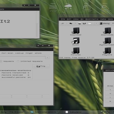
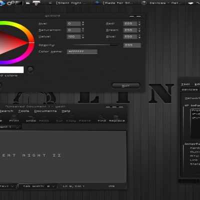
WoW
nale12


Source (link to git-repo or to original if based on someone elses unmodified work):
fixed some bugs
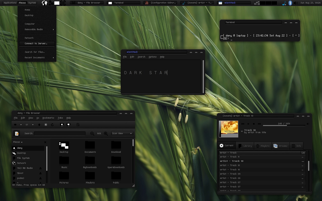
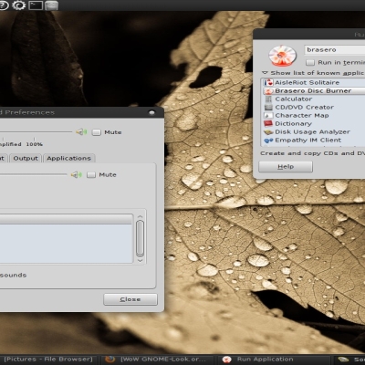
20.10.2009 -emerald theme added
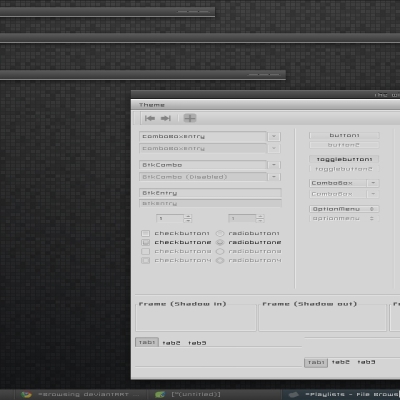
04.11.2009 -better look of all buttons,check and radio buttons replaced


More GTK2 Themes from nale12:
Other GTK2 Themes:


Ratings & Comments
24 Comments
why download icon is inactive?
Nice job. Very dark and elegant ^^
thanks
WP please...awesome theme!cools...
there is a link on DA enjoy
Voted up! One small doubt. My navigation icons (up, back, home etc )in both browser as well as nautilus has become small compared to other themes. Is there any way to make them to become normal size again ?
this way looks nicer,but if you have bad sight look in gtkrc file and find line with "gtk-button=12,12:gtk-large-toolbar=12,12" and put what you want,usually 16,16
this way looks nicer,but if you have bad sight look in gtkrc file and find line with "gtk-button=12,12:gtk-large-toolbar=12,12" and put what you want,usually 16,16
Looks nice but how on earth will the average ubuntu person know how to install everything your instructions are terrible
sorry,my english is very bad,i hardly wrote what i wrote,if you something don't understand ask here and i will try to explain
I didn't know how to get the icons the same and the top panel i didn't know how to make it look like that. thanks.
You must remove menubar icon and adjust font size to fit panelbar button(or you can chose cure font,it is in the archive,it has fixed size).Everything is in system-preferences-appearance.
Like everyone else I think this theme is well just spectacular... 98% if you get the frame shadows,vertical progress bars and mouse over highlight perfected then it would be 100% - again not to take anything away it's a brilliant theme and a fantastic example of what you can do with pixmaps.
really nice yes, and another thing i thought of was that it really resemble the theme from the site http://cored.org/ i have to say thou that this theme.............................FUC......ng ROCCCKS i meen it its really one of the greatest darkest theme ive ever layd eyes on, id have to say that this theme really really really really hhhmmmmmmm okay a ran out of words there :-)) but hey.. havent i made myself clear enough already .-) love it just love it. ooh the icons you name in the README, cure where do i find these icons? Kind regards MikeDK
lol sry thought the icons was named cure or cur but no, isnt it ALLBLACK? the icons ? Kind Regards MikeDK
font is cure,not icons,icon set is allblack
thanks man
I didn't spent to much time on vertical progressbar because i don't know any application that uses it,and whats wrong with mouse highlight.
... dark themes I've ever seen! Good work. Voted up. :)
very very great work ! the best dark theme i ever seen !
Like this alot! great work =)
Very nice works
very nice work :)
thanks