


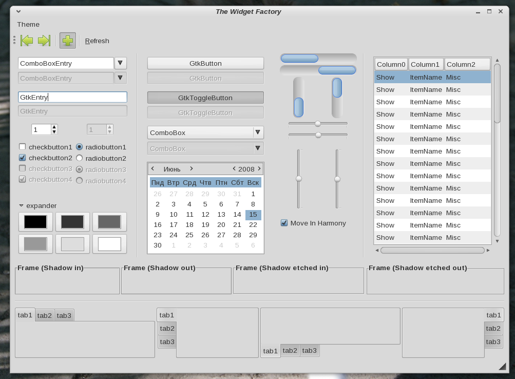
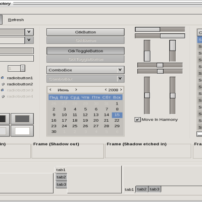
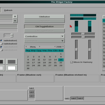
Swing
untouchable89


Source (link to git-repo or to original if based on someone elses unmodified work):
-- 0.4.0 --
Change size of buttons on panel.
-- 0.4.1 --
Radio button and check box in GtkTreeView was fixed.
Progress bar in GtkTreeView is squre now.
Openbox theme was added.
-- 0.4.2 --
New xfwm4 theme.
Metacity theme was improved.
Index.theme using default buttons layout.
-- 0.5.0 --
Text entry improved.
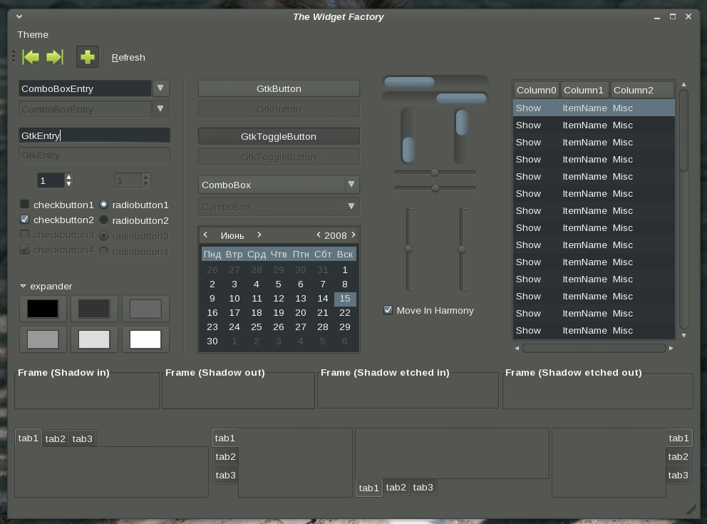
Dark version of theme was added.
Dark openbox theme.
Dark xfwm4 theme.
-- 0.5.1 --
Arrow up fixed in dark version.
Index.theme in dark version using elementary dark icons.
-- 0.5.2 --
New colors for links in dark version.
Spinbutton was improved.
Spinbutton pressed arrows.
-- 0.6.0 --
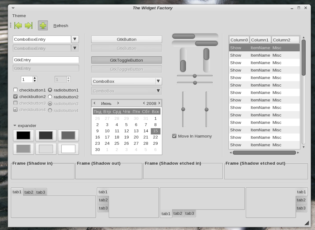
New monochrome version.
All themes compressed in zip (zip don't saving unix permissions) that may help with missed images.
-- 0.6.1 --
Progressbar colors fixed in monochrome version.
-- 0.6.2 --
Color scheme for gnome-terminal
-- 0.6.3 --
Panel reworked.
-- 0.6.4 --
New openbox themes.
Statusbar improved.
PrudenceDark using same metacity theme as Prudence.
-- 0.6.5 --
Statusbar's frame improved.


More GTK2 Themes from untouchable89:
Other GTK2 Themes:


Ratings & Comments
34 Comments
This is one of the few themes that looks perfect as is! спасибо
Great job! As I read here are a little emotion;) I think it unnecessarily. I think attacking others is not an option. Many people here do not realize that what is offered them for free, and most people do just for fun and feeling good. From my assessment is positive, at any rate up! I praise and I wish much success not only in this business, but we wish you much success AgiliaLinux distribution.
Спасибо. =)
nice thanks my friend
can we make the nautilus windows look a little more unified? i mean, the places section background color could be the same as window background color. here is what i want to tell in picture: http://i54.tinypic.com/10qjn9g.png
I think, current nautilus look stable and unified.
and i think the opposite!
you think, but I have seen. White "Places" is a feature ;)
what you get from what you see depends on "how" you think! if you are the creator of this theme, i expect you to answer the way whether you are to modify this "feature" or not. if you are not the creator of this theme, then go the way you do.
Please, don't double your post ;) I'm not creator, but I'm member of AgiliaLinux project, which uses Prudence as primary and, well, my opinion is almost primary ;)
да, хотел сказать "несу ответственность", но вменяемого перевода не придумал :)
not sure what makes you over-declare but being a member of a community does not make you speak in the name of a production! you are not the one i ask the question! i do not care about your usage style. i do not care if you are a member of sth or not. i do not care about you!!! thanks for your unnecessary replies which made this place a nonsense forum. by the way, doubling post was not intentional. but this reveals the way what you get from ideas!
> but being a member of a community does not make you speak in the name of a production! ok, I rephrase this. I'm one of developers of AgiliaLinux project. > you are not the one i ask the question! i do not care about your usage style. i do not care if you are a member of sth or not. i do not care about you!!! Take the careness, I'm the second boss of this theme. > thanks for your unnecessary replies which made this place a nonsense forum. by the way, doubling post was not intentional. but this reveals the way what you get from ideas! whahaha ;) I think you're in stress… relax, relax…
what you get from what you see depends on "how" you think! if you are the creator of this theme, i expect you to answer the way whether you are to modify this "feature" or not. if you are not the creator of this theme, then go the way you do.
what you get from what you see depends on "how" you think! if you are the creator of this theme, i expect you to answer the way whether you are to modify this "feature" or not. if you are not the creator of this theme, then go the way you do.
I don't like it. =)
thank you! this was enough!
i don't like the nautilus style of this theme. i won't use it :=)
No problem. don't use it. =)
this was all i asked!!! instead of depending on what you want, if you showed the way to modify your design, you'd have managed a bigger job. here it is dear: http://i54.tinypic.com/3507a55.png anyways, yes, i will not use it ;=D
include "nautilus.rc" you need add this in gtkrc file. http://dl.dropbox.com/u/933063/send/nautilus.rc
You could use some nicer font for the screenshots though
*Liberation Sans* is not nice? =)
Well, it's supposed to be :). I used to used it myself. Maybe you haven't got it anti-aliased properly? Anyway it's a matter of taste, maybe you like it like that. And what's more important the theme itself looks great. I'm using it right now with Droid Sans font.
I don't like subpixel anti-aliasing. Yes droid fonts is very cool.