


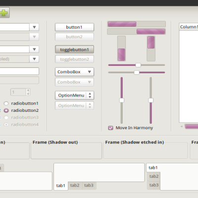
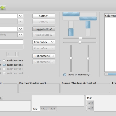
This version is very full of changes and improvements everywhere, I really can't list them all here, just know that every (and i mean *every*) aspect of the gui has been considered, so enjoy it. Keep in mind that, by the way, it remains work in progress and this 0.45 version (that is already the biggest release by now) will lead to the 0.5 "stable" release, don't know when

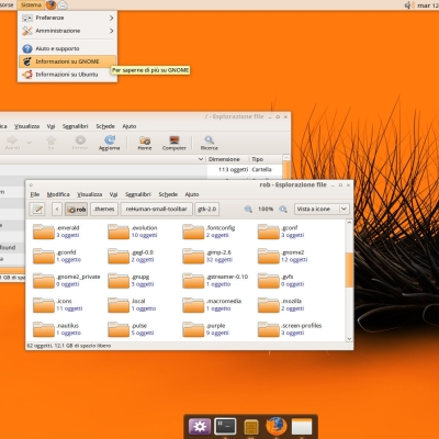
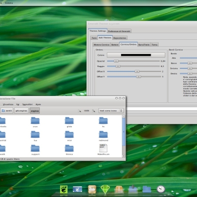
Gtk and Metacity theme plus a wallpaper are included in the archive, choose between normal and classic nautilus version (according to what you have installed on system) and install it by drag and dropping it on the system appreance applet.
Google Chrome/Chromium theme to come soon.
P.S. Refresh the page!


Ratings & Comments
33 Comments
Any news on that? Congratz on your awesome work with this theme! :D
man, this theme is awesome, elegant and clean. thanks for sharing.
This is one of the best themes ever! There are only two things that could be improved (in my opinion): Choosing a custom background color for selected items does not change the color of selected list items. Is this intended? This is ok for me, because i like the blue color. There is another problem regarding the color of selected list items: they are blue in most applications except Evolution. In Evolution list items appear purple. (see http://sven-festersen.de/files/evolution_purple.png) Is there a way to fix this?
In the "gtkrc" search for "style "default"" and comment out/remove "focus_color = "#B06F9C"".
I love this theme. I love the way you used that idea from nautilus streamlined mockup (if you didn't then it looks like it very much :D). Keep up the good work mate :)
p.s. I love the details in this theme. I really love this theme :D . I think that it will be my next favourite (next to shiki brave)
I love that, need to revamp Midori tabs and Chromium colors: http://i.imgur.com/D05Jz.jpg http://i.imgur.com/x7SI2.jpg
With this theme by default, with GDM, when typing my password I've got heart caracters who hidding the password is it normal ?
:) yes
Clearlooks-revamp is now the theme by default for GNOME on Frugalware:) http://frugalware.org/~devil505/blog/?p=1244
happy to see that, you should upgrade to the latest version by the way (the screen shows a previous one)!
Updated ! :)
holy shit, this is truly awesome.
Superb update. Absolutely sterling work. /izo\
Wow! I like it!! This theme gives me new feeling. Thanks fo making this theme!
I also have a question: From the right click menu, the bottom corners are rounded, but the top corners are not. Where is this specified in the gtkrc? I'd love to make all my corners round for menus drop downs!
the font used is lucida sans. for the rounded menu question: they're rounded only when rgba is enabled and given that not all apps support it i disabled it by default. you can change the roundness in the menu style but i don't think it's possible to make the top corners rounded too.
What is the name of the font? I apparently don't have it, as it does not look the same on my machine. Looks wonderful otherwise!
I hate when a theme wants to choose a font or icons for me!
me too but you can edit the index.theme ;)
y'a pas de index.theme dans un theme gtk ;) Si tu veux dire le gtkrc, j'estime que c'est très incorrect de forcer l'utilisation d'une police (crade, qui plus est) alors que le choix devrait revenir par défaut à l'utilisateur. Là, c'est très proche du proprio.
You are right, that approach isn't so good.. it would be great if there was something like font_name = "1px smaller than normal fonr size" to get a relative scaling. I choosed 9 as normal font size and 8 as smaller because i think most of the people are comfortable with these values but this is only temporary and i'm of course looking for a more generic way to define this.. and if someone knows that way, please contact me!
Come back in good style.
I love this theme, thank you very much.
Hello, thanks for share your work. I really like it. I have just a little suggestion about shadow and active button. Can you let us choise the color? (purple #B06F9C default) An other little thing about shadow and tab: http://pix.hostux.net/?v=sanstitre.png can you let always the shadow horizontal? I hope that you understand my poor english. Thanks for your attention.