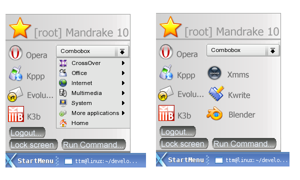
It's just like the XP start menu, except you have to move and click a lot more to get to your programs, awful idea putting the programs up there and requiring another click to get to them.
The current K menu just needs some drag and drop.
I think kde is ready to beat the rest of the graphical environments. Now we have the possibility to use real transparency with xorg 6.8.1. All those shadows and those icon bars with nice zooming effects could become nicer and faster. More animations, in icons, in ksplash. It would be cool to have nice 3d icons in the desktop. If the shadows could have different depths would also be cool and having just parts of the windows transparent. Integrating a videoconference tool in kopete (it would be nice if videoconference could be recorded showing both faces). Adding the possibility to read the messages kde generates with a text to speech tool. And much more things could be done. :)
I think Konsole needs some basic touch-ups. When a particular tab among many has been selected, there is no conspicuous indication of which one has been chosen. Sure, the titlebar changes the title to say "Shell No. 8" or so, but if you look at the actual tabs themselves, there's _no_ indication whatsoever.
Very minor thing, but would be very useful if implemented.
Keep up the good work, guys. =)
Found an interview with some of our fellow devs concerning UI/Usability. It features: Waldo Bastian and Aaron J. Seigo from the KDE project and Havoc Pennington from the Gnome project.
I hadn't seen this before.. but good read.
http://www.osnews.com/story.php?news_id=2997&page=1
According to the KDE 3.3 feature plan they are working on a task based KMenu alternative (which I would gather is something like XP's).
http://developer.kde.org/development-versions/kde-3.3-features.html (search for task)
I like XP's start menu since you have fast access to all of your recently used programs. One thing that would be nice would be to have your most used program at the bottom so it's faster to access. Of course you could just set up the kicker with your most used programs (which I do), a task based one would do it for you (which is convenient).
[sarcasm]Of course the killer feature of 3.3 will be the new fuzzy/funnier clock! [/sarcasm]
Well, it is clearly XP inspired.
I don't consider this intrinsecally evil (I don't like flame wars, and yes, sometimes I even use window$), but I've used XP and I find its start menu really annoying and not really ergonomic.
I hope your project will be more well designed (a lot more).
Keep up the good work
This is indeed really too much XP-ish but I see that it resolve the problem of frequently used apps.
Currently, frequently used apps are at the top of the menu. So the most frequently used apps are the farthest from the mouse ! This seems like a bad UI !
I think this has to do with the fact most people read from top down. So while it may be furthest from the mouse, it's exactly where the first place a user reading the menu is going to look is.
Hence my suggestion to move the recent items to the top left, and the other applications to the right (and the other way around in RTL environments), so while the eye ends up in the corner where it will start reading (it doesn't start in the middle, it starts where the first letter of the first word on a normal page of text begins), the mouse isn't far away from any of the two.
We should try to innovate, not only to mimic!
To do something really new, IMO K-Menu should be *completely* task-oriented, rather than app-oriente.
With this paradigma in mind, let's think about improvements.
A lot of comments here have been right on base. I'm not one to criticize something just because it's too much like Windows. If Windows or Mac OSX has something good, I see nothing wrong with imitating it, and then eventually looking to go BEYOND it as well. However, the Start menu in XP is terrible. I dual boot, and one of the first things I do with the start menu is change it back to "classic view." Why? Because the XP Start menu is so much more difficult to use. I do not want to see that happen to KDE. The best thing I could say is that maybe it would be nice to have an OPTION for it for users who like it, but it should most certainly not be the default.
The other issue is that it is too much like Windows. While I don't think this is an inherently bad issue, there's a certain degree of caution that must be had when imitating something from another OS. If people from Windows migrate over to Linux and KDE, and it looks very much like Windows, they will THINK very much like Windows. They will consciously, or sub-consciously expect it to act like Windows, and when it doesn't, they will be angry. They are in a new operating system - let the visual remind them of that so that it is always in the front of their mind that it is something different and that they must approach it as something different.
Regarding user choice, as was mentioned in the post above concerning slicker, I think it's a bad idea to make it difficult for users to change UI. It should be something that requires sufficient steps in kcontrol so as to prevent it from accidentally being changed (I really see no problem with how it is now) but it should be something that a user who wants to change it should have no problem doing so. The problem isn't with giving users options, as many UI designers seem to think these days, it's with not giving users strong defaults. If your UI design is so great, the user won't switch from it even if they can. Let the USER make the decision, not you.
Beyond the above contructive criticisms, I think this would be a bad idea. Not just because it's MS-Window-ish, but for the same *reason* I do not like the WinXP Start Menu. It makes it *hard* to get an app than it really should be. I hate being in app menu hell, trying to find an app, and digging through sub-menus. KDE, out of the box, is little better, to be honest, but at the moment, I don't see a better "fresh install" solution.
In this solution, it would encourage a user to create desktop icons for his most oft-used applications to avoid using a confusing menu. That creates desk-clutter which is another point of usability that can be irritating.
I truly would love to see an innovative approach to an App Menu that avoided lots of submenus or confusing icon lists, but I don't see this one as being it. No offense meant, mind.
There is nothing wrong with the kmenu, in fact that design is a copy of the XP menu which is poor anyway. The kmenu is set out in cataguries which is much better, most used apps are placed at the top keeping the menu slim.
People should get used to how kde, kmenu is rather than design it like Windows.
The trend lately is for KDE to attempt to mimic the other operating systems. I am aware that the movement is driven by a desire to create a familiar user interface for the ex-windows user converted to linux. I think this needs to change. KDE does not need to replicate the other, it must innovate past the others. Give the end user an almost unbridled amount of control over the look and feel of his or her desktop and interface. This also goes against a lot of the driving forces in UI design. Take control away from the end user and allow them to do a few things that you have tight control over. This makes the environment easier to work in for the basic end user. A project that I have been watching for a while, and I really hope that it continues, is the slicker project. It is a new way of handling the UI. I believe this is exactly what KDE needs. KDE has done a fantastic job on both its integration and presentation so far. It is time to make a new bold step. I for one will be compiling a nice detailed list of changes that I think would give KDE some more ommph, things that other desktop managers and OS's dont have. Too bad I can not code on it right now, but hopefully soon enough.
Justace
Slicker, I can assure you, is not dead. We have actually from the very beginning been considering options as to how to control the user's options, and one of the best ways, it seems to us, is that the desktop as a start should be locked down (i.e. you cannot randomly change the layout by a slip of the mouse, something which could be potentially easy in Slicker because of the large headers on the cards), so that you actually have to unlock the desktop to make changes.
This consideration could fairly easily be translated into the current KDE base, by using Kiosk and as standard lock down some slight things that the 'normal user' (as we like to call those who don't actually want to fiddle with their desktop and in stead just use it) won't use, such as mouse-moving the Kicker and other such options.
A problem with the mimickry, as you put it, is not so much that it's mimickry, but that it's not perfect. The problem is that users will sit down and think "Oh, this is Windows, I'll do things in the same way I did it on my old machine" or whatever, and fail because things are not done the same way in KDE as they are in Windows (or MacOS for that matter, all you Liquid lovers ;) ). I believe it was Suse who first discovered this in a usability study they did a while ago...
I am soo looking forward to slicker. It looks totaly fantastically cool. I just hope that the programmers use a plugin type system for the look. I am a big fan of plugins since is allows somebody to extend the system without having to really understand the core. Anyway, I think that slicker + my mods (If people want them and they can get coded by me or somebody else) will give the end user a huge leg up in the desktop layout battle. Slicker presents information well, looks cool, and then icon layout will finish it off.
Then it will be time to look for something else to improve on.
Justace
Please, if you do IRC, don't hesitate to skip by #slicker on irc.freenode.org at some point (now would be fine, you seem to be online ;) ) and talk with us about it :) Slicker is accepting plugins, and though it doesn't have a Cardstack yet, it will show the content using the Slider (which was the first feature implemented this time around). But as I said, please do come around and have a chat :)
Right, now that nonsense is out of the way, let's be constructive.
The idea is not all bad, though I think that having two rows of icons like that can be confusing at times...
Maybe in stead have the icons as you have them in the left, then a set of actual menus going out from the right side, which could be for example:
* Applications
* Settings
* Bookmarks
* Recent documents
You get the picture, basically what's already an option, just moved around a bit ;)
About why not the combo box: Remember, you should never force the user to click more than they actually have to for usability's sake. I.e. in this case don't just randomly pop up the K menu, because it would get in the way more often than not, but do pop up submenus).
At the bottom, why make use of QT's very nice menu features and actually give the user a box to write commands in, in stead of having to have to open a Run command... dialog (this should always be an option, for more advanced stuff like running as a different user and so on), such as bellow:
------------------------
Run... XXXXXXXXXX [o]
------------------------
Logout... Lock screen
Where Run... is clickable, XXXXXX is a text field and [o] is a button with the gear on it (standard KDE sign for Run).
Then, under that (menu separator bars above and bellow the Run section), have on the left side Logout... (that's where it's been always), then on the right side have Lock screen.
Of course, all the layouts here should be mirrored (left->right, right->left) in a RTL environment, for obvious reasons.
But, for other ideas on redesigns for the K Menu (remember, we don't call it a Start Menu, or an Apple Menu for that matter), have a look at the Slicker website at http://slicker.sourceforge.net where there are a couple of interesting ideas in the mockups section.


Ratings & Comments
27 Comments
It's just like the XP start menu, except you have to move and click a lot more to get to your programs, awful idea putting the programs up there and requiring another click to get to them. The current K menu just needs some drag and drop.
I think kde is ready to beat the rest of the graphical environments. Now we have the possibility to use real transparency with xorg 6.8.1. All those shadows and those icon bars with nice zooming effects could become nicer and faster. More animations, in icons, in ksplash. It would be cool to have nice 3d icons in the desktop. If the shadows could have different depths would also be cool and having just parts of the windows transparent. Integrating a videoconference tool in kopete (it would be nice if videoconference could be recorded showing both faces). Adding the possibility to read the messages kde generates with a text to speech tool. And much more things could be done. :)
I think Konsole needs some basic touch-ups. When a particular tab among many has been selected, there is no conspicuous indication of which one has been chosen. Sure, the titlebar changes the title to say "Shell No. 8" or so, but if you look at the actual tabs themselves, there's _no_ indication whatsoever. Very minor thing, but would be very useful if implemented. Keep up the good work, guys. =)
Oops...wrong place. Ignore. :-#
Sorry for my really bad English... I think (all) you had better write it all to the 'KMenu (idea)' article somewhere on kde-apps.org
I don't like this, it is XPish and the combobox is realy annoying.
Found an interview with some of our fellow devs concerning UI/Usability. It features: Waldo Bastian and Aaron J. Seigo from the KDE project and Havoc Pennington from the Gnome project. I hadn't seen this before.. but good read. http://www.osnews.com/story.php?news_id=2997&page=1
According to the KDE 3.3 feature plan they are working on a task based KMenu alternative (which I would gather is something like XP's). http://developer.kde.org/development-versions/kde-3.3-features.html (search for task) I like XP's start menu since you have fast access to all of your recently used programs. One thing that would be nice would be to have your most used program at the bottom so it's faster to access. Of course you could just set up the kicker with your most used programs (which I do), a task based one would do it for you (which is convenient). [sarcasm]Of course the killer feature of 3.3 will be the new fuzzy/funnier clock! [/sarcasm]
Well, it is clearly XP inspired. I don't consider this intrinsecally evil (I don't like flame wars, and yes, sometimes I even use window$), but I've used XP and I find its start menu really annoying and not really ergonomic. I hope your project will be more well designed (a lot more). Keep up the good work
This is indeed really too much XP-ish but I see that it resolve the problem of frequently used apps. Currently, frequently used apps are at the top of the menu. So the most frequently used apps are the farthest from the mouse ! This seems like a bad UI !
I think this has to do with the fact most people read from top down. So while it may be furthest from the mouse, it's exactly where the first place a user reading the menu is going to look is.
Hence my suggestion to move the recent items to the top left, and the other applications to the right (and the other way around in RTL environments), so while the eye ends up in the corner where it will start reading (it doesn't start in the middle, it starts where the first letter of the first word on a normal page of text begins), the mouse isn't far away from any of the two.
another one winxp-wannabe menu
We should try to innovate, not only to mimic! To do something really new, IMO K-Menu should be *completely* task-oriented, rather than app-oriente. With this paradigma in mind, let's think about improvements.
Sorry, but I just didn't like it, looks to much like Windows XP:s new start menu, which I don't like at all.
...design is very nice, but to me your source of inspiration is obvious - WinXP, and it's modern (compared to possibility to have classic) menu.
Found a few things that I find interesting about UI design. First there's a link to a webblog about UI. Then a link to heuristics of UI design. There are many ways to go about UI design apparently.. task based, etc. And finally a page with many links to government studies, company research pages, etc.. http://maddog.weblogs.com/stories/storyReader$68 The point of the above link is that UI concepts are everywhere, and can be very innovative. http://www.useit.com/papers/heuristic/heuristic_list.html http://www.usernomics.com/user-interface-design.html
A lot of comments here have been right on base. I'm not one to criticize something just because it's too much like Windows. If Windows or Mac OSX has something good, I see nothing wrong with imitating it, and then eventually looking to go BEYOND it as well. However, the Start menu in XP is terrible. I dual boot, and one of the first things I do with the start menu is change it back to "classic view." Why? Because the XP Start menu is so much more difficult to use. I do not want to see that happen to KDE. The best thing I could say is that maybe it would be nice to have an OPTION for it for users who like it, but it should most certainly not be the default. The other issue is that it is too much like Windows. While I don't think this is an inherently bad issue, there's a certain degree of caution that must be had when imitating something from another OS. If people from Windows migrate over to Linux and KDE, and it looks very much like Windows, they will THINK very much like Windows. They will consciously, or sub-consciously expect it to act like Windows, and when it doesn't, they will be angry. They are in a new operating system - let the visual remind them of that so that it is always in the front of their mind that it is something different and that they must approach it as something different. Regarding user choice, as was mentioned in the post above concerning slicker, I think it's a bad idea to make it difficult for users to change UI. It should be something that requires sufficient steps in kcontrol so as to prevent it from accidentally being changed (I really see no problem with how it is now) but it should be something that a user who wants to change it should have no problem doing so. The problem isn't with giving users options, as many UI designers seem to think these days, it's with not giving users strong defaults. If your UI design is so great, the user won't switch from it even if they can. Let the USER make the decision, not you.
Beyond the above contructive criticisms, I think this would be a bad idea. Not just because it's MS-Window-ish, but for the same *reason* I do not like the WinXP Start Menu. It makes it *hard* to get an app than it really should be. I hate being in app menu hell, trying to find an app, and digging through sub-menus. KDE, out of the box, is little better, to be honest, but at the moment, I don't see a better "fresh install" solution. In this solution, it would encourage a user to create desktop icons for his most oft-used applications to avoid using a confusing menu. That creates desk-clutter which is another point of usability that can be irritating. I truly would love to see an innovative approach to an App Menu that avoided lots of submenus or confusing icon lists, but I don't see this one as being it. No offense meant, mind.
There is nothing wrong with the kmenu, in fact that design is a copy of the XP menu which is poor anyway. The kmenu is set out in cataguries which is much better, most used apps are placed at the top keeping the menu slim. People should get used to how kde, kmenu is rather than design it like Windows.
The trend lately is for KDE to attempt to mimic the other operating systems. I am aware that the movement is driven by a desire to create a familiar user interface for the ex-windows user converted to linux. I think this needs to change. KDE does not need to replicate the other, it must innovate past the others. Give the end user an almost unbridled amount of control over the look and feel of his or her desktop and interface. This also goes against a lot of the driving forces in UI design. Take control away from the end user and allow them to do a few things that you have tight control over. This makes the environment easier to work in for the basic end user. A project that I have been watching for a while, and I really hope that it continues, is the slicker project. It is a new way of handling the UI. I believe this is exactly what KDE needs. KDE has done a fantastic job on both its integration and presentation so far. It is time to make a new bold step. I for one will be compiling a nice detailed list of changes that I think would give KDE some more ommph, things that other desktop managers and OS's dont have. Too bad I can not code on it right now, but hopefully soon enough. Justace
Slicker, I can assure you, is not dead. We have actually from the very beginning been considering options as to how to control the user's options, and one of the best ways, it seems to us, is that the desktop as a start should be locked down (i.e. you cannot randomly change the layout by a slip of the mouse, something which could be potentially easy in Slicker because of the large headers on the cards), so that you actually have to unlock the desktop to make changes. This consideration could fairly easily be translated into the current KDE base, by using Kiosk and as standard lock down some slight things that the 'normal user' (as we like to call those who don't actually want to fiddle with their desktop and in stead just use it) won't use, such as mouse-moving the Kicker and other such options. A problem with the mimickry, as you put it, is not so much that it's mimickry, but that it's not perfect. The problem is that users will sit down and think "Oh, this is Windows, I'll do things in the same way I did it on my old machine" or whatever, and fail because things are not done the same way in KDE as they are in Windows (or MacOS for that matter, all you Liquid lovers ;) ). I believe it was Suse who first discovered this in a usability study they did a while ago...
I am soo looking forward to slicker. It looks totaly fantastically cool. I just hope that the programmers use a plugin type system for the look. I am a big fan of plugins since is allows somebody to extend the system without having to really understand the core. Anyway, I think that slicker + my mods (If people want them and they can get coded by me or somebody else) will give the end user a huge leg up in the desktop layout battle. Slicker presents information well, looks cool, and then icon layout will finish it off. Then it will be time to look for something else to improve on. Justace
Please, if you do IRC, don't hesitate to skip by #slicker on irc.freenode.org at some point (now would be fine, you seem to be online ;) ) and talk with us about it :) Slicker is accepting plugins, and though it doesn't have a Cardstack yet, it will show the content using the Slider (which was the first feature implemented this time around). But as I said, please do come around and have a chat :)
Right, now that nonsense is out of the way, let's be constructive. The idea is not all bad, though I think that having two rows of icons like that can be confusing at times... Maybe in stead have the icons as you have them in the left, then a set of actual menus going out from the right side, which could be for example: * Applications * Settings * Bookmarks * Recent documents You get the picture, basically what's already an option, just moved around a bit ;) About why not the combo box: Remember, you should never force the user to click more than they actually have to for usability's sake. I.e. in this case don't just randomly pop up the K menu, because it would get in the way more often than not, but do pop up submenus). At the bottom, why make use of QT's very nice menu features and actually give the user a box to write commands in, in stead of having to have to open a Run command... dialog (this should always be an option, for more advanced stuff like running as a different user and so on), such as bellow: ------------------------ Run... XXXXXXXXXX [o] ------------------------ Logout... Lock screen Where Run... is clickable, XXXXXX is a text field and [o] is a button with the gear on it (standard KDE sign for Run). Then, under that (menu separator bars above and bellow the Run section), have on the left side Logout... (that's where it's been always), then on the right side have Lock screen. Of course, all the layouts here should be mirrored (left->right, right->left) in a RTL environment, for obvious reasons. But, for other ideas on redesigns for the K Menu (remember, we don't call it a Start Menu, or an Apple Menu for that matter), have a look at the Slicker website at http://slicker.sourceforge.net where there are a couple of interesting ideas in the mockups section.