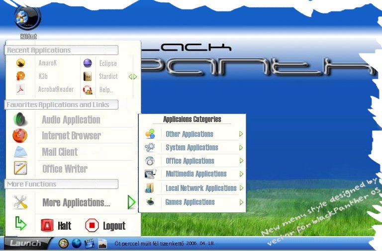
Most start menus look a bit like Windows menus because windows menus are based in turn upon older ideas about HCI. So get over it.
I like the way a lot of recently used apps fit in the upper panel, for me the one I want to use is usually the one that just fell off the list! :)
The 'More Applications' button is actually a big improvement over WinXP where hitting the 'All Programs' can cause a monstrous multi-column menu that fills the screen from top to bottom and left to right to fly out and cause a mental shock :)
My critique is the lack of a 'Run...' tool, no search tool and I cant guess what the green L-arrow means
From the usability point of view, the KDE program menú is better than windows for 2 reasons:
1) It only puts applications. Widnows puts many things grouped into submenus (uninstall, configure, related apps)
2) All applications are categorized according to its intended use. It does not have the "all programs" menu.
But, more used apps may be very nice to have in the main list of the K menu. I think it is a good thing, with 2 level menu is still easy to get the application pretty quick
Why should most applications to be hided behind "All applications" styled button? I hate this on windows XP but i must live with it because i like that idea i have most used applications in list.
And i think K-menu style is much better than windows because user can find every application fast and still he can see all most/last used applications.
You can have full screen as space to do menu, but why it must only have few things listed and still use so much space so there isn't so much to see?
Nice idea but you can do something similar with the current kmenu as I have.
Just edit your menu and put all folders inside a submenu, then put links to all your favorite apps on top-level. Like this -> http://2sdw.com/kmenu1.png
I don't have the recent menu items on there but that's easy to add back also.


Ratings & Comments
6 Comments
Most start menus look a bit like Windows menus because windows menus are based in turn upon older ideas about HCI. So get over it. I like the way a lot of recently used apps fit in the upper panel, for me the one I want to use is usually the one that just fell off the list! :) The 'More Applications' button is actually a big improvement over WinXP where hitting the 'All Programs' can cause a monstrous multi-column menu that fills the screen from top to bottom and left to right to fly out and cause a mental shock :) My critique is the lack of a 'Run...' tool, no search tool and I cant guess what the green L-arrow means
Bad idea. KDE is NOT Windows. Make your OWN thing!
go home windows boy
From the usability point of view, the KDE program menú is better than windows for 2 reasons: 1) It only puts applications. Widnows puts many things grouped into submenus (uninstall, configure, related apps) 2) All applications are categorized according to its intended use. It does not have the "all programs" menu. But, more used apps may be very nice to have in the main list of the K menu. I think it is a good thing, with 2 level menu is still easy to get the application pretty quick
Why should most applications to be hided behind "All applications" styled button? I hate this on windows XP but i must live with it because i like that idea i have most used applications in list. And i think K-menu style is much better than windows because user can find every application fast and still he can see all most/last used applications. You can have full screen as space to do menu, but why it must only have few things listed and still use so much space so there isn't so much to see?
Nice idea but you can do something similar with the current kmenu as I have. Just edit your menu and put all folders inside a submenu, then put links to all your favorite apps on top-level. Like this -> http://2sdw.com/kmenu1.png I don't have the recent menu items on there but that's easy to add back also.