


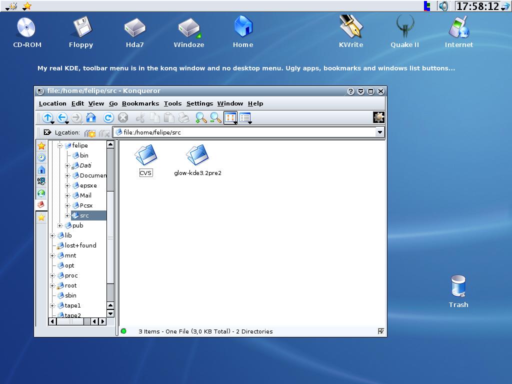
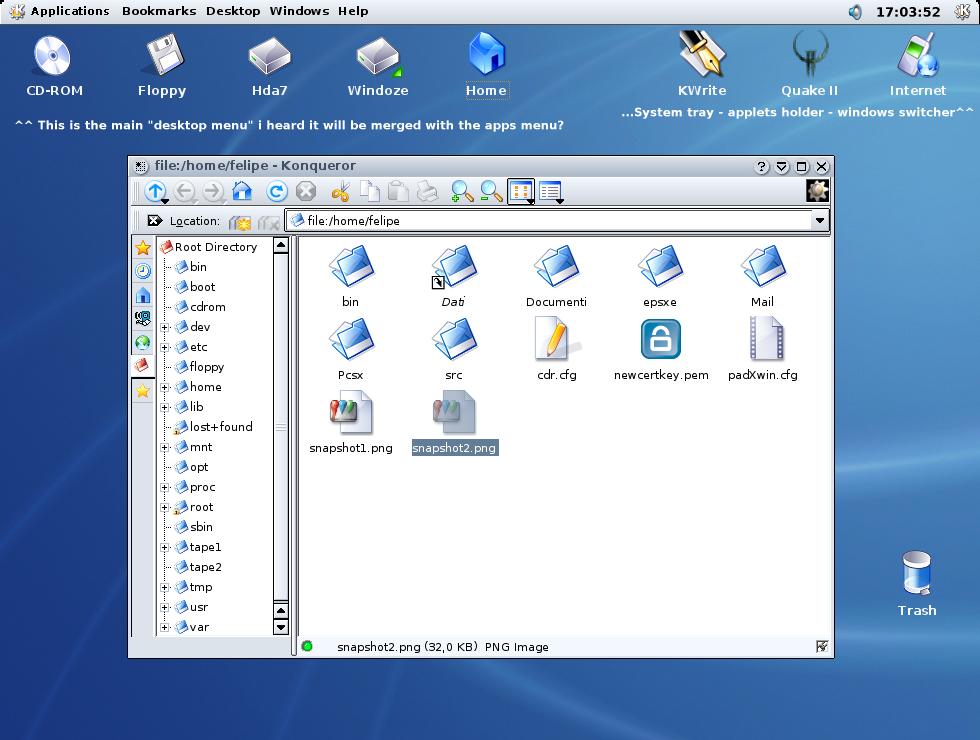
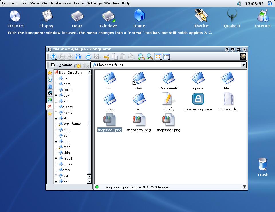
ok, this is my very personal point of view. I'd just like if kde moved towards
this direction (nothing revolutionary). It would basically consists in a deeper
integration between kicker, toolbars, applications menu and desktop menu.
These three components are still too distant nowadays (to me), and i think they
could provide an incredibly integrated environment, if properly mixed

Also, I don't know what the current situation in cvs is, I heard somewhere that
the merge between desktop menu and applications menu was kind of planned...
I'm posting this because I'd really like to know what do you think about these fake-shots and their idea...
felipe
PS: If all this looks to you too much of an imitation of mac os... well, look at
gnome2.2. Btw I think KDE should go on further with its original sinthesys of
the best gui's, not just fake transparencies


Ratings & Comments
11 Comments
It already *does* exist that feature on KDE. Just take a look on Look & feel under Desktop section in the Control Center.
Hi what icons are you using?? I like the hdds on the desktop especially
This feature have been implemented in KDE 3.2.x
this is already on the wishlist. they are going to change/add the desktopmenu as an applet that can be added like other applets to the panel.
now that's good news :) As regards "improvements" vs "eyecandy": I think this is a great improvement in usability! Plus you don't have to misconfigure your usual desktop layout just because you can =) It's simply one more (cool) option felipe
a nice concept.... but is functionality there?
Your proposal is certainly more functional than the way it's done now, but as uga mentioned, it still requires you to activate a specific window to access its menu items. That may be a minor inconvenience in itself, but not being able to get to the K-menu or any of my launch buttons unless I activate the desktop is a major inconvenience. Furthermore, applets like KWeather, Dictionary, KMix, Media Control, and KNewsTicker can quickly eat up all menu space.
really nice, looks like macos x I like it, and for those who don't like it, just don't use it! I want it!
I'd rather have something functional than have something pretty, but annoying and useless. For once, I would never be able to use that thingy up there, since I have an external taskbar on top hidden. I find that much more useful than an external toolbar. And see this problem as an example: Have two or more different apps open at the same time (like kword and konqueror for example): When one of the apps gets the focus, you cannot see the menubar of the other app, until it gets the focus. That's pretty annoying, and slows down things when one uses many apps at the same time.
I used to be in the same boat as you. ;) Yet, I was suprised by how quickly I adapted to the "MacOS" way of doing things. I was happy that KDE had a MacOS-like menubar, but it is very limited and the suggestions here (including dockapps, and clock) would definately make it good. You have a good point about menu bars on un-focused apps, but I can't think of any time that I've needed to click on an un-focused app's menu. Maybe just the way I do things... ...however, the damn good thing about KDE is, "Do it *your* way." ;-) Right now, I'm set up in a more "traditional" Windows config, taskbar and k-menu at the bottom dealie...but I'd rather have it all at the top like in the screenshots here.
actually you're wrong for a couple reasons, and this is purely analytical, none of this is opinion and this information is based on fitts law:
A menu at the top of the screen is more efficient than in the middle for these reasons:
The menu at the top of the screen, when touching the very edge of the screen, effectively has "infinite" height because you can throw the mouse at the top as fast as you want and it will never go past the top of the screen. the time to aquire a target is a function of it's size and it's distance from the mouse cursor. Therefore, since the menu item has infinite height, it's time to aquire is less than that of a menu floating in the middle of the screen.
as an example of when this was proven, bruce tog (famous interface design expert) did an experiment where he took a normal mac and stacked a second monitor on top of the first. he then allowed the mouse to go past the first monitor onto the top monitor. when a user accustomed to macs would try an access the menu, they would typically offshoot the menu item by nearly half a screen width on the above monitor. after the users got accustomed to it they went from the speed a mac user normally accesses a menu item to the normal time it takes a windows user to access the menu item (or in this case linux since most menuing systems in linux are like). I'll let you figure out which user was faster.
Let me say from experience of using OSX and linux, having menus in one place: reduces screen clutter from 10+ apps with visible menus on the screen and, makes it faster to access by putting menus ALWAYS in the same place on the screen.