
UI redesign for konqueror settings
Source (link to git-repo or to original if based on someone elses unmodified work):
Available as/for:
Description:i updated my system to kde 3.2 and noticed some improvements in usability in general. however, the configuration-dialog for konqueror is still painful - this thing is nearly unusable for average users.
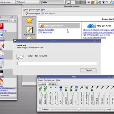
i installed the qt3-designer to play with some UI-elements. my idea was to split up the configuration dialog in four big parts: one for konqueror as a file manager, one for konqueror as a browser, one for security issues and one for "advanced" users (this will contain all the weird features i did never touch). today, the configuration dialog consists of 17 (!) elements (the icons on the left) with sub-elements for each. i've made a tree-structure for nearly the whole thing (for those who are interested: i used the program called "freemind". it's in the bz2-file) - it looks horrible.
so i restrcutured and reorganized the menus and items (maybe quite arbitrary), collected the most useful features in the main sections and moved the other stuff into expert mode - for people who like to mess around with every SSL-algorithm.
this is just an idea. who knows - maybe somebody may like it... :-)
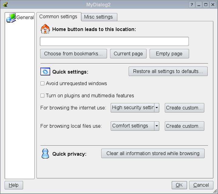
removed screenshots because they break already existing ui-standards for configuration dialoges (thanks to comments / kde-usability). created a (quick 'n dirty but standard-compliant) dialoge for general settings (just one module for now).
"create custom..." buttons should lead to a dialoge with advanced options.
old screenshots remain in the bz2-archive.







Ratings & Comments
28 Comments
Honestly, your design needs a lot of work. You've crammed in far too many things into that one panel. The best way to start this would be to identify all the differen ways Konqueror is used. Once that's done break down the preferences for each of those ways. Straight off the bat it's for filesystem and web browsing. So you have settings relating PURELY to file system browsing and those PURELY to web browsing. Lastly, you have settings which are common to BOTH. Now for the sake of user friendliness we should also split the first two sets of settings (say that three times fast ;) across "advanceness". That is it asking the average user too much. Those should go into the advance settings. So we have GENERAL (shared and simple), WEB, File and ADVANCED (shared and complex). Now, I don't have time at the moment and since this is your project, how about you take the setting options that exist in the current control panel and list them in those 4 categories. After that I'll help you out some more.
Whoops, I goofed -- I haven't slept. ADVANCED should have ANY setting from any set that is too advance. Best way would be to have tabs within ADVANCED, such as general, web and file system.
The fact is, Konqueror Settings is a bit confusion and with a lot of options. For a new user, he may don't feel confortable and confuse with this lot options. I think this ideia is good, it sounds like Slackware's KISS (Keep It Simple Stupid).
I must say I'm quite shocked
I think one thing that would be helpful, at least for me, is to use small icons in the sidepane so that you don't have to scroll so much to see all the categories.
I have seen many people misconfigure konqueror settings(may be coz of lots of options) and konqueror stops working(like one guy changed file association of directory, other changed default stylesheet). When a new user after playing with konqueror-config realize that he has done something wrong he is not able to find "Restore To Factory Defaults Button". This applies to everything from konqueror to mobile that there should be a option that sets all *advanced options* to defaults.
i agree that splitting up the settings in this way might be a bad idea if you like to change one or two single options - that would be a "clicking hell"... ;-) maybe it could be split up in just two sections - "basic" and "advanced". "basic" will let you change some common features (your home-URL, turn on / turn off java, etc.). "advanced" will let you play around with the rest of the options. another possiblity: steal the security-dialog from firebird (it has this "panic-button" for deleting every private information - really cool!). in my opinion, the number of changeable options should be reduced anyway - it is easier to install a whole linux-system than configuring konqui. but this is part of the "KDE needs user-levels" - discussion, so maybe i'll join the usability-mailinglist when i have more spare time regularly...
Well, maybe this can all be done with the Advanced... button which could just be used more? It's already there in many KCMs, so why not Konqueror?
I don't like this because : doesn't respect the GUI design of others kde application. check the configuration screen in kate, kview, kdevelop, kghostview, kmail, ... regards.
I completely agree that the konqueror settings need reworking. They are not unusuable, and anyone with common sense can understand them but they should be better organized and easily understanable at first glance. I do not believe these designs are in the right direction though. As people have already mentioned, you shouldn't need to click settings and then click into another different settings dialogue (browser, files, advanced), and besides this does not fit in well with the rest of the system.
After your suggestion, I had a closer look at the konquer settings window. I agree that your "splash" screen like configuration is probably a good idea for a distro like Xandros or Lindows, but will probably not be adopted by the core KDE team. However, there are two suggestions I can take away from this that do apply for the main KDE branch. Currently, both the category for file manager and browser are labeled as "Behavior" with an icon for the respective category. I believe that this is not very clear and should be changed to "File Manager" and "Browser" appropriately. When glancing, you don't have time to associate icons to meanings as the words will be much more applicable. Definitely I believe this suggestion should be taken up with KDE.
You're fast. Nice to see you here :) -redrat
I just dont understand why you think konqueror is in someway badly layed out. Most of the time you dont need to change things and it can be done all in one window, I mean how are can it be. I do wounder if people at kde-look have properly got used to linux and KDE at all.
The keyword here is 'intuitivity'. This is a big problem with the "you can do everything in one place" mentality. If there are too many options to choose between, it becomes counterintuitive and thus difficult. This proposal tries to fix some of that counterintuitivity. It's been a long-standing problem that specifically Konqueror, which is a great technical achievement, is sometimes unnessecarily obscure to configure. This would fix some of those problems by moving options you rarely used.
Well it doesn't mather if you most of the time dont need to change things, the GUI should allways be comfortable to eyes and handy to users. It shouldn't mather if it's some hacker system or some crap that hardly works. I agree that is better to get done all in one window.
You ask why? The answer is pretty simple: cause not everybody is a geek, a developer, a power-user or whatever else. Lots of people are simply USERS. They want to surf the web, ftp and all other "things" Konqui is able to, but they don't know, and they don't WANT TO know what are the technical settings behind. Obviously a more detailed level of config shall be always there, but maybe a click more away, so only the ones who really want to set it could do it, as they are doing now. Scalability based on user.
The "okay-apply cancel" button line makes little sense with your proposal, so I would rather suggest to drop it or use it only for settings in the subsection. So the usability may get worse. It is very important to get an consistent UI. Your proposal is "different" configuration style, so it would have to be applied for other apps as well.
There is a kde usability mailing list. I think you might be interested in it. Subscribe: https://mail.kde.org/mailman/listinfo/kde-usability Archives: http://lists.kde.org/?l=kde-usability&r=1&w=2 About your sugestion, to be honest I don't have much time right now so don't have that much to say, but I did notice that you have entries for configuring Konq as a filemanager and web browser. Well those are only two profiles of konqueror, mine comes with 4 profiles by default we can create our own, so I don't think the dialog can be done that way.
This thing makes changing one setting a farce, I have to go to konq prefs and then open another window just to change a setting. Granted, the konq prefs is a monster but splitting it up into more than one dialog doesn't improve it at all.
Hi This seems to be a good idea Present conf dialog is indeed cluttered. Anil
It's to much like IE and the Konqueror settings are nice as they are thanks. :)
sorry for invasion, but do you think it is ok to reject because it looks like something else? This idea could be discussed really into extremes ... I am KDE as well but there arfe lots of really good looks and features in MS apps ...
Theres nothing wrong with the configuration dialogue of Konqueror, the only problem I ever had with it was trying to change the homepage, but I soon realised that you have to change it another way. I certainly would prefere it to an IE style options window.
I think some of the ideas here are a good idea. At least the front page, which basically tells you where to go, something we've needed to introduce the configuration to new users (and I would also like it that way, because I have bad memory and don't use it very often ;) ). The settings dialogs under there break the consistency of KDE with the tab layout, in stead of the KDE Configuration Dialog layout, with the items to the left side in stead of as tabs.
well, i installed a linux system for my parents and they've never got used to the configuration dialog. they don't know whether "TLS" is a good thing. they really don't know, whether "use with caution" is dangerous or not... ;-) (from now: everything is "imho"... ;-) ) konqueror is the best example for missing usability guidelines within KDE. i really love KDE but it has to be restructured. in my opinion, average users don't like to configure more than 100 options in one single window with a dozen of tabs and sub-options which are poorly layouted anyway - some options are nearly empty (appearance), some are crowded with tabs and nested lists (crypto). some UI-elements exist twice, e.g a slider and a spinbox for ONE item. one of them isn't necessary and could be removed to save space on the screen. another example: "web shortcuts" contains a single tab - why one tab? you don't need tabs if you only have one... personally, i only change my home-url and some tab-behavior. from time to time, i delete my history and cache - that's it. i don't want to start a flamewar - maybe my idea is even worse... ;-)