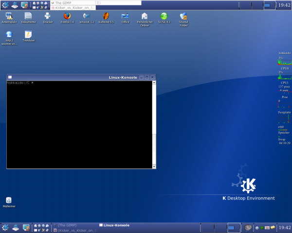
Description: In the screenshot you can see Kicker (top edge of the picture) and at the bottom you can see a "dependend control-bar" (Abhaengige Kontrollleiste) of kicker.
I posted this as KDE-Improvement (not as screenshot) because it is a kind of request to the developer to remove the white-border in the kicker-panel (top edge of the picture) so that it looks as beautiful as its child-panel, and because people can improve the look of KDE 3.3.x already now if they:
1. add a dependend control-bar to kicker, 2. remove all usual applets from the kicker, 3. minimize kicker as needed.
Enjoy..
p.s.: i am using Taskbar V2 and Systray V2 (both hopefully integrated in KDE 3.4 , click on my username and you'll find more about it)
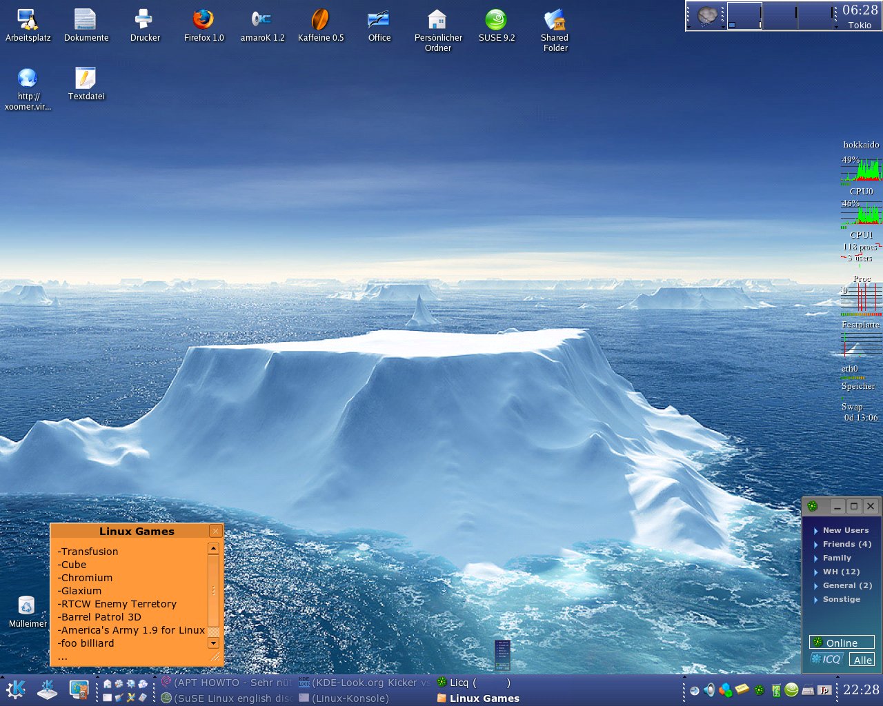
Sorry to be a typical kde-look poster, but where can I get that awesome desktop wallpaper! It is absolutely incredible, I must have it.
I also would like to congratulate you on that colour scheme, it rocks for sure :)
You mean this one:
http://www.kde-look.org/content/show.php?content=20160
There's a SVG version (for the competition) and PNG versions for 1024, 1280 and 1600. Search for "crystal style" or click on my username.
I don't know where to get the other wallpaper, but someone else'll reply!
Hey, MxCL, you are entitled to be typical, simply on the grounds of being one of the devs of one of the single coolest programs on the planet at the moment ;)
amaroK is your friend ;)
hi, thanks for your impression :)
i think i downloaded the picture from this site:
http://lucbianco.free.fr/posters_index_en.html
but i can only find a small size version now, that is a bit sad. Or maybe i downloaded that here on kdelook, i will search for a bigger version..
i found it again, with a little bit luck ;)
http://lucbianco.free.fr/3D/Ter233.jpg
well, really nice wallpaper, and really nice people that share their work with Linux-Lovers..
For completion.. have a look at his policy to use the content from his site.
Nice - and true about the drug thing :). But I cannot agree with the rest. "Choice" IMHO is one of the most important features in linux - patronizing I do have in the win-thing...
I admit the white line is not very important, and maybe with some skins doesn't look that nice, but I was glad it was there because it made the kicker more 3d.
the easiest way to get that white line is, if you edit the background picture (of kicker) with gimp and add some white pixels...
but in fact.. that white line is totally misplaced, because, there is no way to hide the white line because it is coded. the Look of kicker should be fully customizeable, and until now, the best way is to remove the border.
I agree, it should be fully customizable, therefore the white line would be a nice option :) If I add white pixels to my kicker background the arrows of the menu icons are on that white line not under it as it is now.


Ratings & Comments
14 Comments
Sorry to be a typical kde-look poster, but where can I get that awesome desktop wallpaper! It is absolutely incredible, I must have it. I also would like to congratulate you on that colour scheme, it rocks for sure :)
You mean this one: http://www.kde-look.org/content/show.php?content=20160 There's a SVG version (for the competition) and PNG versions for 1024, 1280 and 1600. Search for "crystal style" or click on my username. I don't know where to get the other wallpaper, but someone else'll reply!
Yeah I meant the iceberg one. Sorry I should have been more specific... :)
Hey, MxCL, you are entitled to be typical, simply on the grounds of being one of the devs of one of the single coolest programs on the planet at the moment ;) amaroK is your friend ;)
hi, thanks for your impression :) i think i downloaded the picture from this site: http://lucbianco.free.fr/posters_index_en.html but i can only find a small size version now, that is a bit sad. Or maybe i downloaded that here on kdelook, i will search for a bigger version..
i found it again, with a little bit luck ;) http://lucbianco.free.fr/3D/Ter233.jpg well, really nice wallpaper, and really nice people that share their work with Linux-Lovers.. For completion.. have a look at his policy to use the content from his site.
please don't remove that white line - it looks so great with my standard kicker-skin - make it optional, please!
http://aseigo.blogspot.com/2004/11/features-drugs_23.html
Nice - and true about the drug thing :). But I cannot agree with the rest. "Choice" IMHO is one of the most important features in linux - patronizing I do have in the win-thing... I admit the white line is not very important, and maybe with some skins doesn't look that nice, but I was glad it was there because it made the kicker more 3d.
the easiest way to get that white line is, if you edit the background picture (of kicker) with gimp and add some white pixels... but in fact.. that white line is totally misplaced, because, there is no way to hide the white line because it is coded. the Look of kicker should be fully customizeable, and until now, the best way is to remove the border.
I agree, it should be fully customizable, therefore the white line would be a nice option :) If I add white pixels to my kicker background the arrows of the menu icons are on that white line not under it as it is now.
Just to let you know, the latest cvs build of KDE 3.4 has this issue fixed. :)
oh, cool, now we can also use dark backgrounds for kicker, and with taskbar V2 also a light textcolor, looks good. thanks for the good news :)
No problem. Maybe I'll post a screenshot or something.