Description: These are some of the mockups I've presented at kde-artists.org. Please find the description and comments at: http://kde-artists.org/main/component/option,com_smf/Itemid,48/expv,0/topic,377.15
Note: First screenshot based on the concepts from appeal.kde.org
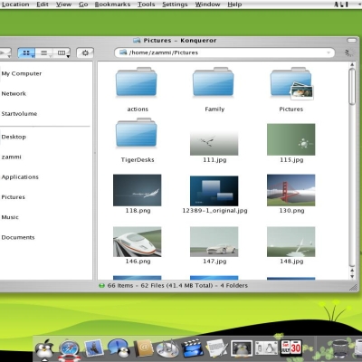
This is just the filebrowser i would like to see. extra information on the side oabout the folders and the files and shortcuts to other folders.
The windows Xp file browser has almost the same features, and i know people hate windows, but his feature is good, no mather on wich operating system.
I hope that this mockup will become reality,aso that we can download it.
keep up the good work!
I like your filebrowser, but also I think it's a bit overcrowded. Therefore your idea of the corner/apps it's realy great, kde team should take it to kde4. I think that your idea makes using graphical enviroments useful.
I like things to look pretty, and to be informed and be given simple, easily acessible options. But I like things to be kept simple and uncluttered. I hate the Microsoft style of doing things which to me is just a big waste of screen real estate rather than actually helpful.
How about something that is nice looking, simple, helpful, and minimalistic. Something that doesn't waste big slabs of space on my screen giving me information that I don't always wan't anyway.
Innovation is the key to KDE's future.
i prefer stick to KISS principle. this thing looks very nice but i have my doubts about usability - it's just too cluttered. action icons in corners of selection are neat, but i think many people will quickly run 'out of corners' :-) i think circular layout would be better
The first mockup seems the best, however I would get rid of all those unnecessary and confusing tabs, along with the context menu on the right. On-click chooser is great improvement, imho, presenting some nice options, I hope double-click would still open the image within Konqui...The other two are more-less disastrous attempts at fake usability, being actually a nightmare of cluttered options. Btw, what iconsets are you using in the screenshots? I hope my comments will not be understood as an insult, just an opinion... Keep up.
Thank you for your comment. Actually at the moment I'm doing some kind of brain storm to come up with a brand new idea (Combining with some nice technologies coming in KDE4 like Tenor). The main thing should be usability, isn't it.
Actually the icons are downloaded from http://www.guistyles.com and mixed with OS-L icon set from here kde-look.
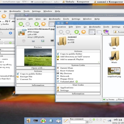
Really like the concept on the 2nd screenshot. But find it will be better to have the folders tree on the left side, instead of right. Excellent Idea. I hope this type of idea will be there soon implemented.
I like your ideas. Now the real challenge ... finding fine folks to implement them! Unfortunately HTML and PHP coding aren't worth squat when it comes to coding for KDE. Maybe one day I'll have to take up C or C++ or something.
I like the 2nd (without the kde logo between files and tree view, less buttons on toolbar and less informations on the statusbar). And I really don't care if it resembles slightly MS Vista.
I was thinking... may a slight difference in the color tint of each window's statusbar help to identify windows even without checking it's content ?
In my humble opinion, I think these are way too "busy". For example, the first mockup has tabs on the top and the side. The second and third mockups almost look like they're from an IDE instead of a file manager! Also, the icons need to all be the same size. It's very difficult to scan across the file names when they're misaligned because of the icon sizes.
This is just my opinion. My favorite file manager "style" is still the classic box with icons and nothing else.
I like the first shot, but not it's amarok like panels. What about a collapsable area with dynamic content that users can choose?
Second and third shots seens so clutered, with much options that turns the filemanager use confused.
I like the first screenshot! well, the 2000 tabs are not so good (specially the vertical ones), but the idea of little icon action around the selected icon is really really good! (I just post a similiar idea in another comment here on kde-look).
The second and the third are the usual Vista's ripoffs and I don't think they have place in KDE4, which goal is to be innovative.
(if people started to show this kind of mockups say...1 year ago, probably I would have said they were good, but since they started to appear as soon as Vista's screenshots were out, they don't deserve too much attention, IMO)
I only partially agree.
Surely side tabs have to go away. A more vertical layout, yet not innovative, still be the most natural (and better for 4:3 screens).
About innovations and Vista clones... well, tree sidebars are even less innovation, but they're good to use, then still there. I'd really prefer a Vista-like upper and lower bars than a sub-icons system.
When I moved from gnome to kde, my wife got scared simply by the meny "copy here, move here, ..." she got prompted when dragged a file to a folder. And she's right! Better having common tasks and infos just in sight. Vista do it very well.
Summarizing, imho I don't care who arrived first. Convenience must be first, innovation just after that.
And, maybe, in their next beta that will not be there any longer :D


Ratings & Comments
29 Comments
This is just the filebrowser i would like to see. extra information on the side oabout the folders and the files and shortcuts to other folders. The windows Xp file browser has almost the same features, and i know people hate windows, but his feature is good, no mather on wich operating system. I hope that this mockup will become reality,aso that we can download it. keep up the good work!
instead of downloading the file, the link shows me a picture of filebroweser replacemente :S can you fix this?
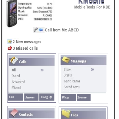
in the first screen shot. What is it? I like it.
I like your filebrowser, but also I think it's a bit overcrowded. Therefore your idea of the corner/apps it's realy great, kde team should take it to kde4. I think that your idea makes using graphical enviroments useful.
I like things to look pretty, and to be informed and be given simple, easily acessible options. But I like things to be kept simple and uncluttered. I hate the Microsoft style of doing things which to me is just a big waste of screen real estate rather than actually helpful. How about something that is nice looking, simple, helpful, and minimalistic. Something that doesn't waste big slabs of space on my screen giving me information that I don't always wan't anyway. Innovation is the key to KDE's future.
i prefer stick to KISS principle. this thing looks very nice but i have my doubts about usability - it's just too cluttered. action icons in corners of selection are neat, but i think many people will quickly run 'out of corners' :-) i think circular layout would be better
Love the idea of corner actions. Simplier than ever. Please contact kde team to tell 'em about this ;)
You have a great suggestion with your corner actions. I also like your proposed file manager, very clean and nice looking.
Actions/apps corners (screen shot No 2) are brilliant idea!!! The rest of your propasal is either good, but a bit to "overcrowded" - IMHO.
Sorry. Not screen shot No 2 but 1st one :-)
The first mockup seems the best, however I would get rid of all those unnecessary and confusing tabs, along with the context menu on the right. On-click chooser is great improvement, imho, presenting some nice options, I hope double-click would still open the image within Konqui...The other two are more-less disastrous attempts at fake usability, being actually a nightmare of cluttered options. Btw, what iconsets are you using in the screenshots? I hope my comments will not be understood as an insult, just an opinion... Keep up.
Thank you for your comment. Actually at the moment I'm doing some kind of brain storm to come up with a brand new idea (Combining with some nice technologies coming in KDE4 like Tenor). The main thing should be usability, isn't it. Actually the icons are downloaded from http://www.guistyles.com and mixed with OS-L icon set from here kde-look.
Really like the concept on the 2nd screenshot. But find it will be better to have the folders tree on the left side, instead of right. Excellent Idea. I hope this type of idea will be there soon implemented.
I like your ideas. Now the real challenge ... finding fine folks to implement them! Unfortunately HTML and PHP coding aren't worth squat when it comes to coding for KDE. Maybe one day I'll have to take up C or C++ or something.
Sorry, but these are mockups for KDE4. The best one (Eye candy + follows the HIG standards) will be a part of KDE4. Here's a link: http://kde-artists.org/main/component/option,com_smf/Itemid,48/expv,0/board,24.0
These all resemble the latest beta of Vista. Not all that original.
I like the 2nd (without the kde logo between files and tree view, less buttons on toolbar and less informations on the statusbar). And I really don't care if it resembles slightly MS Vista. I was thinking... may a slight difference in the color tint of each window's statusbar help to identify windows even without checking it's content ?
In my humble opinion, I think these are way too "busy". For example, the first mockup has tabs on the top and the side. The second and third mockups almost look like they're from an IDE instead of a file manager! Also, the icons need to all be the same size. It's very difficult to scan across the file names when they're misaligned because of the icon sizes. This is just my opinion. My favorite file manager "style" is still the classic box with icons and nothing else.
But I think the majority wants both: some more eycande, some classic.
brilliant!!
Same as my oppinion : great ! How far with the code-part are you ?
Has somebody tested it yet? What about the performance? Does it slow down your system a lot?
I like the first shot, but not it's amarok like panels. What about a collapsable area with dynamic content that users can choose? Second and third shots seens so clutered, with much options that turns the filemanager use confused.
I like the first screenshot! well, the 2000 tabs are not so good (specially the vertical ones), but the idea of little icon action around the selected icon is really really good! (I just post a similiar idea in another comment here on kde-look). The second and the third are the usual Vista's ripoffs and I don't think they have place in KDE4, which goal is to be innovative. (if people started to show this kind of mockups say...1 year ago, probably I would have said they were good, but since they started to appear as soon as Vista's screenshots were out, they don't deserve too much attention, IMO)
I only partially agree. Surely side tabs have to go away. A more vertical layout, yet not innovative, still be the most natural (and better for 4:3 screens). About innovations and Vista clones... well, tree sidebars are even less innovation, but they're good to use, then still there. I'd really prefer a Vista-like upper and lower bars than a sub-icons system. When I moved from gnome to kde, my wife got scared simply by the meny "copy here, move here, ..." she got prompted when dragged a file to a folder. And she's right! Better having common tasks and infos just in sight. Vista do it very well. Summarizing, imho I don't care who arrived first. Convenience must be first, innovation just after that. And, maybe, in their next beta that will not be there any longer :D