


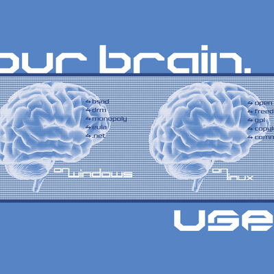
YourBrain
logixtek


Source (link to git-repo or to original if based on someone elses unmodified work):
Added-
---------
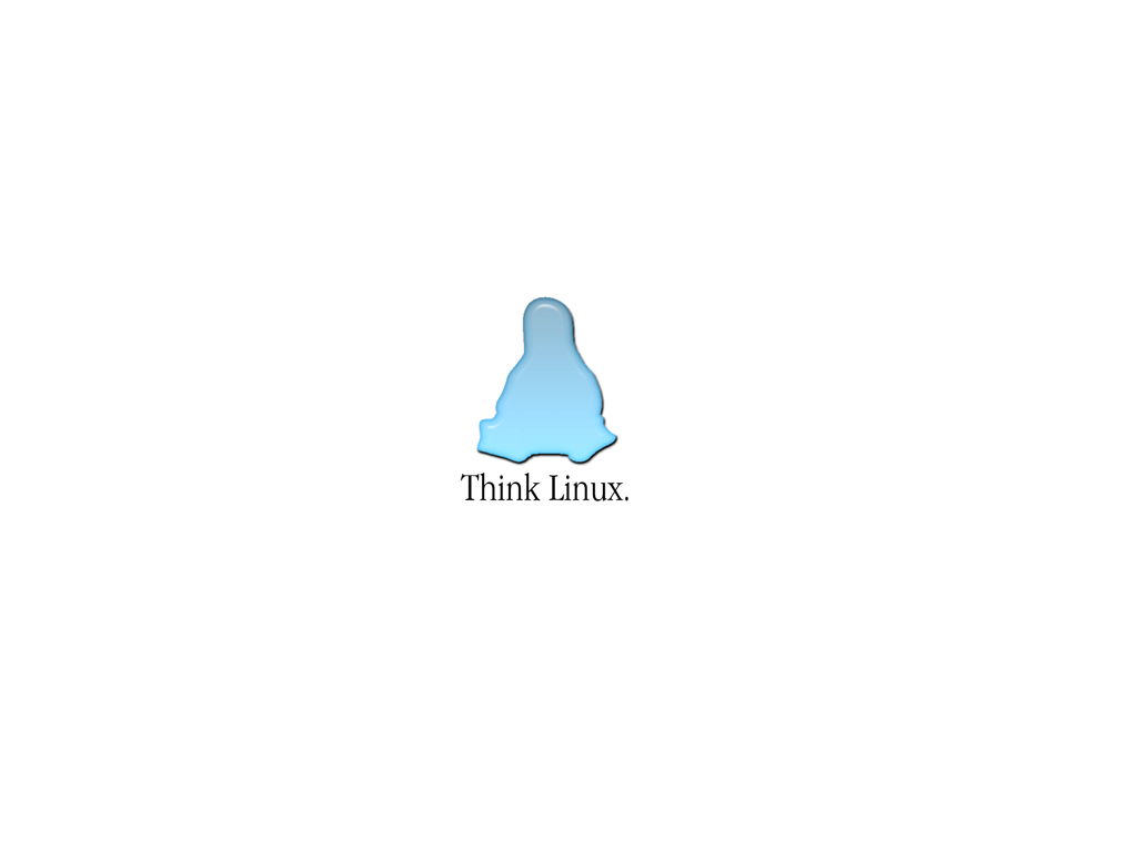
thinking_white_1024_768.png-The original flat wallpaper.
thinking_trans.png-250x250 px. flat, with transparent background
thinking_trans_no_text.png-Same as above, but with no text.
thinking_trans_gimp.xcf- Gimp layered file.
Added-
---------
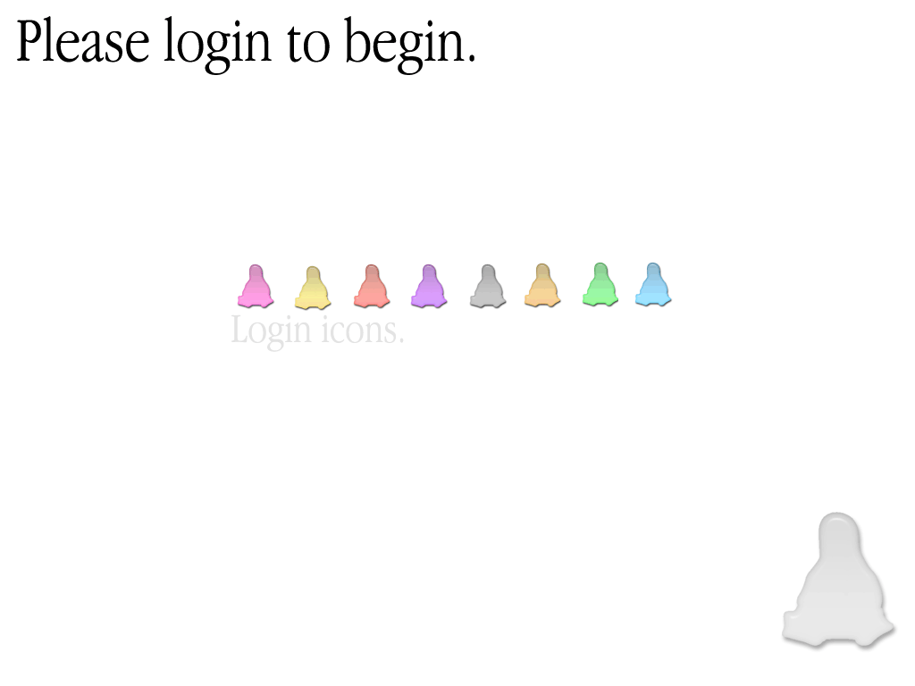
login_screen_aqua.png
Various colored login icons which BTW are badly dithered in the picture.
Added-
---------
login_screen_clear.png-Same as the one before, but using a clearish Tux.
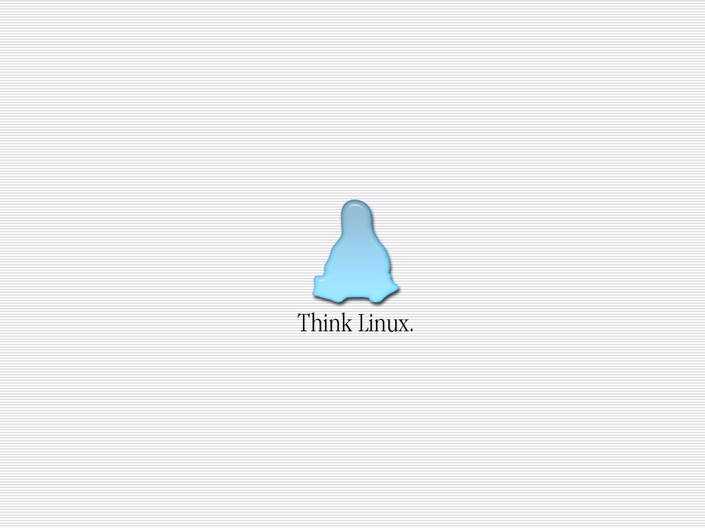
thinking_scanlines_1024_768.png-Same as original wallpaper, but using ‘scan lines’ in the background.
scanlines_1024_768.png-Just a 1024 x 768 px. picture with the ‘scan lines’.
And that’s that. Nothing else to do with this. Thank you all for the compliments.


Other Wallpaper Other:

Ratings & Comments
20 Comments
Your work looks very nice with complete "liquid kit" ;-) Thank you for providing Gimp layered file, great idea and very usefull! FLC
This wallpaper ist really great. I myself use it in combination with Liquid. There ist nothing that could look like better. And those login icons are funny, but in my opinion a little bit too small. Could you distribute them in 64x64? This would be really great.
it look's real cool!you're da man!
for the update of the wallpaper with the little lines.
this is the best wallpaper i've ever seen in my life!
The third one of yours.. Tux in a black background with small lines. can you make a wallpaper out of it? exact the same, in 1024x786 and no 'Example' written on it? looks hot. thanks, good work.
I repeat, a definite keeper!
my compliments to the creator!
Now this is an amazing background. To avoid the white background (as suggested in the changelog) i putted the following options on the Background configurator: - In the Background tab, I choosed Elliptic gradient on the Mode listbox, some kind of dark blue on Color 1 (like #1E72A0) and white on Color 2. - In the Advanced tab, I choosed Elliptic Blending and moved the Balance bar until the bright spot was below the logo. It excels (for me, of course :)
looks neat for me, thanks for the advice.
Quality! No words can express how impressed i am. Go on and use the ideas given above. Tamás
Why don't you just release the penguin solo with transparent backgrounds as png or gif? In that case anybody could use his favourite background and put this as logo over it.
It goes great on my iBook!!! Kde has never looked so good! Keep up the good work!
GREAT! =)
Or, somewhere inbetween, bluish, grayish? I too dont really like white backgrounds, I have mine set to the same color as the default KDE titlebar.
... use kde's blending feature to improve it a bit. Now I've got a nice "shadowed light blue" background with it.
Love it... but unfortunatly white backgrounds make me completely mad. Could you by any chance make a version with a black background?
Great wallpaper. Not bloated at all... It'll probably last alot longer than other wallpapers.
it's simple, refreshing, clean. the message gets to the point. nice to finally see some quality back here in kde-look.org
Wow! I've neverhs such a chuckle! I really love the idea of this wallpaper. It's just cool.