


deKorator
motyR


Source (link to git-repo or to original if based on someone elses unmodified work):
0.1 start point
0.2 as SUSE saying "simply changed" 
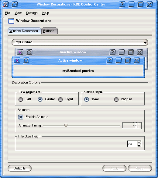
0.3 add the abillity to change active and inactive decoration's color, the abillity to change the title bar height and animations


More KDE 3.x Window Decorations from motyR:
Other KDE 3.x Window Decorations:


Ratings & Comments
16 Comments
very nice windeco, but when the window is maximized, or stretched to 1600 pixels wide, there is a black square on the titlebar. i believe this is caused by the titlebar gradients not being long enough good work though
i'll check it though logicly it doesnt ment to happend, could u send me ascreenshot of the problem to moty@gawab.com? 10x in advance!
doesnt metter, found it apixmap problem, try it now.
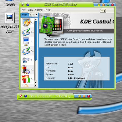
What font and KDE version are you using? I'd really like to know, it's the first time I've seen a decent KDE look, usually all the fonts look awful in KDE (way too thick and blurry). Thanks.
luxi sans
that bad???
i think lost of people may had problem to build it please generate the ./configure script for us, make sure it works without the admin directory and makesure you delete autom4ke.conf directory or something like that. people complain about my project because I was doing exactly like you, supplying the strict minimum, but ... people like to have some generated stuff generated for them ;)
it look's like 500 k'b r not enough but i'll work on something. 10x alot.
good, maybe your idea needs improovement, but at least you are creating something new, .... not cloing .NET over and over again like most people here. keep going, some of your stuff may revolutionize the way people look at their desktop. maybe not with this particular one, however.
well what can i say in my opinion its really looks great but looking at your replayes i see that it is'nt the case for you gui's ,so please could u point me to those things u think needs improvement it really will be abig help,i dont want to insult anyone but the other one's i see on this site r just plain color windeco's and the replaye they get from u gui's really amaze me so again please point me to those things u think i should refine. peace!!!
I'm sorry, I did not make myself clear. Actually I like your myBrushed windeco. it Looks good, I just think it won't be the 90% favorite. but no problem here, right ;) we want more choice... and let people prefer anything they want. so, I'd like to encourage you to continue your work by creating new innovative window decorations. You seems to want to make different style, and I like that.
please tell me what the hell is going on when i try to update some screenshots, looks like what ever i do the site is alwayes remmember the old screensots!!!
The site does not do this, your browser does. Hold the SHIFT key and click on reload.
Are you updating this or are you just trying to keep it on top of the list? I don't see any differences.
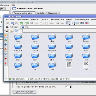
...the texture of the window header should be changed to make tiling look better. All in all - good theme.
agreed. a good start but there is some detail work that must be done, like improving the tiling. maybe, the brushed should have a higher gamma, too. i imagine, once finished, this can look very good.