


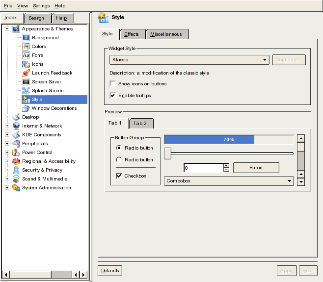
the HighColor Classic and KDE Classic style.
On the other hand I dislike grandients and even KDE Classic
has a gradient in it's progress bar.
I wanted to make the style more consistent, so the frame of a button
does look exactly like the frame of a combo box now.
The style has been cleaned up - a bit of waste and some bells and whistles
have been removed.
So you can see, the name Klassic fits perfectly

(Kind of - I'm not a poet nor a musician and not even an artist!)


Ratings & Comments
4 Comments
Have you made the combo boxes and the K Menu arrow not so large? That's my number one gripe with the KDE Classic style.
I like it!
is possible to have any screenshot?
OK