


Daurora
negas


Source (link to git-repo or to original if based on someone elses unmodified work):
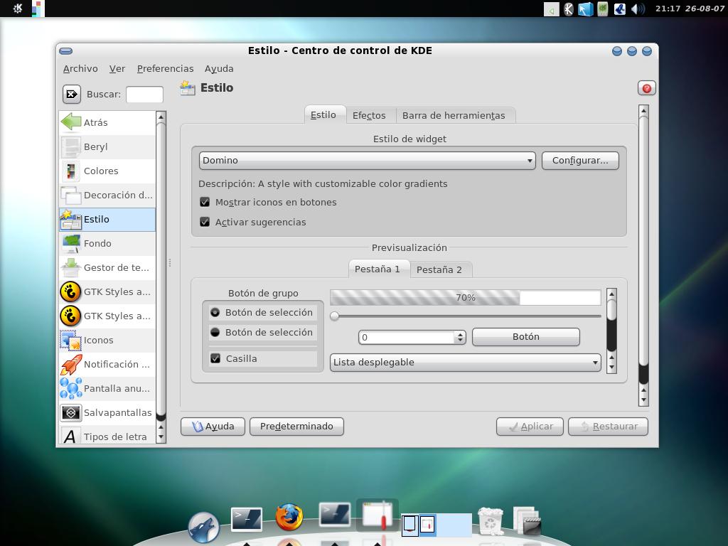
0.2------
* Fixed tab gradients
* Added grey gradients menu
* Fixed slate color scheme
0.1------
* Inicial release
* Added Color scheme


Other KDE 3.5 Themes:


Ratings & Comments
10 Comments
Wow, this is the best style configurator I've ever seen... I used to use lipstick, polyester, domino and some other styles, but this one is just amazing, by its configurability and by its professional look and feel. Thanks for option to save/load setups, this is a must in such complicated feature-rich beast! You've done great job, thank you very much! Keep up the good work, for all kde users! :)
As I said above, this Domino config is absolutely wonderful. I love how it's not too smooth, but isn't way too glossy either. So I was thinking, "Man, there should really be more themes like this, the gloss is just perfect..." And then it struck me -- why not create more themes like this, but designed for different color schemes? (I think) this would look perfect with a green or blue color scheme specifically designed for this Domino config, not just slate.
This is a beautiful theme. It makes KDE simple enough to admire and use. Keep up the great work.
your theme is really nice, but the title color is white here, it should be black as yours. any ideas? (i already set my colors to slate)
Fixed!
I'm not to much into light themes (like the one you provide), and all the domino dark themes just look bad imho (either too dark, or too much glass). Just for the heck of it I tried this config with the default domino color scheme, and it is definitely a keeper! It's just the perfect shade of grey, not too shiny, and the whitish widgets look great against that grey. Thanks for such a great config! If you want something to improve though, for the default Domino color scheme, could you make the menus more grey? That's my only gripe, the menus don't fit in as well with the rest of the theme.
Nice idea. New menu gray gradients
i love it!
I like it, thanks for share it! Only one thing: can you change the tab gradient to make a smooth transition into the page? Cheers!
Good idea, thanks