


enjoy it!

Thanks to all.


Source (link to git-repo or to original if based on someone elses unmodified work):
1.4
A new dark wallpaper added.
1.3
Added monochrome version.
1.2
Added two stickers.
1.1
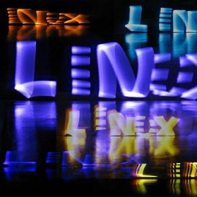
Changed the logotype.
Added some wallpapers.


Other Cliparts:


Ratings & Comments
22 Comments
8 8 great
9 Not downloading it yet, but it looks great.
Thank you.
Ottimo design italiano! ;) Senti ma hai mai pensato di proporre il tuo logo come logo ufficiale di Linux? Tutti quelli cui l'ho mostrato hanno pensato la stessa cosa!
Ehi grazie mille! Quando l'ho creato l'anno scorso volevo farlo, ma poi tra una cosa e l'altra non ci ho più pensato... Però ora che me ne fai ricordare ci proverò di certo! Lo propongo alla Linux Foundation!!!
Forza! Tienici aggiornati
awesome work! i like it:D
Grazie!
grazie a te per aver condiviso.
I prefer your Linux Logo. Very nice work !
Thank you! glad you like it!
I like your artwork.. thanks for share ;)
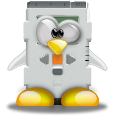
Very nice penguin. Looks like it climbed a mountain and is looking back to see if there are others behind... But the font looks a bit too bulky and square to me. I think I'd prefer something more round and sans-sérif, like the font in this wallpaper: http://opendesktop.org/content/show.php/A+Glittering+Future?content=141998&PHPSESSID=77a7386fcafd9028f0b9bb293f91779e
very nice. perfect work!
:)
Thanks for sharing, it is a nice, clean and modern concept indeed. Don't forget to publish a black version (white on black / black on white) Cheers and thanks again. Thumbs all the way up.
And let's go with the monochrome version! You're right, I forgot something important. thanks to you for the contribute.
Congratulations, Your artwork is perfect. :)
I'm glad you like it!
Nice, but you can improve it. I mean the letter "X" can be improved. The white line, which is rise up to penguin seems to be very thick. I understand your decision here (the symmetry with upper left corner of the letter "X"), but "X" is really bad at the moment. However, the penguin is magnificent.
thanks for your comment! in fact, the "X" is the weakest part of the job, and can certainly be improved. As soon as I have time I will try a better solution. I already have one or two ideas!
thanks for your comment! in fact, the "X" is the weakest part of the job, and can certainly be improved. As soon as I have time I will try a better solution. I already have one or two ideas!