


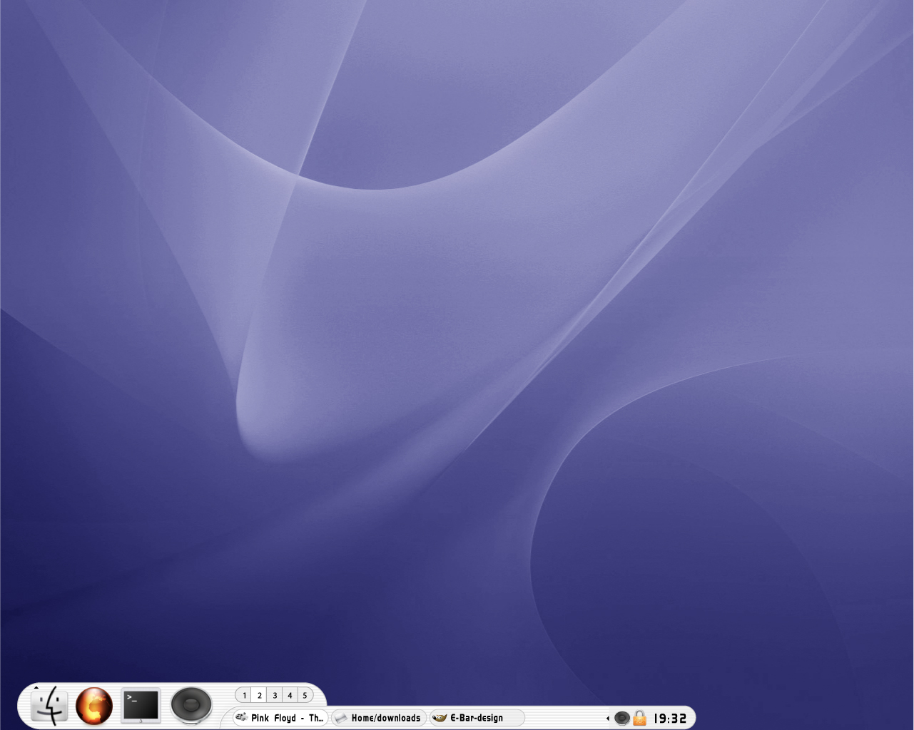
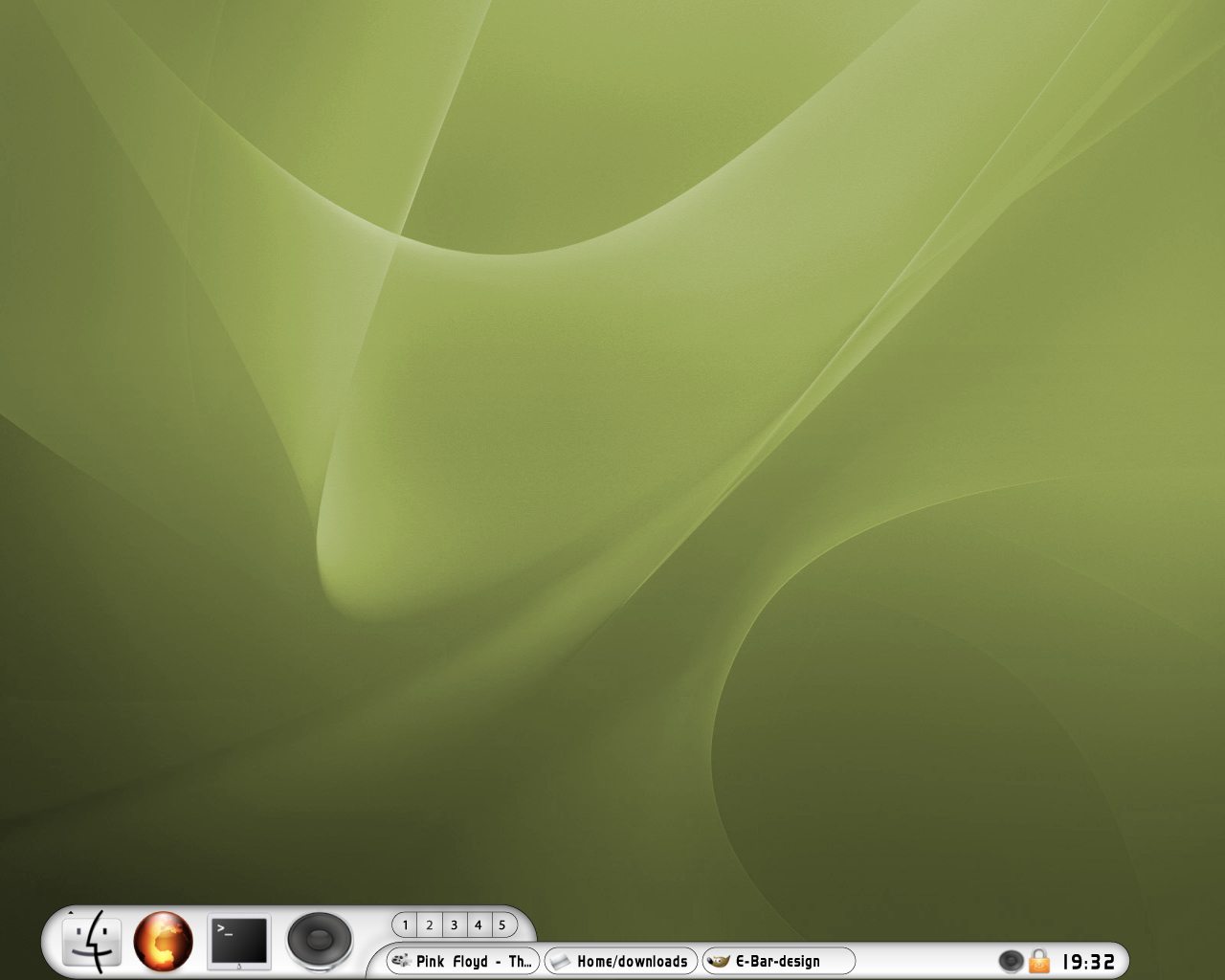
Ex-Bar 2 (Just design + PNGfiles)
borrocop


Source (link to git-repo or to original if based on someone elses unmodified work):
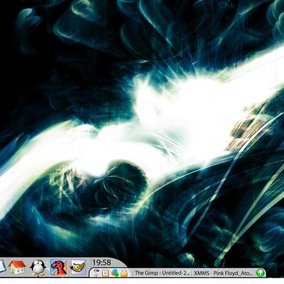
Aqua-look (first screen)
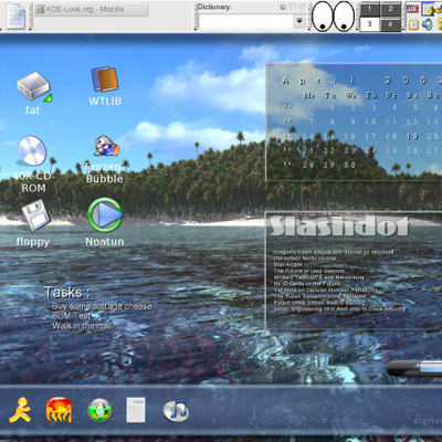
Plastic-look (second screen)


More Karamba & Superkaramba from borrocop:
Other Karamba & Superkaramba:
Ratings & Comments
3 Comments
Well, it probably doesn't apply to fitt's law. Probably the most important button is the one on the left (the kde menu i assume) and it takes aiming to get to it. It would be better to have it flush with the left side of the screen. Also, i don't like the idea of panels being 2 different sizes. It means that if you maximise a window you have all this wasted space above the taskbar. Of course, this would be good for converting those crazy windows users :)
Great design, really. Two things: The K-Button is no problem at all, you can call the menu using dcop (take a look at my TGlass theme for this;www.kde-look.org/content/show.php?content=7566 ).
You're right with the maximizing problem. I think, the only solution (exept redisigning the whole theme) is to cut it apart into TWO themes. One is kept free when maximizing, the other one (with the buttons) stays always on top of all applications.
I'd really like to see this work, especially if you manage to build a nice and fast taskbar.
Chip
I don't think that there's a problem with the kde-menu-button, it's easy to reach, and it's almost the same position as the kde-kicker or the mac dock... You're right about the "maximise-window-problem" The wasted space can be used for another karamba app, like a cpu monitor or an xmms-control. If you use the usual kde-kicker you also lose place, in the left en right for example, the only different thing is that the standart kicker can have more tasks... But thats not a problem with the e-bar I think...