


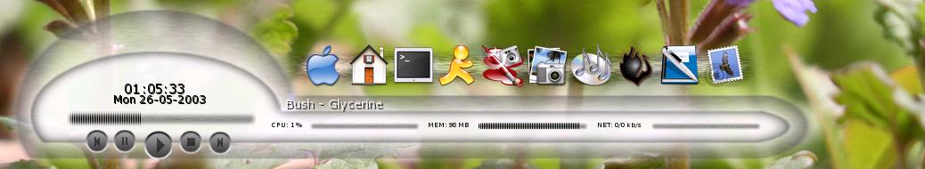
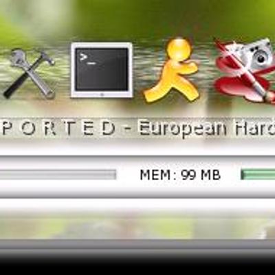
Soybar
soyahz


Source (link to git-repo or to original if based on someone elses unmodified work):
Now its a little more transparent, some of the links are updated. I do not have time to add a task manager, but if someone would like to help with that i would much apriciate it. :-D


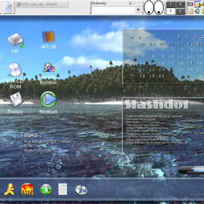
Other Karamba & Superkaramba:
Ratings & Comments
6 Comments
It's not the size that counts, it's how you use it... (Sorry, couldn't resist) But seriously, nice theme. Looks great.
if you're going to implement something like the "kroller" or smooth-zoom effect, i'll j*rk *ff :-) i don't think it's tooo big. that's kind of an advantage of the karamba themes: they are in the background, not disturbing you in any way -> so, i don't care much about the size ;-) thanks for soybar, muesli
This is much better than the original SoyBar, but can still be improved. For one, the background is too big, if you could tone that down a bit that would be better. The icons should feature the rollover affect from osXBar - he's done a great job with that bar, so you should work wish him on establishing a rollover python object that can just be inherited and reused. While the icons are pretty good, they should also display the name of the icon when you mouse over them, so that you know exactly what is going to be launched. Other than that, this is a pretty darned nice dock app.. congratz and thanks :) -Ashari
it looks like a penis.
yes, it DOES look like a penis
It's pretty good. I changed the icons to the slicker ones, turned off the shading and changed the fonds to New Brand and made them a bit bigger. Other then that its great.