


KDE-Look t-shirt "look"
mart


Source (link to git-repo or to original if based on someone elses unmodified work):
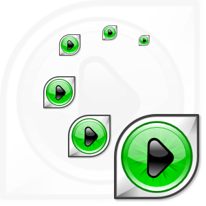
0.4:
-drop shadow directly in the svg version, made with the stepped gradient tecnique
-re-exported the 16x16,22x22 and 32x32 pngs
0.3:
same icon, oly fixed the svg version in order to render correctly with ksvg
0.2:
-little modification to the play icon
-different proportions
-a little bit more contrast


More Various Artwork from mart:
Other Various Artwork:


Ratings & Comments
13 Comments
I like this icon way better than the current amaroK icon. I hope they change it.
It's the best eyecon I have ever seen :)
spiffy looking icon. You got my vote Fab
good work ;)
You completely have my vote here.
just to add -- This will render down to a 2 color shirt nicely. check out my interpretation here. http://www.amiddayatlantic.com/ken/crsc-app-amarok-tshirt.png mmm sweet profits for the amarok team
I might buy that shirt.
Hi! I really like this icon. I think it suits very well the concept (wolfeye and music player) the simpliest and coolest way, as it is not an "abussive" way. It's very recongnizable too. In fact, what else, even more than an speaker, reminds a media player than the "play" symbol? Also the green, shiny color inside... really candy for the eye It fits also in Crystal theme very well. And impressive... man, I first tried amarok the day I saw your icon! I'm using it since then with this icon, and I'll be using it even if it's not the chosen one. In my opinion, this icon says amaroK
Yeah, nice icon and it even looks good in 16x16. A really good work!
Very nice idea!
Very nice work!
I like it and im using it along with my crystal set. Cheers :-)
I like it very much ... Fab