


KDE-Look t-shirt
meNGele


Source (link to git-repo or to original if based on someone elses unmodified work):
->
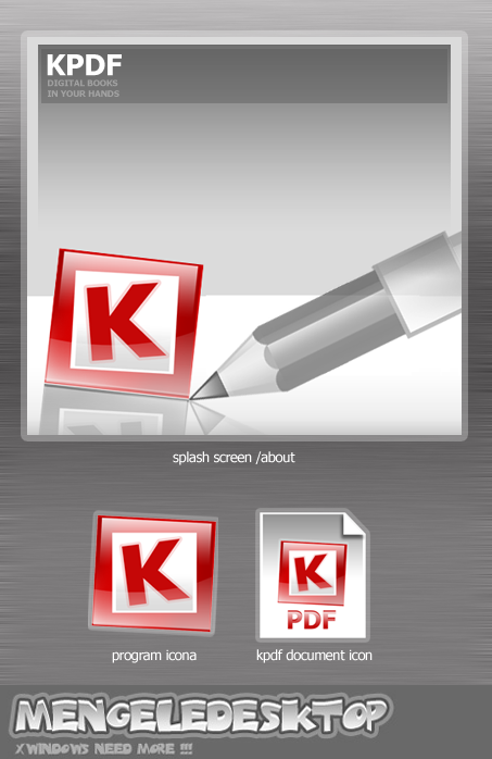
new: new splash screen/about
----------------------------
->
there is no more KDE PDF, only KPDF !
Splash Screen is without transparent elements, but still fancy 
-----------------------------


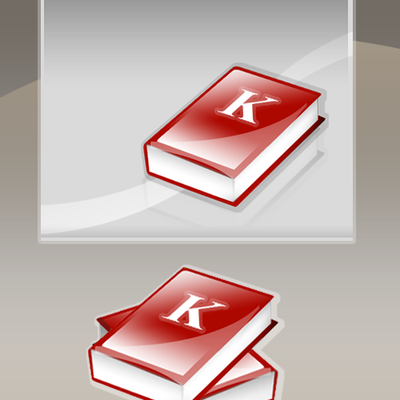
More Various Artwork from meNGele:
Other Various Artwork:


Ratings & Comments
19 Comments
THe biggest problem, as I see it it that the pdf logo is copyrighted and really should not be used in this logo, although any other logo does not "say" pdf quite like the original visual metaphor...until now this is my favorite because it looks nice, and is easy to remeber. The mimetypes look nice and simple to understand
I'd add "pdf" instead of K, but other than that... a nice one. its a bit 'boxed', that is...
GREAT :)
I have absoulutely no way of interpreting this as a pdf icon. At least put the words "pdf" somewhere near the k.
you have some realy great skils but one thing. NOT ALL KDE APLICATIONES HAVE TO BE DESCRIBED WITH A K. please make the same thing with the acrobat simbol or somting that tels us its an PDF. the K at moast tels us its a kde Aplication.
... yes,.. but ! if put ACROBAT logo (or some modificated shape) it will be some kind of AR icon COPY, this icon have Red frame around the white square, that associated to acrobat document, and k in middle is best option, puting some book, or paper document is realy stupid !!! sorry for bad ENGLISH !
Very cool.
NICE!! really, its cool :)
I guess the splash screen should have some transparent backgrounds to give it a form that is not simply rectangular. Well, this would mean that the splash screen currently could only be implemented on X11R6.8.0. Please keep this in mind, when you design funky splash screens.
There is an exception to this. You can use a 1bpp transparency mask. The splash screen cannot have a shadow, but it can have a shape. Try to open the transparent splash screen with kolourpaint to see what it will look like.. not bad at all! And there will be no problem for developers to implement a shaped splash, it's a fun 5-minutes work! ^_^
Oh, OK. I didn't know this. Thank you for the explanation.
Hello, splash and documenticon say kdepdf, the app name is kpdf. The svg sources (if you used svg) would be apreciated (the contest rules have changed to include that)
GREAT Job!!!!!! You got skills keep it up by the way did you use sodipodi or inkscape to make these?
The name mengele is a painfull one, from an european historical point of vue. Reading "mengele desktop" in big shocked me, as i started to wonder if it was some kind of sick joke. Then I realized that it was probably some coincidence, nonetheless you should probably think about making some changes to that part of the picture and/or to the name/pseudo. The icon is pretty cool on the other hand. Splitting kde in two is not very readable tho.
I guess the logo will not be shown once the set is installed, but yes, I agree, the name Mengele has quite a bad meaning for most Europeans that know what happened during the war.
Apart from that, it looks good btw :)
point of my nick is NG in meNGele NG are first letters of my name Nenad Grujicic, mengele was my alias in Quake III Arena from first day (1999), but i keep this nick !! why not dr.mengele was a very big BRAIN ?! iznt ?
why not ? because that "dr." was maybe a "big brain", but he was on the side of evil. if your nick would be hitler or stalin we would feel the same... :(
He was not. He was a complete moron. His experiences made no sense from a scientifical standpoint and from no other standpoint either, except for his devasted mind. Who can be dumb enough to pour bleach into someone's eyes in order to turn them blue? A moron, and a shitty one, i tell you.