


KDE-Look t-shirt "look"
mart


Source (link to git-repo or to original if based on someone elses unmodified work):
fixed a typo
0.2:
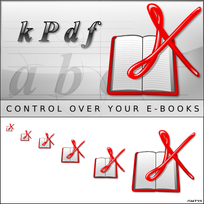
a spashscreen :-)
followed some suggestion: now the k is bigger and rotated to seem more like a k


More Various Artwork from mart:
Other Various Artwork:


Ratings & Comments
12 Comments
I think this is beautiful since it remember the acrobat icon in the little sizes, but in bigger sizes we can see the details and it's different from acrobat icon. The only problem is the K (A) looks more like an "X", it should be cool for xpdf.
Really nice work. Looks great in all sizes.
Also SVG source file is included which makes this submission really a possible winner .... Let's see what happens .. Fab
...this one's my favorite. Easy, recognizable, clean, fits into Crystal and similar themes. Great idea and good work on it. Nicely done. ;-)
I really like this one. My vote goes here!
but I had the same basic idea before. However I don't believe that I would have realised it that good. Excellent! And best: The icon can easily be recognized at any resolution.
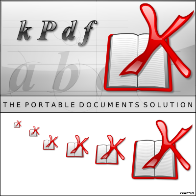
I love your splash and icons, but I don't get your text "CONTROL OVER YOUR E-BOOKS", because I don't use KPDF for any e-books, but for financial statements and documents from/to the internet, from/to friends, MS Windows-users... Is it too much to make it portable documents insted of e-books? ...and isn't kPdf written KPDF or kPDF? Just my 25 cents
Exelent work, congratulations, you're desing is cool
You misspelled "your" in the splash screen. You have "yor".
oooops :-)
i will just suggest 1) to make the book sit on the bottom edge (now it looks weird, because it's rotated only too little bit so it seems like an error, not intention) 2) to rotate the "K" acrobat logo about cca -15 degrees (in left direction or counter-clock-wise if i spell it right)
This is a great idea, a good concept. Maybe it should be a little skewed, to look more like a K, I'm sure everyone will notice the similarity to the adobe icon anyways. And.. I'll keep it a bit darker.. This is a good entry for the contest.