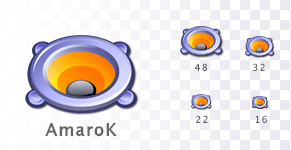
Frankly, I find a speaker icon for a media player rather boring and generic. There is nothing special about the symbol, it's the typical media player icon.
Mind you, I'm not saying your icon is bad. I'm just not too fond of yet-another-speaker.
with a great style, but it lecks originality and the connection to the "identity" of the application.
It rather looks like a professionaly designed icon for Audio Settings.
I dont want to put your work down, i hope you dont understand me wrong, but in my mind it would need
more of a original touch for the specific app.
greets and wishes
flo
your point of view is right, I've posted it anyway since it's an "audio" icon and amaroK and "audio" application, and also because it's a good loking logo for an app.
But hey, I don't expect to win.
cheers
Well at the risk of loosing the contest too, euxneks, i really like your icon too :) The last version added the necessary contrast with the black outline to actually look very good in 22x22 too. Great job (i think i'm not posting in the right place, :D )
My reasons for liking this one:
1.) Simplicity. A clean, usable style. Not too busy. Yes, the speaker is overused, but so what? This is one of the few speakers that are actually pretty.
2.) Colour choice. Nice and bright, and the icon remains sharp and clean at all sizes.
This one's a winner.
I really like this one. Clean, simple and beautifully crafted. Whether its a speaker--which I know is somewhat overused and far from pioneering--or not, it does hold its own. Just splendid :D
Looks great! But really for me at least, I'd prefer something that isn't a speaker, since all the media-apps seem to have speaker icons.
But this one is distinctive and that is probably the most important thing about icons.


Ratings & Comments
26 Comments
Very good addition to nuvola icons, but dont mind be being blunt, but where can I downlaod the actual icons?
Frankly, I find a speaker icon for a media player rather boring and generic. There is nothing special about the symbol, it's the typical media player icon. Mind you, I'm not saying your icon is bad. I'm just not too fond of yet-another-speaker.
I understand this point of view. Doesn't matter :)
Although I very much like it! Fab
Very nice icon, great job and congratulations but I think it won't win because it is very in Crystal style.
Grrrrr! it is not in Crystal style :).
Looks crystalish enough to me, I doubt the amaroK devs are going to be that picky about crystal. However, it is just a speaker. Kind of plain.
Looks nice and integrates with your Nuvola icon set really good!
I like this icon a lot, but it doesn't render to 16px that well, IMO.
Well, I think it renders ok; it's hard making a icon that still looks good in 16x16...
Very, very good. I love it ! croky
That's what I thought first when I saw it.. ;)
my mum say it looks like a turtle :|
turtles are fun. I like the icon more now that I see the turtle. :)
with a great style, but it lecks originality and the connection to the "identity" of the application. It rather looks like a professionaly designed icon for Audio Settings. I dont want to put your work down, i hope you dont understand me wrong, but in my mind it would need more of a original touch for the specific app. greets and wishes flo
your point of view is right, I've posted it anyway since it's an "audio" icon and amaroK and "audio" application, and also because it's a good loking logo for an app. But hey, I don't expect to win. cheers
wow.
Simply the best ... la la llaaa
This one is my favorite so far. Not that the others haven't been great. This one is just extra special.
I like it a lot. The bright orange is really appealing.
yes.. at the risk of losing the icon contest -- this does look pretty.. It's fairly reminiscent of a flower - which is always pleasant. =)
Well at the risk of loosing the contest too, euxneks, i really like your icon too :) The last version added the necessary contrast with the black outline to actually look very good in 22x22 too. Great job (i think i'm not posting in the right place, :D )
My reasons for liking this one: 1.) Simplicity. A clean, usable style. Not too busy. Yes, the speaker is overused, but so what? This is one of the few speakers that are actually pretty. 2.) Colour choice. Nice and bright, and the icon remains sharp and clean at all sizes. This one's a winner.
I really like this one. Clean, simple and beautifully crafted. Whether its a speaker--which I know is somewhat overused and far from pioneering--or not, it does hold its own. Just splendid :D
Looks great! But really for me at least, I'd prefer something that isn't a speaker, since all the media-apps seem to have speaker icons. But this one is distinctive and that is probably the most important thing about icons.