


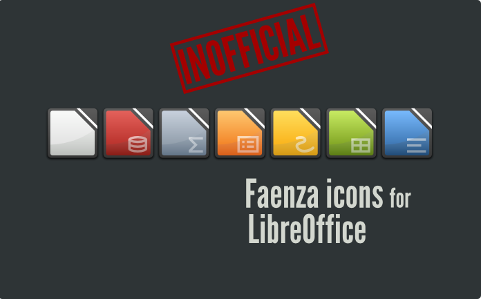
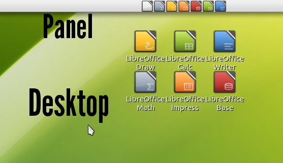
If you like both Faenza and LibreOffice, you maybe don't like to see the OpenOffice icons used on your desktop.
Install these icons and forget Oracle

includes 16px, 22px, 24px,32px, 48px, svg and an install script
////////////////////////////////////////////////////////////////
INSTALLATION INSTRUCTIONS:
////////////////////////////////////////////////////////////////
the script "install-icons" will copy the libreoffice icons into the folder
/home/your_name/.icons/Faenza/apps if you run it without root privileges [personal installation]
/usr/share/icons/Faenza/apps/ if you run it with root privileges [system installation]
1. Make shure, the Faenza icon theme is already installed in /usr/share/icons/
get it here: http://tiheum.deviantart.com/art/Faenza-Icons-173323228
2. open a terminal
3. type:
cd /[location of "install-icons" script]
example:cd /home/joe/downloads/Faenza-LibreOffice-Icons
4. type:
./install-icons [personal installation] /home/your_name/.icons/
sudo ./install-icons [system installation] /usr/share/icons/
5. enjoy your new LibreOffice icons!
////////////////////////////////////////////////////////////////
for suggestions contact me @ bertob93@gmail.com


Ratings & Comments
3 Comments
Please help me! I've just installed the latest version of faenza, and then I tried to reinstall your libreoffice icons, but it just changed my faenza icons to the gnome default icons, except for the folders icons and the panel monos... Any way to undo the script???
wtf?? No idea why or how this happened but it's unlikely the script did that... I don't think it is possible to undo the script. Maybe the best thing is to delete the Faenza icons, reinstall them and try to install the libo-icons once more. By the way V2.1 isn't the newest version, there's V3 now: http://gnome-look.org/content/show.php/LibreOffice+Faenza+Icons+%5Binofficial%5D?content=138257
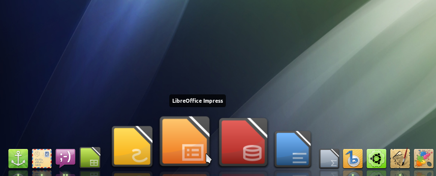
Personally, I'm not a big fan of Faenza icons. The square icon look is fine on the side of Unity, but I'd rather have normal icons everywhere else on my desktop. This set, however, looks nice and works well because it is working with the square shape instead of against it. I'll be using them to replace my Tango icons for a bit of simplicity and colour, rather than the classic OOo logo with an overlay.