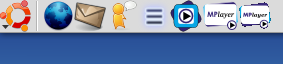
I think the Mplayer icon is hard to read and has a poor image quality...This one is more "visual"On the 2nd screenshot you can see the difference between the stock .xpm icon on the left, the same icon in svg in the middle and mine.


Ratings & Comments
5 Comments
Very sharp, nice and clean. This should be Mplayers new icon.
Would be cool to have this icon in scalable(48x48 svg), 32x32, 22x22 and 16x16. Have these around?
I uploaded what you asked for.
great work dude!! very nice you came out with this... the normal mplayer icon kind of sucks, this is way better, why don't you talk with the developers to make yours the default??? cheers.
Thanks dude! Any comments to improve it?!