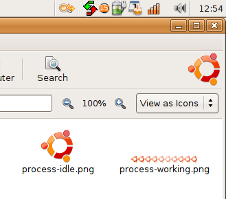
This looks great, but the icon is a little bit too big (in contrast with the much smaller nautilus button icons next to it)). It almost touches the borders of the bar. Can it be shrunk down, just a little bit?
Would you consider making one of these for LinuxMint?
I had never even noticed that the foot was animated until I saw this. Using a logo in place of the foot is awesome!
Very nice detail!
I'm not a linux mint user....
but I was looking for an useful icon and it was imposible find a nice one...
I'n not sure, but I think that the round one is the old version, so, it will be stupid work with it....
The new one is not so simetric like the round one. I can try to make it spin, but the result will not pay the pain.
If you got a good idea about how to handle the animation and it's inside my pour skills I could try to make it.


Ratings & Comments
7 Comments
This looks great, but the icon is a little bit too big (in contrast with the much smaller nautilus button icons next to it)). It almost touches the borders of the bar. Can it be shrunk down, just a little bit?
How do I remove this if I dont want this
copy back the old files. if you didn't make a backup you have to re-install nautilus
what is the command to reinstall nautilus
Reinstall gnome-icon-theme with Synaptic.
Would you consider making one of these for LinuxMint? I had never even noticed that the foot was animated until I saw this. Using a logo in place of the foot is awesome! Very nice detail!
I'm not a linux mint user.... but I was looking for an useful icon and it was imposible find a nice one... I'n not sure, but I think that the round one is the old version, so, it will be stupid work with it.... The new one is not so simetric like the round one. I can try to make it spin, but the result will not pay the pain. If you got a good idea about how to handle the animation and it's inside my pour skills I could try to make it.