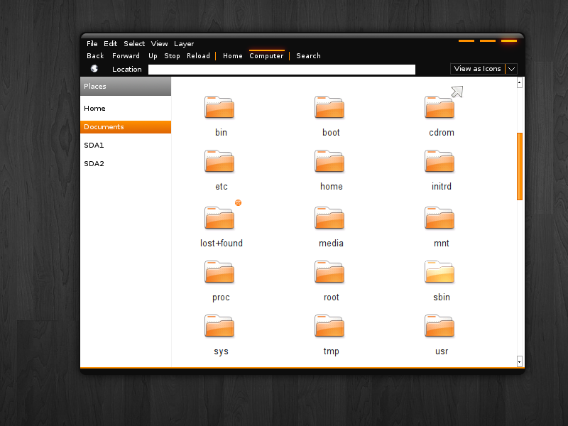
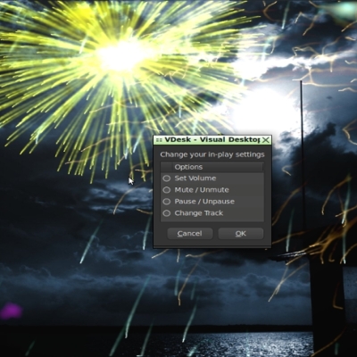
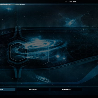
Description: just a concept for the next ubuntu release that i came up with. its just a concept at this stage so there are likely obvious flaws. vote up if you like it and leave a comment
You should see the other guys making concepts for next Ubuntu theme, for example check this: http://raraken.deviantart.com/art/Ubuntu-Theme-Concept-v0-3-73791834
This one does not look too bad. I personally don't like dark, it's not good for long-time usage. The icons could be more modern.
I wonnder if they really will merge the titlebars and the window menus, it looks nice and spares space, but is it possible with gtk?
For now absolutley not.
But if it ever happens, probably it can only work with metacity or anything wrote to do things like that. Because for this, it's need to integrate gtk with the window manager. And it's theme too.
In Russia we say:
"????, ??????? ?? ??????? ????", it sounds like "Uzhas, letyaschiy na krilyah nochi" and means "The horror, is flying on the wings of night".
Why all the ubuntu themes looks so tasteless? I suppose it is because of lack of colors, and using only orange and white (orange and black in this case), whereas there are so much beatiful colors, and the properly usage of the whole palette can make things much better.
While this theme might be appropriate for a few individuals, it lacks mass appeal. I can speak for many people when I say that Ubuntu needs to ditch the garish oranges, browns, blacks and other "earthy" color schemes for awhile. They've been using such themes since the very beginning and it's starting to get real old. Instead of a group of devs sitting around asking each other what they like (or even asking the community) they should take a look at usability studies conducted over the years that indicate people's preferences for certain color schemes and then design something for Hardy accordingly. I would like to see something much more refreshing (and more professional) for the upcoming release.
Personally, I would not like a Hardy theme that is this dark. Dark themes are not easy on the eyes. Also, it's a bit too "special" for people in general to stick with it.
But, for a standalone theme, it's very nice! :)


Ratings & Comments
10 Comments
You should see the other guys making concepts for next Ubuntu theme, for example check this: http://raraken.deviantart.com/art/Ubuntu-Theme-Concept-v0-3-73791834
I like the black and orange.
This one does not look too bad. I personally don't like dark, it's not good for long-time usage. The icons could be more modern. I wonnder if they really will merge the titlebars and the window menus, it looks nice and spares space, but is it possible with gtk?
For now absolutley not. But if it ever happens, probably it can only work with metacity or anything wrote to do things like that. Because for this, it's need to integrate gtk with the window manager. And it's theme too.
In Russia we say: "????, ??????? ?? ??????? ????", it sounds like "Uzhas, letyaschiy na krilyah nochi" and means "The horror, is flying on the wings of night". Why all the ubuntu themes looks so tasteless? I suppose it is because of lack of colors, and using only orange and white (orange and black in this case), whereas there are so much beatiful colors, and the properly usage of the whole palette can make things much better.
In Russia we say: "????, ??????? ?? ??????? ????", it sounds like "Uzhas, letyaschiy na krilyah nochi" and means "The horror, is flying on the wings of night". Why all the ubuntu themes looks so tasteless? I suppose it is because of lack of colors, and using only orange and white (orange and black in this case), whereas there are so much beatiful colors, and the properly usage of the whole palette can make things much better.
While this theme might be appropriate for a few individuals, it lacks mass appeal. I can speak for many people when I say that Ubuntu needs to ditch the garish oranges, browns, blacks and other "earthy" color schemes for awhile. They've been using such themes since the very beginning and it's starting to get real old. Instead of a group of devs sitting around asking each other what they like (or even asking the community) they should take a look at usability studies conducted over the years that indicate people's preferences for certain color schemes and then design something for Hardy accordingly. I would like to see something much more refreshing (and more professional) for the upcoming release.
Sweeeeeeeet! I, personally, like dark themes, and this one is great!
Good!! :)
Personally, I would not like a Hardy theme that is this dark. Dark themes are not easy on the eyes. Also, it's a bit too "special" for people in general to stick with it. But, for a standalone theme, it's very nice! :)