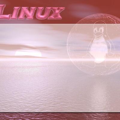
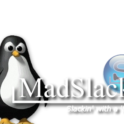
Description: This is a little modification I made to a Conectiva Linux splash screen I got off of kde-look.org. I took out the distro title and added the flare. Hope you like it!
Update: If anyone from Conectiva does not like me or anyone else removing their title from these images, please notify me and others so we may stop. I don't want to use another's work when they would prefer I didn't. I had originally made this for myself, but decided to submit it when I saw the Gimp splash screen submitted.
Good image overall. The flare adds a nice effect, but this image looks a little less sharp than the original in places. In the future it might be helpful to use a higher compression ratio, especially on splash screens.
Also, if you're concerned about any possible issues with Conectiva, why not just leave the logo on? Most anyone who downloads the splash would be able to remove it themself if they wanted, and Conective still gets credit for their work.
I like it. But there's one little thing: when all's loaded, except the last part (and then the percentage thingy comes in), the black line at the bottom disappears... How come?
Anyone know what Conectiva thinks of all of this? I mean, we've seen their Gimp splash screen lose their logo. And now their KDE splash screen... And the Crystal Icons are being included everywhere.
Granted, impersonation is the highest form of flattery. But I'm curious their take on the whole "branding" situation.
I'm not pointing any fingers (personally, I love the Gimp splash, and the KDE splash -- but I don't run Conectiva either). I'm just curious about their views on all of this.
If I'm not mistaken, GPL says that you can rework and redistribute the code -- just as long as you keep credit where credit is due.
The Conectiva folks created this... and some might see the removal of their logo as removing their part of the credit. Much like fixing a bug in the Kernel and removing Linus's name from it.


Ratings & Comments
7 Comments
Good image overall. The flare adds a nice effect, but this image looks a little less sharp than the original in places. In the future it might be helpful to use a higher compression ratio, especially on splash screens. Also, if you're concerned about any possible issues with Conectiva, why not just leave the logo on? Most anyone who downloads the splash would be able to remove it themself if they wanted, and Conective still gets credit for their work.
I like it. But there's one little thing: when all's loaded, except the last part (and then the percentage thingy comes in), the black line at the bottom disappears... How come?
Honestly, I can't tell you - except for splash_top.png all the other pictures have been unaltered, so I can only guess the original does that as well
Anyone know what Conectiva thinks of all of this? I mean, we've seen their Gimp splash screen lose their logo. And now their KDE splash screen... And the Crystal Icons are being included everywhere. Granted, impersonation is the highest form of flattery. But I'm curious their take on the whole "branding" situation. I'm not pointing any fingers (personally, I love the Gimp splash, and the KDE splash -- but I don't run Conectiva either). I'm just curious about their views on all of this.
Isn't the stuff GPL'ed?
If I'm not mistaken, GPL says that you can rework and redistribute the code -- just as long as you keep credit where credit is due. The Conectiva folks created this... and some might see the removal of their logo as removing their part of the credit. Much like fixing a bug in the Kernel and removing Linus's name from it.
..that Conectiva has been releasing is under the GPL. So free to use..free to modify. :)