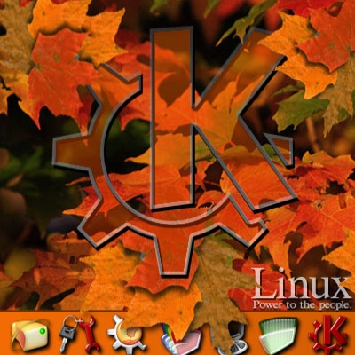
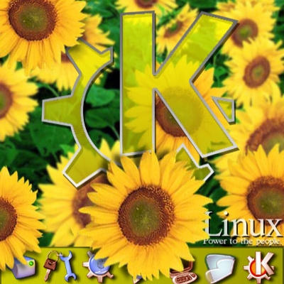
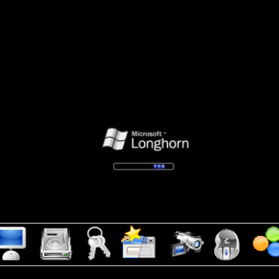
I think the idea is great, but the font style could be less coca-cola like, and without such striking colors, if you ask me. The "KDE" looks a bit like something pastet over the other stuff without really belonging there. More consistency in look would greatly improve this concept, like using less saturated colors and "simpler" font styles like verdana or something like that IMHO. But anyway, a great idea and a good start. Thumbs up.
Yep, your right about a lot of that. All in all it was just an experiment. I wanted to 1) bring the text/image down into the bottom bar, to 'blur the lines' between the top and bottom, and 2) try a transparent background & a semi transpart image. It seems to work well.
I'll prob revamp this soon to something more pretty. :)


Ratings & Comments
2 Comments
I think the idea is great, but the font style could be less coca-cola like, and without such striking colors, if you ask me. The "KDE" looks a bit like something pastet over the other stuff without really belonging there. More consistency in look would greatly improve this concept, like using less saturated colors and "simpler" font styles like verdana or something like that IMHO. But anyway, a great idea and a good start. Thumbs up.
Yep, your right about a lot of that. All in all it was just an experiment. I wanted to 1) bring the text/image down into the bottom bar, to 'blur the lines' between the top and bottom, and 2) try a transparent background & a semi transpart image. It seems to work well. I'll prob revamp this soon to something more pretty. :)