


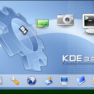
KDE 3.3 K Way Splash-screen
arcisz


Source (link to git-repo or to original if based on someone elses unmodified work):
04/29/2004
- Added CD Cover and Label
- Erased KDE Text.
- Added KDE Integration text at bottom of the "OpenOffice.org".
- Erased stock around the "OpenOffice" text.


More KDE 3.x Splash Screens from arcisz:
Other KDE 3.x Splash Screens:


Ratings & Comments
17 Comments
I'm working on some icons for OOo myself, but I can't seem to get the birds looking 'authentic' Did you create the birds from scratch, or is there some spec somewhere? I am using paths in the gimp at the moemnt - they're close but not quite right. Any advice much appreciated
I would like to know how install it to OOO... it's really beautiful. I use ooo with KDE icons and this splashscreen would be wonderfull with them. :) Thanx, keep up good work :)
I think this will just be the splash screen for the OO.org KDE Integration project. I'm not sure you can install it yourself (unless you change the files in the source?) Or maybe you can find where those files end up and just replace them (back up first!)
How can I install the splash into openoffice? thx
You can download it from here http://download.kde.org/download.php?url=packages/ooffice/
Can somebody please send me a direct link where I can download openoffice.org for kde...and if there is a gentoo ebuild please send me a link.
Looks great - would it be possible, perhaps, to provide a (very) high resolution so we can make a CD stomper and CD envelope from it?
Here you go: http://arcisz.one.pl/openoffice.png http://arcisz.one.pl/openoffice_notext.png Both in 2048x1396 resolution.
I see that you are interested in CD Cover that's why i created one for you. Enjoy!
Thanks so much - I'll see what I can come up with!
This is really cool. Can you post the path to copy them to.
I hava no idea where you have to copy this. I made this because OpenOffice.org KDE needs the splash :).
Good idea to remove the huge "KDE" and instead use a the small "KDE integration" - much better now :)
I agree, much better; thank you! I have one more request... Could you please provide a version with dark outline around the text (instead of the current white) not to interfere with the seagulls? What do you think?
It's really good, however, the writing does not look very well anti-aliased. Also, I don't think that the "KDE" is neccessary on the end, I believe that the gear around the "O" is enough...
I agree, the KDE at the end is unnecessary - otherwise it's an excellent splash screen! :)
Thank you for the pictures! I vote for removing "KDE" as well. Or maybe you could add a small note like "KDE edition" somewhere instead of it?