


Linux_CAT
chrismose


Source (link to git-repo or to original if based on someone elses unmodified work):
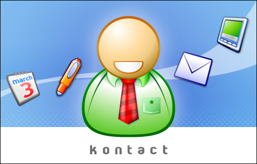
r3:
1. Removed disturbing elements to make it look cleaner.
2. Added 1px border
rc2
I've followed some suggestion I've read in the comments:
1. 20px taller and moved
2. "kontact" to the bottom, removed "kde" and "kde logo".
3. added a smile to the face.


Other KDE 3.x Splash Screens:
Ratings & Comments
12 Comments
Dave, Let me start stating that I love your work and I use your icons in my desktop. That said, an app icon based splash could use the default (crystal) icons. However, the default icons in Kontact do not fit well one another (yours look much better). The crystal Todo, KNotes and News icons do not fit with their crystal conterparts. Is there something you can do about it? (Like offering replacements that fit better the crystal defaults for these icons? Cheers, Carlos Woelz
answering to you by email, since I was about to go OT
Very nice, great color, and great icons. I think it can win.
I think it perfectly fits the Noia-icon theme. : )
uhm, no! it perfectly fits Nuvola icons. 26 april, Nuvola 1beta will be released.
I'd suggest: - removing the kde, the klogo, and the 3.2.. - making it about twenty pixels taller - putting the kontact text under everything in the white area.. and centered
Yes... you're absolutely right.
There is only thing that looks (IMHO) a litlle bit irritating - the big empty head. Other than that it conveys the idea of a PIM Suite very well, and it looks nice.
umh, maybe your right, I'll think what to put on the face, maybe just a smile and little eyes, let me see ...
lol, put a 'post it note' on his head!!! only joking But I am unsure why a lot of themes lately have those kinda faceless men. I think I've missed the point somewhere along the way. I am a terrible designer, but I thought about having a super imposed almost transparent calendar in the background which might look good with the other stuff you got there.. No idea if that makes sense to you.
Don't do nothing with face. Do something what will look like hair. :)
I agree that a smile and eyes would be great. But you'll figure out what will be the best. After all you're the icon king :) keep up your great work