


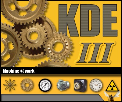
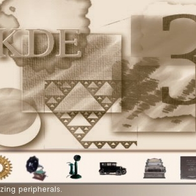
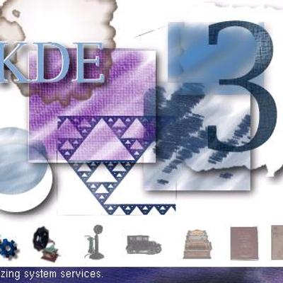
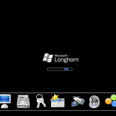
Old Time Splash Screen
joelsonoda


Source (link to git-repo or to original if based on someone elses unmodified work):
The 1st of April, Year of out Lord 2002
--I took out the black line because I didn't like it.
--Changed the text on the splash
The 30th of March, Year of our Lord 2002
Well, my changelog was erased somewhere along the way, so I'll just try it again
--Took a shower
--Fixed the positioning problem of icon 6 that made bleed out of it's alloted space
--did what I consider to be a real improvement to the bottom bar
--Had a drink of water
--Fixed misspelled word in description
--wrote changelog


More KDE 3.x Splash Screens from joelsonoda:
Other KDE 3.x Splash Screens:


Ratings & Comments
6 Comments
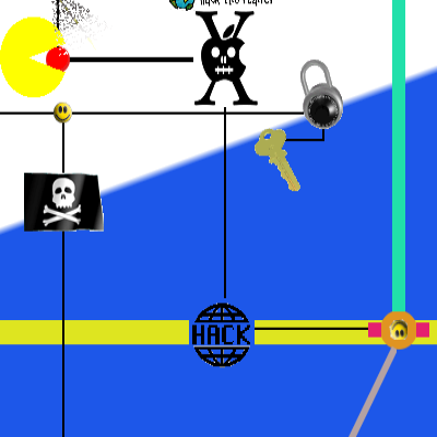
not bad icons are great
... somewhere! i mean the picture of cog-wheels used as a main motive... is it copyright-free? it's a bit much used (by the micro$hit as well) idea and they're ugly imo too. what about replacing them and leaving just the corner part of the radioactive sign? (just my opinion) ps: wow! i'm giving comments today for free ;o))
The cogs in this image have been drawn from an image made by a photographer who says that his photos are free for personal and commercial use. I could do another loud splash with just the corner of the fallout symbol, but I'll leave this one too because I like the cogs. Thanks for your input!
So, we're the creators of loud content in this little community, the ones who stray from convention and throw the standard, cautious bounds of style to the wind and with abandon venture into somewhat uncharted territory. Fun stuff!
I like this splash! It _is_ very original, especially icons.
Well, I can guarantee that you won't find these icons anywhere since they are my creations. I did use two photos, but you wouldn't recognize anything. You certainly might not like the splash screen, but if anyone is interested in using these little images for their splashes or anything else, just let me know.