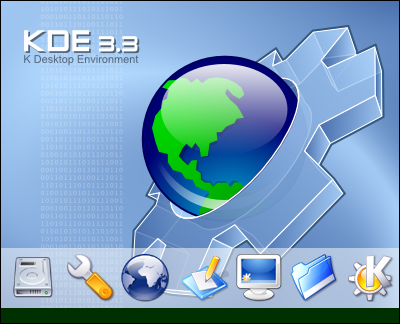
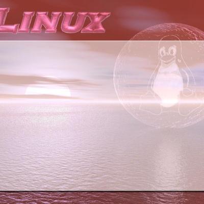
I really liked the splash screen you put together, especially the version that shipped with KDE 3.3 (with the more detailed Earth). Can you redraw the version number so it doesn't say 3.3, but 3.x, then re-release it?
Great splash screen. This is one of my 2 favorites (Metallic KDE 3.3 + 3.2 spash screen). These splash screens deserve a higher rating. I like this one so much, I'm using this even though I use KDE 3.2!
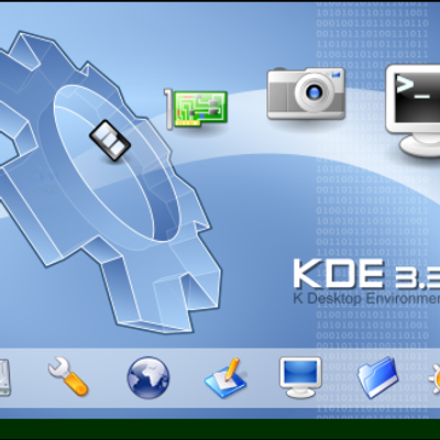
Why do you use the Crystal icons ?
There are a lot of better one's out there. Sure they were great at first, but kde 3.3 should bring something new. A new icons look is neccessary IMHO
This is great! One thing bugs me, however. The font where it says KDE 3.3 looks... well, a little too fancy, really. Too futuristic. A simple sans-serif font would do very well to bring it down to the pleasant not-in-your-face level of the rest of KDE. Other than that, this has got my vote :)
Actually, it seems you were right at first... The original font does seem to be rather futuristic. Go ahead with the old one, I stand corrected :) As mentioned by someone bellow, the other does seem to fit the feel of this splash better :) You still got my vote ;)


Ratings & Comments
15 Comments
I really liked the splash screen you put together, especially the version that shipped with KDE 3.3 (with the more detailed Earth). Can you redraw the version number so it doesn't say 3.3, but 3.x, then re-release it?
Great splash screen. This is one of my 2 favorites (Metallic KDE 3.3 + 3.2 spash screen). These splash screens deserve a higher rating. I like this one so much, I'm using this even though I use KDE 3.2!
Why do you use the Crystal icons ? There are a lot of better one's out there. Sure they were great at first, but kde 3.3 should bring something new. A new icons look is neccessary IMHO
I use Crystals because i like that style and they're default in KDE.
kde 3.3 will not have a new icon set.. kde 4.0 might.
Yes it might but this iconset should be a revolution. I don't see any iconset that can replace Crystals as default in KDE.
It's clearly the best splash screen around. It should be made the KDE 3.3 default splash screen, it is much better than the boring standard one.
I like it but can you make the planet smaller so we avoid the overlap?
But that was my intention. That is why iconbar is transparented.
This is great! One thing bugs me, however. The font where it says KDE 3.3 looks... well, a little too fancy, really. Too futuristic. A simple sans-serif font would do very well to bring it down to the pleasant not-in-your-face level of the rest of KDE. Other than that, this has got my vote :)
How about now ?? I tried it to be similar to the font in default KDE 3.2 Splash.
Actually, it seems you were right at first... The original font does seem to be rather futuristic. Go ahead with the old one, I stand corrected :) As mentioned by someone bellow, the other does seem to fit the feel of this splash better :) You still got my vote ;)
My opinion: I am glad that I managed to download first version with fancy font :o) I do not like the new font. Awesome splash,using it right now.
I liked it too but it doesn't corporate with the style of the KDE :/
Best yet. Rocks.