


http://www.kde-look.org/content/show.php?content=38948
But to me it is a little too blurred in the eyes and at the edges and too rough in color gradient to look good with the precision-cut nuoveXT icons I currently use. Also it seems to be a little cut at the bottom of its mouth. So I started up gimp and tried to sharpen the edges, smoothen the colors and modify the mouth.
I made some slightly different versions, maybe some of you like one of it too

Included is a script to build the icon sizes 16,22,32,48,64,72,96 out of the 128x128 icon.


Ratings & Comments
5 Comments
WOw You have made my little GIMPY as cute as he needed to be. My eyes blurred with tears of joy. thanks p.s. Now we need a big eyed tux too.
*blush* I was hoping you like it :) > p.s. Now we need a big eyed tux too. Any ideas? Hmm - maybe I could.... let me think - just a moment please.... Very quick'n'dirty but: GIMPY in disguise ;) http://img454.imageshack.us/my.php?image=tuxtest28kw.png
http://img172.imageshack.us/my.php?image=tuxtest3fish4dv.png
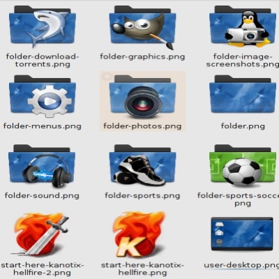
this could go on I'm sure...i.e. SUSE etc. I by the way have Kanotix running on 2 machines at my home....wonderful distro. but ugly out of the box I must say. I use PCLINUX on the 2 laptops.
ooooh naughty wonderful!!