

Korporate
asifalirizwaan


Source (link to git-repo or to original if based on someone elses unmodified work):
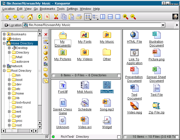
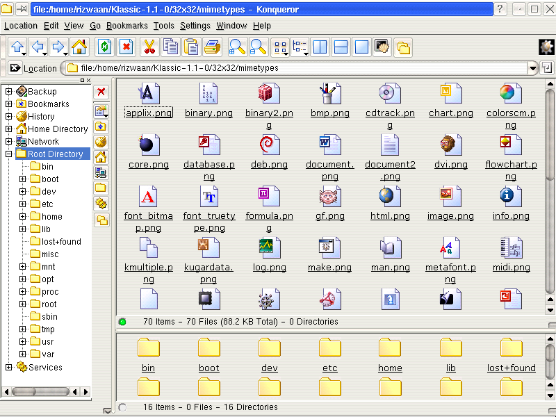
1.1.0-devel2- Added Blue toolbar icons... and 2 Icon themes are placed in one tar.gz file.


More Icon Sub-Sets from asifalirizwaan:
Other Icon Sub-Sets:


Ratings & Comments
22 Comments
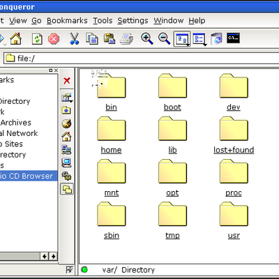
good work, but the icons look too simmilar to windows, especially the media file-icons are too obvious that they are from windows.
I pretty much like this theme but the yellow colour hurts my eyes, to my taste it's to bright, but i don't mind the m$windowish look, nice one
Nice icon theme, but may I suggest that you make the navigation icons, etc, a bit drabbier? Giving them a bright color like that can be distracting. Perhaps a grayish-tan would be better?
I really think this icon theme is great! And I'm waiting for more icons (for the programs like kwrite, etc). Nice work, thanks!
I like the blue color of your mime-types icons very much, ok folders are from windows, but icons are clean and nice. I have some suggestions for toolbaricons: 1. Look at filepaste toolbar icon - it is very nice because you combine yellow and blue. Same with fileprint icon. 2. You should maybe do the same with the rest of toolbar icons. For example: fill gohome icon with blue (like other icons) and keep yellow on the roof (maybe also door). Reload and stop button have to be like filecopy (blue with green reload and red stop). For viewmag+ and viewmag- try to make lens blue and handle yellow. I am not sure about up, back and forward, if you add blue section to other icons they are maybe not going to look too yellow :) Best regards, antialias
your suggestions Antialias, Actually I got inspired by your Technical-1 icon theme. Thanks for your good advice, I will try it :)
Hmm, looks a lot like "another OS." (laugh to self) Seriously, the icons look very sharp. You have a knack for the understated look, something which is wanting in a lot of computer designs in general (take a look at XP for example. Does the desktop remind me of the acid-powered commercials? Yes, yes it does. :) The arrow icons etc. do seem a mite reddish, but I think you can work with that. I'm not sure how at this point, but I think they can be fixed rather than discarded.
Hmm, looks a lot like "another OS." (laugh to self) Seriously, the icons look very sharp. You have a knack for the understated look, something which is wanting in a lot of computer designs in general (take a look at XP for example. Does the desktop remind me of the acid-powered commercials? Yes, yes it does. :) The arrow icons etc. do seem a mite reddish, but I think you can work with that. I'm not sure how at this point, but I think they can be fixed rather than discarded.
The navigation arrows are nice in an intrinsic sense, but when combined with the other icons on the toolbar, there's a bit too much yellow on the left.
I like the arrows. Please don't replace them. :)
at 800x600 resolution, the arrows looks very nice. if you use 1024x768+ resolution, you find it difficult to see the arrows. And this this was created at 800x600 resolution. If you have better Arrow to contribute please mail/attach me.
looks nice :) -fault
If you dont like the up/down/left/etc/etc arrows just open the tgz and delete them all, then install it and it reverts to the default icon them (the blue ones) which look good.
Nice icons, but the up,next,back arrows are too colorful and u use too much red and yellow on the toolbar icons, try replacing the red with another color and put a differnet shade of yellow.
I like them. Looks like Windows icons on steroids.
No sir, I don't like it. It's smooth and all, which I can appreciate, but I just don't like the icons. Sorry.
ya, you are a prick. nice icons man.
In my personal opinion I don't like soo much this icons (don't understand wrong you made a nice job only the theme is bad :) ... but are very good for users who work very much with Redmond OS
smooth icons, look great with anti aliasing. The only ones I dont like are the back/forward/up/arrows. I think they are a bit too vibrant possibly.
Looks excellent except the back/up/forward icons.
Nice theme, but browserbuttons are too golden compared to the other nice Icons.
will be a lot of complaining about the fact that it looks like "another OS". -- Well I like this icon theme ... and use it to show to people that there is more to Linux then simple look-n-feel of the desktop. Thanx for such a great icon-theme. --- Fab