


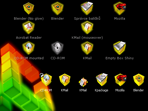
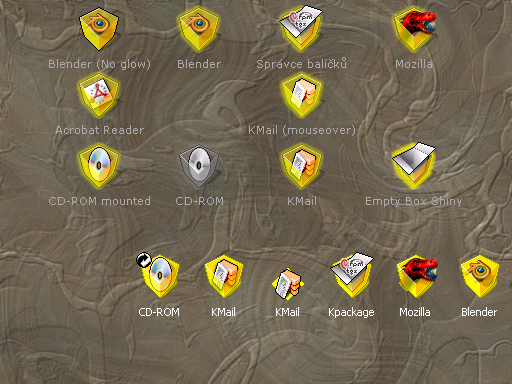

This is preview release of semitransparent icons I'm working on. As you could realize, the main concept goes together with Kubical wallpaper, but you can use them with every background color, tile or wall... (I've tested it for you)
Enjoy and comments are welcome!


Ratings & Comments
18 Comments
nice and innovative work!
i think it looks good, but i would prefer blue, not yellow, for the normal icons. anyway, it looks very good!
this work is very beatiful!!!
this work is very beatifullll!!..;PP..byez
It's great! Very innovative! When I come home I'll first download these icons and I'm sure they'll fit great on my desktop. I agree that they fit well on every scheme. Just imagine suse/mandrake/redhat style with this - it's perfect!
Nice idea, I haven't downloaded them yet, 'couse I am on a public computer, but they look diffeent and nice.
Nice to see stuff that does not emulate something else (as far as i know :-) and then its good too. Keep it up.
I like your other Kubical KDE stuff, and these icons are great too. I agree with the other poster who mentioned smaller icons - I do use 48x48 with the iKons theme because it's just _that good_, but a choice of small icons would be good too. :)
mmmh, these boxes look nice. Don't know if they fit my current desktop but maybe I have to make the desktop fit my icons then ;) Too bad it's just 48x48 icons because I don't use them. IMO anything bigger than 32x32 is just too HUGE. I'll have a look again if there are smaller ones available :)
i'm working on it. i have found just one dilema: should i cooke them (32x32) that way as you can find them (the two icons for kmail and blender) in my preview pack? or should i cooke them as an "shrinked" version of 48x48? i've tried it, but the result was, that the icon inside the cube was in my eyes too small to recognize what should it represent
Not sure about the yellow. I'd prefer another colour (maybe blue or green). But the concept is excellent. Keep up the good work.
my colors concept goes as follows: gray (silver) - unmounted systems, disabled stuff yellow - common applications and stuff orange - mime types red - superuser, admin (root) icons, locked (private) stuff green - filesystem stuff (suggestions welcome) unfortunatelly blue doesn't match with my color scheme... maybe sometime in the future
I think they all lokk very good, but one thing bothers me. To have the icons yellow makes it hard for my eyes ontop of wight. It's too sharp and bright, yellow is (IMHO) the worst color of'em all, it doesn't fit with anya other color (except sharp yellow and sharp red.) Just my ?0.01
... cause it just fit well with my desktop and looks good. yes, i was thinking about other colors too and about how they goes together between and together with the background. i've found the solution in the semi-transparency, i believe. thanks to the transparency it goes perfectly with every color and every background i've tried (and if not, choose other one ;) even they are not "compatible" with yellow (yes, i've studied it ;). tell me which color do you want for "common applications and stuff" and i can think about it. you can choose from the next Kubical colors: yellow, orange, red (i don't recommend this) and green.
In my untrained opinion, perhaps yellow is not the most practical of colors, but that in no way means that we shouldn't use it. Also, black goes with yellow! Those are two of the most commonly combined colors. Just look at all of the US school busses (c.f. police "caution" tape). I'd say, "Stick with yellow. Be loud. Be different."
Empty??
just try it again please... it is 77KB only. (unpack it to your kde icons directory)
I installed it correctly - the only icon I see different than the defaults is the Kmail icon.