


Nuvola
dave


Source (link to git-repo or to original if based on someone elses unmodified work):
11 new icons
Total icons added and changed : 96
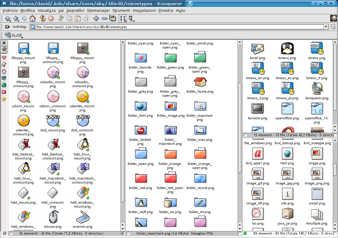
_FILESYSTEM
added file_temporary.png (32x32)
changed desktop.png (32x32,48x4
changed folder_home.png (32x32)
changed folder*.png (32x32,48x4 [62]
changed lockoverlay.png (32x32,48x4
_MIMETYPE
added colorscm.png (16x16,32x32,48x4
added log.png (16x16,32x32,48x4
added mime_ascii.png (16x16,32x32,48x4
added postscript.png (16x16,32x32,48x4
added source_moc.png (32x32,48x4
changed info.png (16x16,32x32,48x4
_ACTIONS
added fileprint.png (16x16,22x22)
added frameprint.png (16x16,22x22)
_APPS
added konqueror.png (16x16,32x32,48x4
added opera.png (16x16,32x32,48x4
changed kmail.png(16x16,32x32,48x48,64x64)


More Icon Sub-Sets from dave:
Other Icon Sub-Sets:


Ratings & Comments
74 Comments
These ones are between my favorites. The thing I like most is it's readability in konqueror. In this respect, these ones are by far the best! Thank you very much!!
I know you're doing this in your free time but it would be really nice if you could add some 64x64 icons. 48x48 was fine for me before I got a bigger monitor but now it's just too small for me. The icons are very nice, just wish they were bigger. Ever thought of using Kontour?
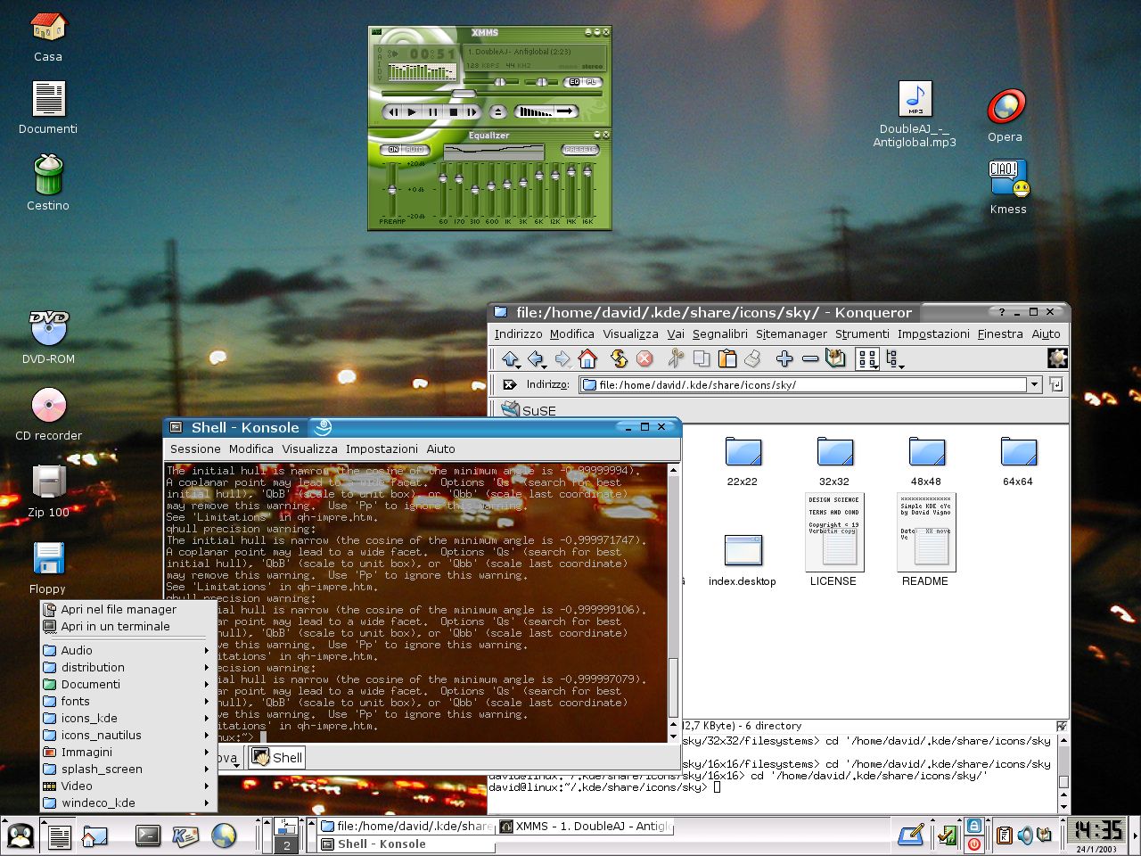
Ciao!! Lo skin che usi con XMMS
The icon for DVI files is almost equal to the one for TeX files. That's bad. The result from the compilation (DVI) should stand out from the source files (TeX) otherwise it is really hard to locate by looking at the icons. Also the look should be somehow close to the one from PS and PDF files. Take a look at the Hi-Color or Crystal icon sets. Keep up the great work ;) J.A.
I just tried your icons and I like them very much. Tip: They look even better with a flat toolbar. :)
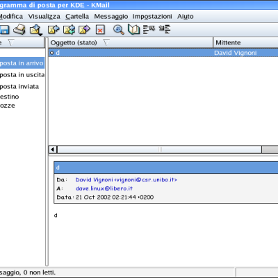
the new kmail is very nice :-) but could u please make icons for kcontrol - khelpcenter - konqueror to make the default kicker looks sky :-)) i notice that home icon in kicker is smaller than other icons keep the great work :)
I've noticied the home 32px problem. On my PC I've now solved it creating a new 32x32 home_folder, more classic (floder+little home on lower-left corner).
I'm already working on it and will be included with 0.7.3
I think this is the most usable icon theme for kde so far, pretty and functional at the same time. Olav P.S. I didn't like the new kmail icon very much (perhaps because of my colour scheme) and I lifted the wonderful yellow folders from your "Desktop Icons" as usual but that's just me :):). Olav
I'm getting more eyecandy for KDE than I can handle! It's great that we now have a wide selection of good icon themes to choose from! :D -- Regards, Helmers
Your Iconset is really beautiful, I like it. Keep your good work going! By the way, where can I get the nice background image? I saw it several times, is it from SUSE or RedHat? Can you post it here or just send it to me?
the wallpaper is from RH8, I love it. I'll send to you
I believe i made two sets of extensions for MS mimetypes. One for crystal, and one for sky. Check em out
Hi! This set should be included in kde 3.1! It's very good! But we need a new kmenu icon, because, not all kde users use linux :-). And the konsole icon looks like a gnome terminal icon, right? Basically, it's like a rip:-) OOo icon is fantastic, but we need better icons for konqueror, xmms, noatun ... I think you should modify some icons form a set called iKons, because SKY and iKons are pretty compatible.
I love the jimmac's gnome icons, and I often look to his icons to get inspiration. The konsole icon and the one of gnome-terminal are similar but I haven't ripped anything, maybe you could say I've made a "reverse engenering" of it. you can compare them to see that aren't the same and probably weren't created in the same way. Mimes, Devices and Filesystem are almost completed, I've just to make a full 32px and 16px conversion... so the next step is to have fully working ACTIONS and APPS.
I don't know who I've to ask for the inclusion of SKY icons.
Yo, what window decoration is that???
The window decoration comes is from SuSE 8.1
Amazing quality, and design speed for that matter. Pretty and functional at the same time, i.e. not "overdesigned" as most icon themes. I will not download another icon theme again (except for your updates of course). Olav
like i said before, i like your sky icons a lot.....just 3 buts: 1. i would like a new bookmarks folder icon, so my bookmark toolbar in konq. looks better; 2. i'm not to font of your home icons in konq....it doesnt fit in... 3.where is the nice k menu icon??? I dont like the penquin face, i really liked your k icon......can we have it back please. Keep up this great work...we are waiting for your next release ;) greetz, deech
I know bookmark is ugly, I've forgotten to work on them. Probably I'll use a "heart" as bookmark. I've removed the gohome in konqueror 'cause I wasn't satisfied of the old one, this will be a priority for the next release. kmenu: I've removed the "K"menu 'cause I really don't like it, I've put the penguing again 'cause for now is the one I prefer, but I'm thinking on a better Kmenu icon.
As of now the most consistent and usable iconset must be your SKY icons. I really like them for several reasons : - Clean - Bordered (adds to cleanliness) - Pretty Crystal and such are nice icons, they look flashy, but are not really that usable for the main purpose an icon has. Recognition of what it is representing. Kudos for your work, and please do continue ! Someone in the KDE development team should take notice of these icons soon, and include the set in KDE.
Please keep on producing such nice icons Dave ! Crystal Icons look good - but your icons are neither mac style or XP style. It makes really a lot of fun to click them !!!!! My favourites are the arrows in Konqueror. If they only were in 32x32. But anyway very good job :)
I don't know why but the second screenshot doesn't display the image I've uploaded. I've tryed 2 times but nothing
Dave. Keep this icon set clean and simple and consistent as it is now. Cheers, antialias