Description: Desktop icons is an eyecandy cartoonish style icon theme for KDE.
This iconset has been the starting point for the SKY icon theme. Now, this new release is based on the SKY icons, in facts the only difference are folder and trashcan icons.Last changelog:
I think you've done a good job. Looking at the preview (I haven't installed them), I think there are two icons that don't quite fit, that's the home icon and the exec icon. I'm not creative so I have no ideas to offer, just seems they are a little different in style to the rest.
Nice and neat and easy to use, very good.
I think the home icon is excellent, In my opinion it should "stick out" just a little bit and this one still blends in nicely with the folder icons - also folders with other colours than yellow.
I do somewhat agree about the exec icon though, I get the feeling that it is too "heavy"?
Still, I don't think I will look for kde icons anywhere else for quite some time :)
Olav
Go on, man. Fantastic icons. I really like the cartoonish design. I always liked gnome default icons and these are even better. Keep up the great work and make also action and toolbar icons (so: no more desktop icons;-).
: some artist are together working on a completely new icon theme. But I'm not sure this is true. I haven't seen any screenshots yet.
the community icon project. You r icons ar beautiful. VEry well balanced not flashy like Crystal, but soft on the eyes and fairly smooth. ME thinks this should be default KDE icon theme. what do u think all?
Sono nato e vivo in italia, ma sono 50% italiano e 50% brasiliano. Comunque si, sono italiano.
translation:
I'm born and living in Italy, but I'm 50% italian and 50% brazilian.
can you work a little on the folders. For the yellow folder for example can you make the lock red. A yellow lock on a yellow folder is a little strange.
this is the same icon theme that was posted with only a trash icon. I really like your icons :) i think they look great and so does antiallias's trash icon. Keep up the grat work, you have a very nice original iconset on your hands... umm hardrive. Now there is Crystal, Ikons, Free Icons, Slick , Hicolor, Marbles, Desktop Ions, there are a bunch of completely different original icons. Thank you linux community.
Just one suggestion: I know your icons have a very elegant classic style but could you also make 2 windows hardrives with an XP logo?
The folders look slightly warped. I think the left hand side is too straight and should be as curved as the right hand side. They'd look as cool as the others if you fixed this IMHO.


Ratings & Comments
64 Comments
the yellow folders remind me of Windows :(
...deserves a much better rating. :-)
Sky is my favourite icon theme although I preferred the "old" folder icons. Good news for me :) Olav
I think you've done a good job. Looking at the preview (I haven't installed them), I think there are two icons that don't quite fit, that's the home icon and the exec icon. I'm not creative so I have no ideas to offer, just seems they are a little different in style to the rest. Nice and neat and easy to use, very good.
I think the home icon is excellent, In my opinion it should "stick out" just a little bit and this one still blends in nicely with the folder icons - also folders with other colours than yellow. I do somewhat agree about the exec icon though, I get the feeling that it is too "heavy"? Still, I don't think I will look for kde icons anywhere else for quite some time :) Olav
These icons rock - nicely cartoonish and not "overloaded". Please go on with it!
Go on, man. Fantastic icons. I really like the cartoonish design. I always liked gnome default icons and these are even better. Keep up the great work and make also action and toolbar icons (so: no more desktop icons;-). : some artist are together working on a completely new icon theme. But I'm not sure this is true. I haven't seen any screenshots yet.
the community icon project. You r icons ar beautiful. VEry well balanced not flashy like Crystal, but soft on the eyes and fairly smooth. ME thinks this should be default KDE icon theme. what do u think all?
what's the "community icon project"? dave>>
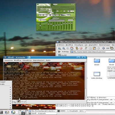
Can you tell me where I can get that font your using for the icons in screenshot 2? Very nice icons :)
this site is very beautiful and totaly user friendly. click to any link you find, in the end I'm sure u'll find the fonts page! dave>>
the site is totaly non-userfriendly
this is the right address
...ma sei italiano? ...Are you italian??
Sono nato e vivo in italia, ma sono 50% italiano e 50% brasiliano. Comunque si, sono italiano. translation: I'm born and living in Italy, but I'm 50% italian and 50% brazilian.
can you work a little on the folders. For the yellow folder for example can you make the lock red. A yellow lock on a yellow folder is a little strange.
this is the same icon theme that was posted with only a trash icon. I really like your icons :) i think they look great and so does antiallias's trash icon. Keep up the grat work, you have a very nice original iconset on your hands... umm hardrive. Now there is Crystal, Ikons, Free Icons, Slick , Hicolor, Marbles, Desktop Ions, there are a bunch of completely different original icons. Thank you linux community. Just one suggestion: I know your icons have a very elegant classic style but could you also make 2 windows hardrives with an XP logo?
Your Icons are fabulous but the folders somehow don't look right. A little more work and I'll use these as my icons.
what's exactly do you think doesn't work with folders? If you could be more detailed you'll helping me to improve the icons. thnx
The folders look slightly warped. I think the left hand side is too straight and should be as curved as the right hand side. They'd look as cool as the others if you fixed this IMHO.
sizes in mind. Because somtimes it doesn't look nice on 16x16-size Keep them coming, I'm a true fan of your icons ... Fab
other size will come! dave>>
This looks like the start of a nice QNX-ish Icon set. That combined with QNIX or RenoDesk (when they get ported) would make a nice Desktop.
The next additions will be: 1. printer 2. home 3. scanner --maybe-- 4. dvd 5. cdwriter
I love this style! However, the color of the tray icon doesn't match the ones for the CDROM and Disk drive. Very well done!