


Aero Cirkles
nuka


Source (link to git-repo or to original if based on someone elses unmodified work):
6-14-05
103 Icons+Reinhardt
Rewroked some of the old ones
6-13-05
80 Icons+Reinhardt
Created new svg font from Calibri(Kalibri? you can find it in the mimetypes folder, the file is called "template.svgz")
6-9-05
67 Icons+Reinhardt
Added Transparent border(not on all icons, yet)
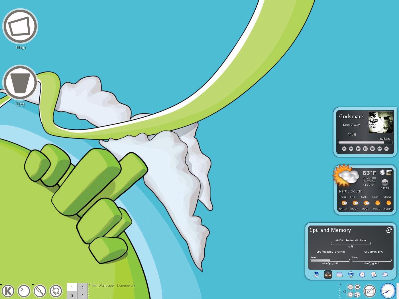
Updated SC1. Screenshots 2+3 are outdated.
6-4-05
First release!
50 Icons+Reinhardt
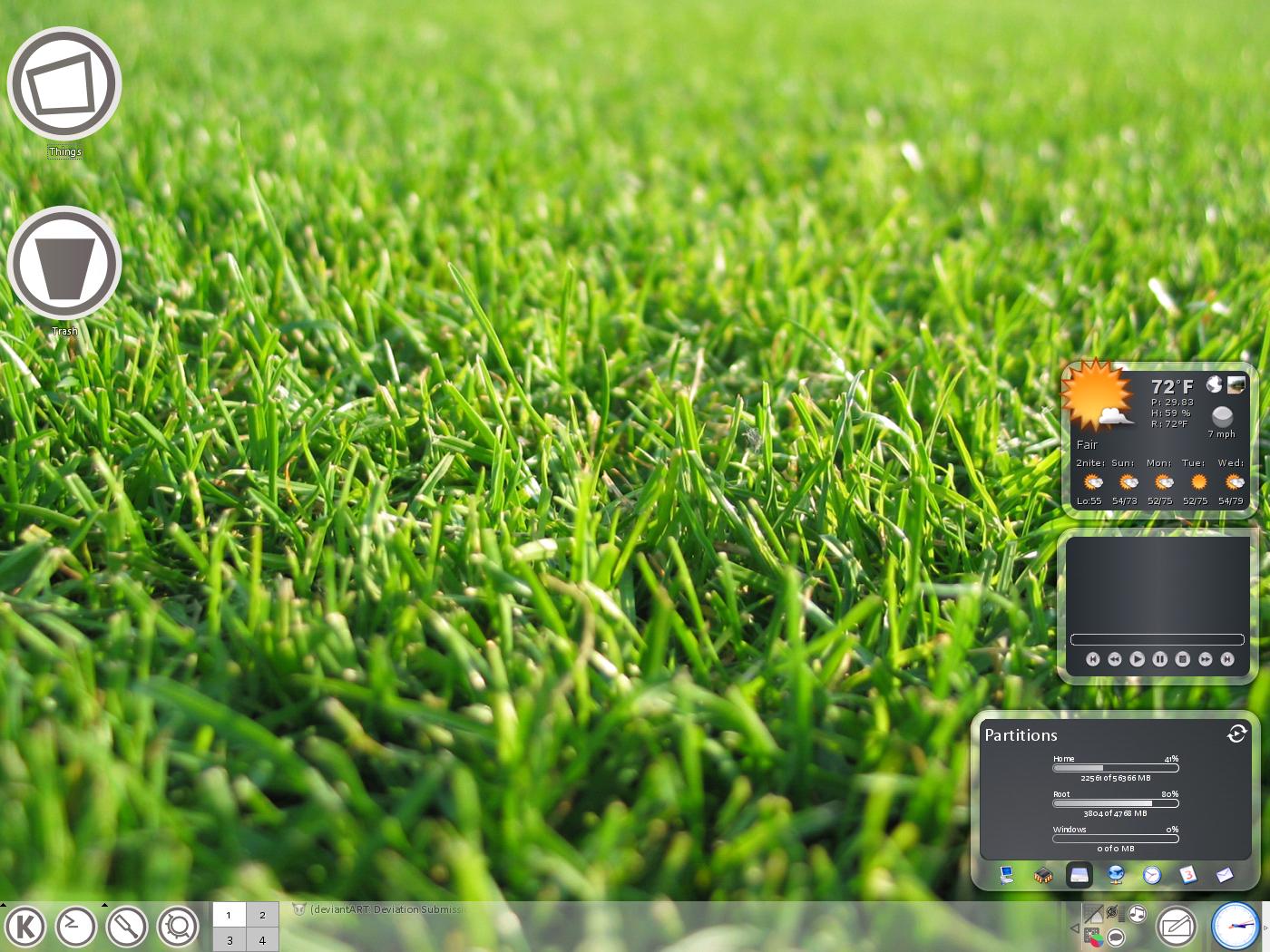
Added Third Screenshot
6-3-05
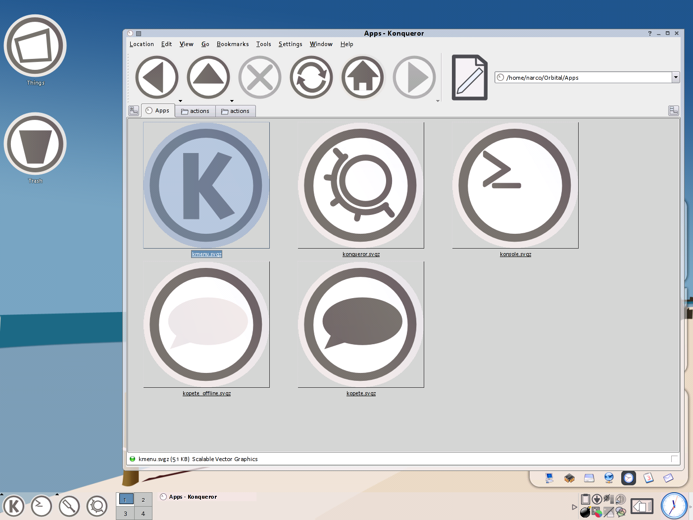
Added a bunch of new icons(See SS2)
Fixed some problems with old icons
Made a final template(download)
6-2-05
Added konsole, configure, trash, konqueror icons.


Other Icon Sub-Sets:


Ratings & Comments
20 Comments
hello! i really like your icons. I hope you can make them a bit faster in the future :-) I have one suggestion though: the file system icons are to similar. it is hard to distinguish between folders and other files. could it be helpful to fill the folder icons with a light grey? just to make browsing easier? there are maybe 100 better ways to differentiate the icons, it was just my first idea. keep up the good work, cheers
Nice work, even if you did adopt the icons from elsewhere. How ever, I find that the icons greatly (and I mean greatly) slow down Konqueror. What is almost instant with SNOWE takes many seconds - sometimes up to like, 15 seconds - to display the contents of the current directory. I have a Celeron D 2.5 Ghz, an ASUS P4P800-VM and an eVGA 6800 (agp) so I don't think it's my hardware, oh yeah, KDE 3.4. Any ideas anyone? Thanks
i know. i had a million different colors in them. im still new with inkscape, so it ended up in really unoptimized icons. im redoing a lot of them and putting them on a blank template, which takes the sizes down from 50kb to about 2 or 3. ive already redone all the major ones(above 50) now i need to redo all the ones above 20-30. by the time it reaches 1.0, all the icons should be less than 5 kb.
I can already notice a difference. These are still my favorite. Again, Great Work!
Keep the work! I have been watching this since you posted it and is growing fast. Good work and nice icons. ;)
thanks. ill have much more time in a few days to work on this cause school will be out. i hope to get around 2-300 icons done soon. i wanna finish this up cause im pretty excited to start work on the aero version. this latest release has a problem with optimization, and some of the icons are about 50-90kb. im fixing them, and i can get the exact same icon to under 2kb. this should help performance a lot. i found out this problem after konqueror started crashing when i went to my home folder.
great icons! where'd you get the wallpaper?
which one? i think the first is from pixelgirlpresents.com (i could be wrong) and the second from deviantart.com and the third from here if you want one of them, just tell me your email address and ill email it to you.
Great, i use it .............. :-)
How do you make your panel do that?
do what?
Have it be transparent, including the buttons.
you can make it transparent by rightclicking it and going to confgiure panel. the options are there on the appearance page. to get the tasks transparent, use taskbar v2 http://www.kde-look.org/content/show.php?content=16261
I find this set just as aesthetic as the crystal set. Very nicely done.
thanks, but i cant take all the credit. some of the images were adapted from the reinhardt set and the whole theme was based on this set here by hermik. http://www.customize.org/details/26969. and now that ive looked into it, it seems that the original orbital set was influenced by some guy named sticboy. the reason i decided to redo the whole set was because he didnt have nearly enough icons, and they were only 64x64.
When will you be done? I can't wait to give these a go? :)
im really not sure. a full set needs about 1300 icons, i have about 30 so far. once i reach maybe 50 or 60 icons, i will release it as a mod of Reinhardt. they arent exactly the same style, but it fits much better than crystal.
Could you send me a copy of what you've done so far, I'd just like to test them out. You can send them to my email address if you like. Keep up the excellent work! Pascal
click download ;)
Cool. It's a simple and clean icon theme.