


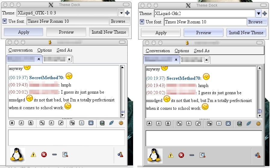

You'll notice there are some definite good improvements in XLiquid2 - look in the top window and you see buttons that fit MUCH better with mosfet's liquid style. Plus, overall, the scrollbar on the side is better - neither is perfect, butit's a general improvement.
The most glaring problem however is the grey Gaim window. It sticks out like a very sore thumb from the erst of the Liquid style. Less importantly is the line underneat the menu bar. In my opinion, the line takes away from a more polished look that was present in the 1.0.3 version. If anyone has thoughts on temporary fixes to these problems I'm more than happy to hear them until someone, hopefully, fixes these.
Not to say I could do better, but I wanted to point it out.


Ratings & Comments
0 Comments