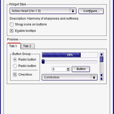
Description: This is a screenshot showing the Plastik Win Decoration in KDE 3.2 Beta2. It contains a slight modification which takes the Title Bar's blend color as the background color for the buttons in the window title. It also shows the close window title button slightly colored.
The Reason why I added this screenshot was to ask folks here what they thought about such a modification to plastik window decoration... Please post your comments.
thanks
Osho
i think, the old window-decoration button color was better. the color handling should not be changed. the old one was more easy for the eyes and that makes plastik really beautiful and gave it a elegance !
maybe hover/highlight color when you move the mouse over the buttons could be stronger (like in your screenshot), but not more colorizing i think.
but it would be perfect for me, it the plastik style gets a horizontal separation-line between toolbars, similar to "Thin-Keramik" or "Alloy" with gradient user-configurable. then plastik would be my No.1 Style !
Without this separation line, the toolbars sometimes look really messy :(
I guess probably this does not suit most people's taste. However, I personally like it (at least the close button should be optionally highlighted with red like in XP).
I agree !
The old close button was fine !!!
This new seem as agressive as Windows xp one !
I like Plastik because of its clear and non agressive shapes and color.
PLEASE : recall the old close button clear style.
Users know that they can close windows ! No need to agress them when they work...
Thank you.
Without this red button, all will be fine.
I love your theme.
You've done a great job !
Heu... Just a secund reply :
Personaly, I don't need the line between menubar and toolbar : I like your clear and clean style as it is now !
And, of course, the xp like close button could be optionnal : but I will des-activate it !
Thanks.


Ratings & Comments
5 Comments
The Reason why I added this screenshot was to ask folks here what they thought about such a modification to plastik window decoration... Please post your comments. thanks Osho
i think, the old window-decoration button color was better. the color handling should not be changed. the old one was more easy for the eyes and that makes plastik really beautiful and gave it a elegance ! maybe hover/highlight color when you move the mouse over the buttons could be stronger (like in your screenshot), but not more colorizing i think. but it would be perfect for me, it the plastik style gets a horizontal separation-line between toolbars, similar to "Thin-Keramik" or "Alloy" with gradient user-configurable. then plastik would be my No.1 Style ! Without this separation line, the toolbars sometimes look really messy :(
I guess probably this does not suit most people's taste. However, I personally like it (at least the close button should be optionally highlighted with red like in XP).
I agree ! The old close button was fine !!! This new seem as agressive as Windows xp one ! I like Plastik because of its clear and non agressive shapes and color. PLEASE : recall the old close button clear style. Users know that they can close windows ! No need to agress them when they work... Thank you. Without this red button, all will be fine. I love your theme. You've done a great job !
Heu... Just a secund reply : Personaly, I don't need the line between menubar and toolbar : I like your clear and clean style as it is now ! And, of course, the xp like close button could be optionnal : but I will des-activate it ! Thanks.