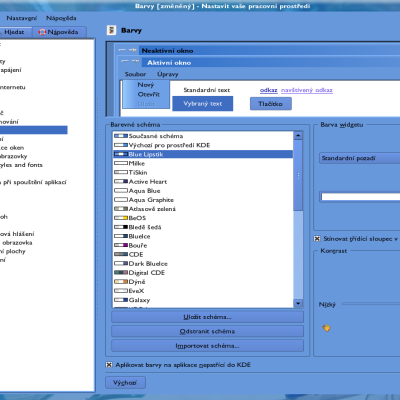
I find darkish colour schemes to be kinda nice, they're a lot easier on my eyes anyways. Actually, believe it or not, but studies have shown that for electronic text, black on white is more readable, but white on black is often the choice that subjects prefer.
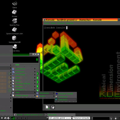
Oh well, whatever, there's your useless information for today I guess. Personally I prefer the original version of Kubical.


Ratings & Comments
3 Comments
...make my eyes feel like they are burning out of their sockets in my dark little cell of an apartment. this one is quite nice.
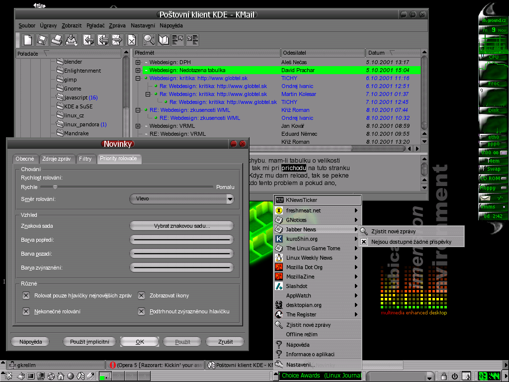
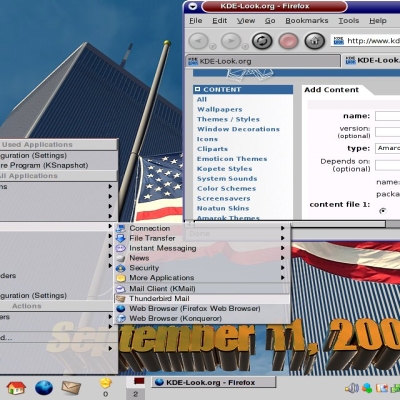
IMHO, such a darkish desktop makes me depressive after using it for a while. And I think I'm not the only one... But the background is pretty cool! :)
I find darkish colour schemes to be kinda nice, they're a lot easier on my eyes anyways. Actually, believe it or not, but studies have shown that for electronic text, black on white is more readable, but white on black is often the choice that subjects prefer. Oh well, whatever, there's your useless information for today I guess. Personally I prefer the original version of Kubical.