The concept is definitely good. Ignore the trolls - it must be a full moon out.
Things I would suggest:
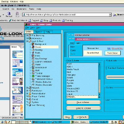
1) Wallpaper - while the existing one has a 'gee-whiz' componenet to it, a matted grey backgorund would provide more contrast and be easier on the eyes (black window bordes/title and black background would get confused).
2) Finish out the iconset (probably something to be done by the icontheme's maintainer) to provide more consistency
You're onto a good thing here. Somee more work and we're on our way to having a usbale high-contrast theme.
One person pointed out above that visually impaired people need no greys. As for the wallpaper, I'm not sure what would be best, but I guess a tight black and white matte patter, such that it would provide a clear contrast with windows yet not be too bright or two dark.
I see the trolls are out and about again.
I was orginally inspired by the black and white icon set (found in the icon section. Anyway, as well as being useful for visually impaired people, this color scheme has other benifets.
Its faster. Using only a small pallete X can draw the screen faster and KDE is also more stable. You are not distracted by all the bells and wistles either. Plus it reminds people of old fasioned 1bpp displays :)
So to all the pepole who don't like it go and follow the liquid & crystal sheep and leave people who want a fast and simple interface alone!
---
somebody who obviously hasn't put
a single thread of consideration or effort in his submition does not deserve to be encouraged.
---
how can you be sure about this?
perhaps someone gets inspired and creates a even better theme?
---
And I'm sure your thoughts about our superficiality will go unsung, as noone gives a damn.
---
perhaps some do
somebody who obviously hasn't put a single thread of consideration or effort in his submition does not deserve to be encouraged.
And I'm sure your thoughts about our superficiality will go unsung, as noone gives a damn.
last comment confirms me in my opinion about the superficiliaty of many people here on k-l.org. Let me point out that:
1. Even if the implementation is flawed, the idea behind this theme is original (no blue! THANKS!) and originality should be encouraged.
2. Visually impaired people NEED a black and white high contrast (no grays) interface


Ratings & Comments
9 Comments
The concept is definitely good. Ignore the trolls - it must be a full moon out. Things I would suggest: 1) Wallpaper - while the existing one has a 'gee-whiz' componenet to it, a matted grey backgorund would provide more contrast and be easier on the eyes (black window bordes/title and black background would get confused). 2) Finish out the iconset (probably something to be done by the icontheme's maintainer) to provide more consistency You're onto a good thing here. Somee more work and we're on our way to having a usbale high-contrast theme.
One person pointed out above that visually impaired people need no greys. As for the wallpaper, I'm not sure what would be best, but I guess a tight black and white matte patter, such that it would provide a clear contrast with windows yet not be too bright or two dark.
I'll be working on an icon set, so you can badger me all you like :)
I see the trolls are out and about again. I was orginally inspired by the black and white icon set (found in the icon section. Anyway, as well as being useful for visually impaired people, this color scheme has other benifets. Its faster. Using only a small pallete X can draw the screen faster and KDE is also more stable. You are not distracted by all the bells and wistles either. Plus it reminds people of old fasioned 1bpp displays :) So to all the pepole who don't like it go and follow the liquid & crystal sheep and leave people who want a fast and simple interface alone!
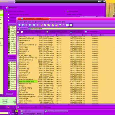
You can speculate till your heart's content, but I'm afraid the screenshot above speaks for itself.
--- somebody who obviously hasn't put a single thread of consideration or effort in his submition does not deserve to be encouraged. --- how can you be sure about this? perhaps someone gets inspired and creates a even better theme? --- And I'm sure your thoughts about our superficiality will go unsung, as noone gives a damn. --- perhaps some do
somebody who obviously hasn't put a single thread of consideration or effort in his submition does not deserve to be encouraged. And I'm sure your thoughts about our superficiality will go unsung, as noone gives a damn.
last comment confirms me in my opinion about the superficiliaty of many people here on k-l.org. Let me point out that: 1. Even if the implementation is flawed, the idea behind this theme is original (no blue! THANKS!) and originality should be encouraged. 2. Visually impaired people NEED a black and white high contrast (no grays) interface
How to use this colo scheme? ---------------------------- 1-Install this color scheme 2-Turn off your monitor!