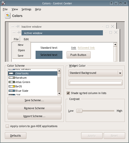
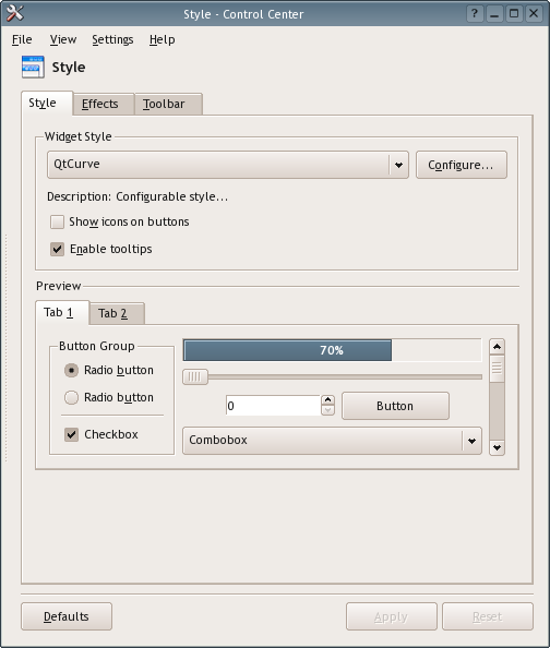
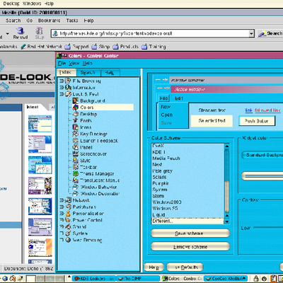
Description: This is the closest equivalent colors to my favourite GTK+ theme, clearlooks. This color scheme fits very well with Qtcurve style, which you can see on screenshots. The font used on screenshots is Trebuchet MS.
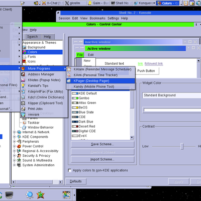
First off, congrats for the color scheme. Using QtCurve the look&feel is wonderful. I would correct a minor detail. Highlighted text has the correct background color, but the text itself should be white instead of black, IMHO.
Hello!
You are right about the correction. However, if you pay attention to the shot, the text IS white but it looks black only in PREVIEW image. That was a bug with KDE 3.4.1, however, it is fixed in 3.4.2 now.
Enjoy!
Actually, I didn't find the small mistake that way. In KDE, everything was fine. It was GTK2 applications that were using the black text which caught my attention :).
This is rather nice, for yet another blue based color scheme. I like the not-too-gray widget colors, especially with the QTCurve style. I downloaded yours and modified mine to use Orange/Yellow for titlebars and highlighted text, but otherwise, quite the nice blend. :D
Thanks for the comment. Yes, I agree that there are plenty of blue based themes out there. However I tried to make a "clone" of clearlooks theme which also uses blue.
Let's face it, blue is nice :) So is green, orange ...
Glad you liked it.


Ratings & Comments
7 Comments
how about an update? Clearlooks has changed.
I'm using it right now. Good work!
First off, congrats for the color scheme. Using QtCurve the look&feel is wonderful. I would correct a minor detail. Highlighted text has the correct background color, but the text itself should be white instead of black, IMHO.
Hello! You are right about the correction. However, if you pay attention to the shot, the text IS white but it looks black only in PREVIEW image. That was a bug with KDE 3.4.1, however, it is fixed in 3.4.2 now. Enjoy!
Actually, I didn't find the small mistake that way. In KDE, everything was fine. It was GTK2 applications that were using the black text which caught my attention :).
This is rather nice, for yet another blue based color scheme. I like the not-too-gray widget colors, especially with the QTCurve style. I downloaded yours and modified mine to use Orange/Yellow for titlebars and highlighted text, but otherwise, quite the nice blend. :D
Thanks for the comment. Yes, I agree that there are plenty of blue based themes out there. However I tried to make a "clone" of clearlooks theme which also uses blue. Let's face it, blue is nice :) So is green, orange ... Glad you liked it.