


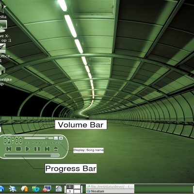
Installation instructions are the same as for my previous skins. As "root" simply extract the gzipped file into your Noatun Kaiman skins directory. For Fedora Core users, this will be "/usr/share/apps/noatun/skins/kaiman".
A copy of the "skindata" file follows, without my E-Mail address. My E-Mail address is included in the "skindata" file that comes with the download if you want to contact me. I would also like some feedback on whether you think that the tutorial is helpful or useless.
I have put a lot of work into this release, and would like some comments, positive or negative. I hope to become a productive member of this community, and value your input. I would especially like some comments on the tutorial.
I hope that you enjoy the skin and that the tutorial is a step in the right direction.
Sincerely, OmniUni.
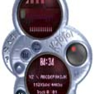
#Third Skin by OmniUni
# Title: MinSkin Clean
# Version: MinSkin 2.0
# Released: January 30, 2005
# Author: OmniUni
# Contact: ------------------
# Use the pound sign "#" to prevent any item from displaying.
# Only the Background element is required.
# This readme is suitable as a self-tutorial if you read the comments.
# Note that anything on the same line as a "#" is bypassed.
# Background Element - This is required. [filename].png
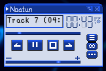
Background: BG.png
# Since this skin is not quite rectangular, it requires a mask.
# The mask is all one color, with transparent pixels where you want
# the background image to be displayed.
Mask: BG-Mask.png
#---------------------------------------------------------------------|
# Tutorial ------------------------------|
#---------------------------------------------------------------------|
# *Note: Coordinates define the top left displayed corner.
#
# Most buttons consist of three images. A normal image, a pressed image
# and a mouse-over image. A button however, may also be constructed without
# a mouse-over image. First, decide how many pixels across by how many
# pixels wide your button will be. Now decide whether your button will include
# a mouse-over state. If it will NOT have a mouse-over state, see procedure
# one, if it WILL have a mouse-over state, see procedure two.
#
# *Procedure ONE:
# Multiply the width that the button will be by two and create a png that
# is this width. The bitmap will be divided by two horizontally by Noatun
# when it generates the skin. The first half of the bitmap is the "normal"
# image, and the second half is the "pressed" image. To display the button
# use the call command followed by the word "FALSE" and then the coordinates.
#
# *Procedure TWO:
# Multiply the width that the button will be by three and create a png that
# is this width. The bitmap will be divided by three horizontally by Noatun
# when it generates the skin. The first third of the bitmap is the "normal"
# image, and the second third is the "pressed" image, and the last third is
# the mouse-over image. To display the button use the call command followed
# by the word "TRUE" and then the coordinates.
#
# *NOTE:
# There are two indicators that you can not interact with. These show whether
# a repeat/random mode is on and the state of playing (stopped, paused, or
# playing). These are divided vertically, so multiply for the height,
# not the width. For the random/repeat indicator, it will be divided by two
# with the top displaying off and the bottom displaying on. For the playing
# state button, it will be divided by three, stopped, paused, and playing
# in that order from the top down. These indicators do not need a "TRUE" or
# false after them, only the coordinates
#
# I will now briefly discuss sliders. two are available, volume and track
# position. The sliders may be horizontal or vertical. The will be divided
# based on whichever way they are longer. In other words, a horizontal slider
# must have the slider background graphic followed by the graphics of what will
# be used to slide to the right. The slider itself can be any length, but the
# sliding graphics must all be the same lenghth. To display the horizontal slider
# use the call command followed by the filename.png, "TRUE" or "FALSE" how long
# the slider background graphic is, and finally the coordinates. If the sliding
# graphic has a mouse over state, use the word "TRUE" and the rest of the bitmap
# will be divided by three, the normal state, pressed, then mouse-over. A
# horizontal slider works the same way, but going from top to bottom.
#
# Numbers are a graphic divided by eleven. In order from left to right,
# the numbers are 0,1,2,3,4,5,6,7,8,9, and a blank space or number off.
# Display by using the call command, file name, and coordinates. Minutes
# display two digits, as do the seconds.
# Letters are somewhat more tricky. The bitmap is divided by 32 across and into
# three rows. The order of the symbols is as follows. Note that [sb] stands
# for a solid vertical bar, [:
 stands for the pipe (colon like symbol found
# by pressing shift + the button above 'enter'), and [p] stands for a pentagon.
# I do not know WHAT the pentagon is for, but it is there. Also [ ] is a blank
# space. All characters MUST use the same space, as the bitmap is divided equally
# and they MUST be in the order below.
#
# [ ] [sb] " # $ % & ' ( ) * + , - . / 0 1 2 3 4 5 6 7 8 9 : ; < > = ?
# @ A B C D E F G H I J K L M N O P Q R S T U V W X Y Z [ ] ^ _
# ` a b c d e f g h i j k l m n o p q r s t u v w x y z { [:
} ~ [p]#
# To display text, use the call command, followed by the png that defines the
# text, how many characters horizontally you want to display, and the coordintes
# of the top left corner of the first character. Tip: Design the characters twice
# as large as they need to be, and smooth-scale them to half size. This will
# result in painless and effective anti-aliasing for the text requiring only a
# little clean up on your part. I reccommend use of a text template like the ones
# included with this skin to help you create the characters.
#
# If you look at the display code below and compare it to the bitmaps with this
# skin, you should be able to figure out what to do. If you have any questions
# or comments, feel free to E-Mail me, and I will respond as soon as I can.
#
# It is actually quite easy once you get the hang of it, but I hope that this
# tutorial can help you pass the learning curve much easier than I did.
#
# Good Luck!
# -OmniUni
#---------------------------------------------------------------------|
# Display Code ------------------------------|
#---------------------------------------------------------------------|
#I will now begin to build the title bar.
#Add Close Button
Exit_Button: Close.png TRUE 180 4
#Add Minimize Button
Iconify_Button: Minimize.png TRUE 165 4
#Add Status Display
Status_Item: Status.png 4 8
#Add Position Slider
Position_Slider: Slider.png TRUE 150 4 54
#I will now add the song title
#Add text
Title: Text.png 12 8 26
Minute_Number: Numbers.png 125 26
Second_Number: Numbers.png 155 26
#Add "Mode On" Indicator
Repeat_Item: ModesOn.png 180 26
#I will now build the Volume Area
#Add Volume Up
Volume_Up_Button: VolumeUp.png TRUE 138 106
#Add Volume Down
Volume_Down_Button: VolumeDown.png TRUE 4 106
Volume_Slider: Vol_Slider.png True 118 20 112
#I will now build the Track Control Area
#Add Last Track
Prev_Button: Back.png TRUE 16 74
#Add Stop
Stop_Button: Stop.png TRUE 88 74
#Add Next Track
Next_Button: Next.png TRUE 120 74
#Add Play/Pause Button
Play_Button: Play|Pause.png TRUE TRUE 48 74
#I will now build the Status/Settings Area
#Add Modes Button
Repeat_Button: Modes.png TRUE 166 79
#Add Configuration shortcut button
Config_Button: Preferences.png TRUE 166 96
#Add Playlist Show/Hide
Playlist_Button: Playlist.png TRUE 166 62
#---------------------------------------------------------------------|
# End of Display Code ----------------------------------|
#---------------------------------------------------------------------|


Ratings & Comments
2 Comments
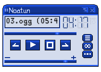
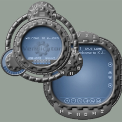
I hardly dare to say it: I don't like the font, the hex-buttons, the pictograms on the buttons - and the grey looks like some old win98 style. Graphically it is very minimalistic. And the text in the status display is too close to the upper border.
Thank you for your comments! This skin was done mainly as an experiment in noatun skin development. The more I used it, though, the more I liked the earlier "minskin 2" which is much lighter in color and uses a completely different button layout. You may want to try this skin instead. Either way, thank you for pointing out some of the skins downfalls that I had not noticed. I will keep them in mind for future skin development. Sincerely, OmniUni