


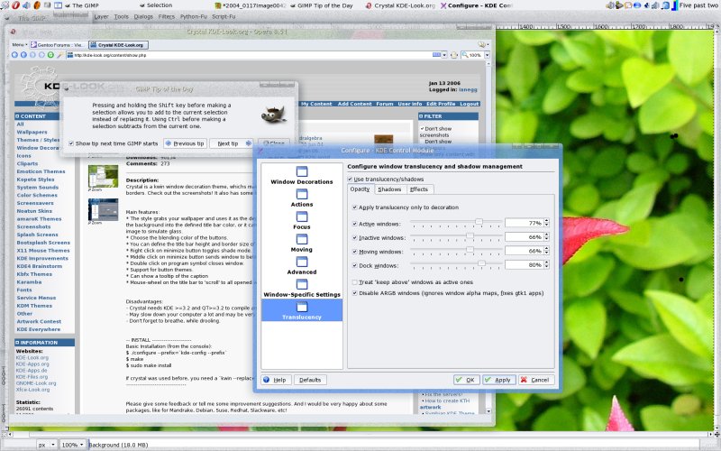
If your wallpaper is set to a frosty noise pattern, or some other small random/repeating pattern, then the effect can be quite nice. However, these patterns don't make good backdrops.
What I suggest for crystal is the option to set the background to something other than the current wallpaper, so you can have the best of both worlds.
Short of Crystal using the actual composite extention, I think this is the best current solution for transparent eye candy.
Someone would have to make some nice backgrounds though, my noise one sucks

edit: I meant to focus the Gimp tip of the day window as it looked nicest in blue, but I forgot. Can't be bothered to do it again
Quick link to Crystal: http://kde-look.org/content/show.php?content=13969
Afterthought: This would also allow you to apply fancy effects to your wallpaper in a second file, and have it show up through the crystal borders, expanding on crystal's built in effets.


Ratings & Comments
7 Comments
That's exactly how crystal should look like! We need to see the windows behind the decoration, not just the wallpaper. Please, please, make that real! Crystal is great and the first really innovative deco since really long ago. Chip
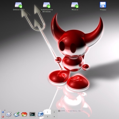
What do you think of my settings...I'm using some blur effect...http://www.kde-look.org/content/show.php?content=33604
Looks very Vista like :) I noticed the window title looks a bit blurred, what exactly did you do for the blur?
When using composite and kcompmgr with kde 3.5, you can use real transparacy for the windec only, when using this ALL the windec will have the transparacy, therefore the closebutton and name will look blurred. /// Freddan
Yeah, I did that in my screenshot ;) Just the text looked like it was blurred - it may just be antialiasing?
When I tried that, my font got blurred like Zammis pic to, maybe you should try a bolder font with a more background like color. 4me that was to darn unstable, konqueror only swallowed my transparacy setting half the time and amaroK refused to play ball at all. /// Freddan
I had similar problems, so I only use composite for the shadows (instead of window borders, ala OSX), for fading in and out and to make everything a bit smoother. Stability is gradually improving. I thought of this though, because it's always nice to show off ;)