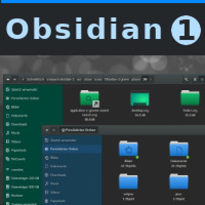
Description: ABOUT ===== Dark theme based upon Adwaita, coming in four different colors. Includes a Gnome- and Cinnamon-shell-theme. Designed to combine with Obsidian Icon Theme. Compatible with gtk 3.20 and above as well as gtk 3.18 and below.
Icon Pack available here: https://www.gnome-look.org/p/1169579/
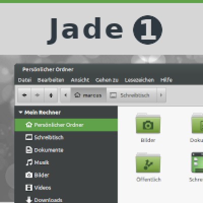
Light version (Jade-1): https://www.gnome-look.org/p/1167214/
!!! Usage with libadwaita !!! - copy the files inside of gtk-4.0 to ~/.config/gtk-4.0/ - copy the files inside of gtk-3.0 to ~/.config/gtk-3.0/ (everything but gtk.css)
PRIMARY DEVELOPED FOR ================ * GNOME (Fedora) * Cinnamon (Linux Mint)
ALSO SUPPORTED =========== * XFCE (Linux Mint Xfce) * MATE (Ubuntu MATE)Last changelog:
I have to say that this is an EXCELLENT theme series. I've used it once before, several years ago, and there was something about it I didn't care for (I think the amber color was too dark for my tastes), so I deleted it. But this time, you've (almost) knocked it out of the park, and in fact, I've made it my GTK and icon theme series of choice on my system (Debian Stable w/ Xfce desktop on my desktop box and Openbox on my laptop).
However, the reason I said you (almost) knocked it out of the park was because, and this isn't that big of a deal, when I open Thunar with sudo privileges, the "running as root" warning bar is is of your currently selected highlight color instead of orange, or amber, as you call it. I'll poke around and see if I can correct that myself. Other than that minor hiccup, I have to say WELL DONE!
Bug report (2021-11-01): Gnome shell, the notification bubble that popup has text in black on a dark gray background. When hover the mouse over the bubble, the text becomes white. It would be more convenient if the text is white permanently in the notification bubble.
Other than that this Gnome shell is really excellent. Thanks
10Came here following your advice on the Jade-1 theme. This theme is really good. The colors are beautiful, the shell theme is excellent. Hope you would consider a version with a compact titlebar. It is unnecessarily big. If you don't have time can you show me what to edit to reduce the size of the titlebar?
9Hi Max.
I didn't try all the color variants, but with the Aqua, the fonts are different in the top panel than the other colors I tried. (blue, grey, teal)
Thanks in advance for fixing!
10Stunning!
Found little "glitch" on gnome-shell.css (line 779/780), the .popup-menu-item:insensitive class is nearly same color as background, so text is invisible (easy example: Pamac Updates Indicator popup).
Noooo... Why !?
I am a fan of you theme and your previous gray tones were just perfect and matched perfectly with all gray dark themed applications.
Why did you change them ? The grays are way too bluish now.
Please, please, please, revert back to your previous tones.
8It looks good! There are however some bugs or missing stuff to be fixed.
So far I found the following:
- The gnome bottom window bar (window list extension) does not get styled with this shell theme and actually gets a weird horizontal line crossing it completely.
- The PDF viewer styling gets completely screwed with this application theme (all backgrounds get full transparent, no window borders, no scrolling bar). This is the most annoying I found so far once it makes the PDF viewer completely unusable.
I made some tweaks to my taste (as such changing the nautilus side pane background) but haven't yet been able to style the window list and pdf viewer.
Hey, can you tell me which Distribution you are using?
The styling behaviour of the PDF-viewer makes me wonder, since it is just an average gtk-based application, so either every other app should show these bugs too, or none. Which pdf-viewer are you using? Evince?
Yes, the GNOME extensions are poorly supported. I focused on the vanilla GNOME because there are just too many extensions out there to keep an eye on everyone.


Ratings & Comments
129 Comments
Hi Max. Do you think you could reduce the size of the titlebar and window buttons please? (slim version?) Thanks in advance!
10 10 the best
10 I am so happy for the new release!
9 Good job!, Congratulations.
8 8 great
10 10 the best
10 10 the best
I have to say that this is an EXCELLENT theme series. I've used it once before, several years ago, and there was something about it I didn't care for (I think the amber color was too dark for my tastes), so I deleted it. But this time, you've (almost) knocked it out of the park, and in fact, I've made it my GTK and icon theme series of choice on my system (Debian Stable w/ Xfce desktop on my desktop box and Openbox on my laptop). However, the reason I said you (almost) knocked it out of the park was because, and this isn't that big of a deal, when I open Thunar with sudo privileges, the "running as root" warning bar is is of your currently selected highlight color instead of orange, or amber, as you call it. I'll poke around and see if I can correct that myself. Other than that minor hiccup, I have to say WELL DONE!
Bug report (2021-11-01): Gnome shell, the notification bubble that popup has text in black on a dark gray background. When hover the mouse over the bubble, the text becomes white. It would be more convenient if the text is white permanently in the notification bubble. Other than that this Gnome shell is really excellent. Thanks
10 Came here following your advice on the Jade-1 theme. This theme is really good. The colors are beautiful, the shell theme is excellent. Hope you would consider a version with a compact titlebar. It is unnecessarily big. If you don't have time can you show me what to edit to reduce the size of the titlebar?
9 Very good theme ! THANKS !!
10 It's very nice, good job. You forgot to fix the Openbox colors.
9 Bonjour, mon thème préféré et presque parfait. Il lui manque pas grand chose pour devenir au top
10 My favourite theme and icon pack. Fan-Tas-Tic.
9 9 excellent well done
9 Hi Max. I didn't try all the color variants, but with the Aqua, the fonts are different in the top panel than the other colors I tried. (blue, grey, teal) Thanks in advance for fixing!
10 Stunning! Found little "glitch" on gnome-shell.css (line 779/780), the .popup-menu-item:insensitive class is nearly same color as background, so text is invisible (easy example: Pamac Updates Indicator popup).
10 Looks cool
2 Looks weird
10 10 the best
9 9 excellent
Noooo... Why !? I am a fan of you theme and your previous gray tones were just perfect and matched perfectly with all gray dark themed applications. Why did you change them ? The grays are way too bluish now. Please, please, please, revert back to your previous tones.
Maybe you are right. The next release will bring back the previous gray tones. Will be released within the next days.
8 It looks good! There are however some bugs or missing stuff to be fixed. So far I found the following: - The gnome bottom window bar (window list extension) does not get styled with this shell theme and actually gets a weird horizontal line crossing it completely. - The PDF viewer styling gets completely screwed with this application theme (all backgrounds get full transparent, no window borders, no scrolling bar). This is the most annoying I found so far once it makes the PDF viewer completely unusable. I made some tweaks to my taste (as such changing the nautilus side pane background) but haven't yet been able to style the window list and pdf viewer.
Hey, can you tell me which Distribution you are using? The styling behaviour of the PDF-viewer makes me wonder, since it is just an average gtk-based application, so either every other app should show these bugs too, or none. Which pdf-viewer are you using? Evince? Yes, the GNOME extensions are poorly supported. I focused on the vanilla GNOME because there are just too many extensions out there to keep an eye on everyone.