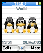
Just one minor thing:
the "T610" in the "window titlebar" is often superimposed by the status icons (profile, signal strength, bluetooth etc.), which just looks "wrong"...
I would either leave the T610 text out completely or move it further to the right, so that 3 status icons can go in the bar before they overwrite the text (I often have signal strength, bluetooth and the "nonstandard profile" indicator there, which makes the text unreadable...)
Otherwise: very nice, my new standard theme...
Patrick
On the risk of revealing my total ignorance... what the devil is a "T610"? A handy? A PDA? A glorified tamagotchi? It has to be something with a small colour screen, and the "Call" button suggests something with phone capabilities.


Ratings & Comments
7 Comments
Just one minor thing: the "T610" in the "window titlebar" is often superimposed by the status icons (profile, signal strength, bluetooth etc.), which just looks "wrong"... I would either leave the T610 text out completely or move it further to the right, so that 3 status icons can go in the bar before they overwrite the text (I often have signal strength, bluetooth and the "nonstandard profile" indicator there, which makes the text unreadable...) Otherwise: very nice, my new standard theme... Patrick
thanks for the positive comment! a changed version has been uploaded.. ;-)
This is great, we need more of these types of themes! Keep up the great work, it looks good on my Sony Ericsson T616 (cell phone)!
is t610 an ericsson phone?
yes
On the risk of revealing my total ignorance... what the devil is a "T610"? A handy? A PDA? A glorified tamagotchi? It has to be something with a small colour screen, and the "Call" button suggests something with phone capabilities.
for not posting this earlier.. but somehow I thought I had posted it here already... damn damn damn.. I'm gettin older.. *lol*