Description: I'm neither a hard core C++ programmer nor graghics guy. But here my 2 cents to kde community to start a new style called "Aero". Graphics tutorials can be found here: http://www.macthink.net/community/viewtopic.php?p=80053 (Sorry even I can't understand the language)Last changelog:
1. Initial Upload 2. Working windows theme sc from osx-e.
Hi,
let me add my 2 cents (of € =) too.
This is a nice idea. KDE has got good themes, but it's nothing in comparison to what is avalaible for win (msstyles) and MAC.
I'd like to do some porting for KDE as I love skinning, but ubfortunately this involves C++ :-( which is over my knowledge.
Anyway this is a nice idea, don't blame it. Skinning is also fun, and as already said this could easily evolve into something different and better looking ;-)
Will post some screenies later, now I need a bed...it's 2 am in italy
Greetings.
AndyGio
this style already exists. its called 'crystal'. download that windeco and use a titlebar size of 40, font: trebuchet ms, size: 19pt
at the most, you'll have to design the button theme and use it in crystal!
crystal windeco: http://www.kde-look.org/content/show.php?content=13969
well, even if M$ IS indeed making something that looks like this, always remeber, open-source moves faster than proprietary. If we adopt this look, not only will we have it first, but we can perfect it before they have theirs done.
Also, this bold new look could evolve into something completely different.
There are people who like fresh new looks. I't wrong to say that M$ can't possibly make anything good looking; that's immaturity. Of course M$ can have good looking stuff, they have the money to hire the graphic designers to make it look nice, but what we can be assured of is that more than likely, whatever they do will probably take up lots of RAM.
Could someone make a Native KDE 3.3 Window theme from this?
It looks cool. Longhorn has a fair different theme, but this is close to it.
And a making some animated buttons wouldn't hurt much...
And making a KDE theme could be nice too...
Great work.
Looks this maybe like Longhorn? I think so!
This is copy of a M$ idea, therefore it's nothing new and besides it's waste of room.
I can't believe that there are people out there, that think what MS makes is useful and cool!?!
GPL stuff is all about usefullnes, security, quality and inovations and not copying allready made stuff.
No thanks, I'll rate for "no".
The rounded rectangles are basically nice looking, but I think you go overboard in rounding the top corners of the white 'window body' section.
It'd look better with a straight-line boundary between the black menubar and the white body. Laying the white area on top with rounded corners makes it too obvious that you're just laying a rounded rect on top. Joining the two areas into a single rounded rect would be less busy and more unified.
Hi,
this looks really nice. Especially because it looks so clean. There are not 100 icons, in 100 different colors, not 100 menu items and so on. I hope, that the kde developers will clean up the desktop environment, so that it looks more clean and easier to use.
Mike
the last screenshot is windows. when i tried to use windows, i also tried to make my desktop look good.
if i were to make a fresh install of windows look like that, it would take a minimum of 5 hours. i kid you not. i prefer kde's way anyday.
that it is work for KDE bitmap themes, I'm not seeing anyone being able to code such thing and I also can't see reason to do so, bitmaps would be great, especially if there has a Stardock SkinStudio for KDE :)
There is one important difference and that is that, with "Aero" one can have the large title border but much smaller side and bottom borders. Rather than create a whole new windeco though, it probably just makes more sense to try and get an addition to the Crystal windeco to adjust a specific border size - if that's even possible.
While I think the premise of Aero (the transparency, the rounded edges) is real neat, I dislike the large amount of wasted space. However, I see a simple solution: make the size customizable, make a smaller size the default for the Aero windeco, and don't make Aero the KDE default. There we go - keeps KE looking nice without wasting space, while also providing an option for people who like the "playskool" look.
I must say, I haven't tried the Crystal windeco, so forgive me if Crystal basically has all this. Based on the pictures I've seen though, it has hard edges and is always one size.
crystal windeco pwnz. i think its better than aero cause its not as cluttered. the amount of wasted space in longhorn is staggering, and that is not a good direction for linux to go in. you want transparent borders? you got em. you want cool shadows? you got em. do you want to waste a shitload of space with pure emptiness? neither do i.
kde3.3 and crystal with x.org 6.8 kicks longhrons ass anyday, vissually.
in terms of features its been kicking its ass since day one.
The style looks neat, but you should know that it says that you can't publish or reproduce that tutorial without the author's consent.(FYI the language is Spanish)
I don't think that it would be a problem, but anyway ask the author for authorization.


Ratings & Comments
23 Comments
I'd LOVE a kde style like that !
Hi, let me add my 2 cents (of € =) too. This is a nice idea. KDE has got good themes, but it's nothing in comparison to what is avalaible for win (msstyles) and MAC. I'd like to do some porting for KDE as I love skinning, but ubfortunately this involves C++ :-( which is over my knowledge. Anyway this is a nice idea, don't blame it. Skinning is also fun, and as already said this could easily evolve into something different and better looking ;-) Will post some screenies later, now I need a bed...it's 2 am in italy Greetings. AndyGio
this style already exists. its called 'crystal'. download that windeco and use a titlebar size of 40, font: trebuchet ms, size: 19pt at the most, you'll have to design the button theme and use it in crystal! crystal windeco: http://www.kde-look.org/content/show.php?content=13969
well, even if M$ IS indeed making something that looks like this, always remeber, open-source moves faster than proprietary. If we adopt this look, not only will we have it first, but we can perfect it before they have theirs done. Also, this bold new look could evolve into something completely different. There are people who like fresh new looks. I't wrong to say that M$ can't possibly make anything good looking; that's immaturity. Of course M$ can have good looking stuff, they have the money to hire the graphic designers to make it look nice, but what we can be assured of is that more than likely, whatever they do will probably take up lots of RAM.
Could someone make a Native KDE 3.3 Window theme from this? It looks cool. Longhorn has a fair different theme, but this is close to it. And a making some animated buttons wouldn't hurt much... And making a KDE theme could be nice too... Great work.
Looks this maybe like Longhorn? I think so! This is copy of a M$ idea, therefore it's nothing new and besides it's waste of room. I can't believe that there are people out there, that think what MS makes is useful and cool!?! GPL stuff is all about usefullnes, security, quality and inovations and not copying allready made stuff. No thanks, I'll rate for "no".
The rounded rectangles are basically nice looking, but I think you go overboard in rounding the top corners of the white 'window body' section. It'd look better with a straight-line boundary between the black menubar and the white body. Laying the white area on top with rounded corners makes it too obvious that you're just laying a rounded rect on top. Joining the two areas into a single rounded rect would be less busy and more unified.
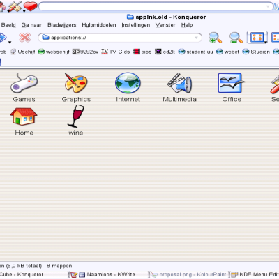
Do you have the homepage where I could find the wallpaper you use in first screenshot? Thanx.
Hi, this looks really nice. Especially because it looks so clean. There are not 100 icons, in 100 different colors, not 100 menu items and so on. I hope, that the kde developers will clean up the desktop environment, so that it looks more clean and easier to use. Mike
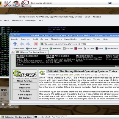
the last screenshot is windows. when i tried to use windows, i also tried to make my desktop look good. if i were to make a fresh install of windows look like that, it would take a minimum of 5 hours. i kid you not. i prefer kde's way anyday.
That language is spanish.
that it is work for KDE bitmap themes, I'm not seeing anyone being able to code such thing and I also can't see reason to do so, bitmaps would be great, especially if there has a Stardock SkinStudio for KDE :)
The windows logo is trash and should be replaced with something else. Just my 2 bits. ;-)
This looks like a job for the Damage and Composite extensions!
this is crystal with huge rounded borders. ugly as hell, but it looks *just* like aero, exagerated a little. http://www.deviantart.com/deviation/10884612/
There is one important difference and that is that, with "Aero" one can have the large title border but much smaller side and bottom borders. Rather than create a whole new windeco though, it probably just makes more sense to try and get an addition to the Crystal windeco to adjust a specific border size - if that's even possible.
You can define the window border size and the titlebar height separately. So you can tweak crystal to look very similar to Aero, except the buttons.
While I think the premise of Aero (the transparency, the rounded edges) is real neat, I dislike the large amount of wasted space. However, I see a simple solution: make the size customizable, make a smaller size the default for the Aero windeco, and don't make Aero the KDE default. There we go - keeps KE looking nice without wasting space, while also providing an option for people who like the "playskool" look. I must say, I haven't tried the Crystal windeco, so forgive me if Crystal basically has all this. Based on the pictures I've seen though, it has hard edges and is always one size.
edges are either square or round. the length of all sides is customizable, as is the tint and a bunch of other things.
crystal windeco pwnz. i think its better than aero cause its not as cluttered. the amount of wasted space in longhorn is staggering, and that is not a good direction for linux to go in. you want transparent borders? you got em. you want cool shadows? you got em. do you want to waste a shitload of space with pure emptiness? neither do i. kde3.3 and crystal with x.org 6.8 kicks longhrons ass anyday, vissually. in terms of features its been kicking its ass since day one.
this is a screenshot, which looks similar to the window deco of aero: http://www.kde-look.org/content/show.php?content=16490 And this is the window deco, he is using: http://www.kde-look.org/content/show.php?content=13969 Which was created by me. X) ROFL, sorry. But maybe I can add an extra button-theme that it lookes more like Aero?
Looks amazing. Very slick stuff. I'd love to see this happen.
The style looks neat, but you should know that it says that you can't publish or reproduce that tutorial without the author's consent.(FYI the language is Spanish) I don't think that it would be a problem, but anyway ask the author for authorization.