


It also have a "flash" effect every hour (when the clock clicks XX:00).
You can:
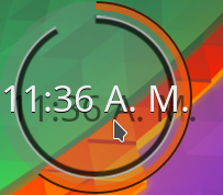
Modify the ring's colors
Disable/Enable the flash
Disable/Enable gradient effect
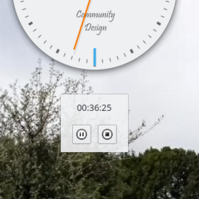
Add a background image of your distro (or any image you want, even remote images).
I want to make it more configurable, so if you have any suggestion for making it more appealing, please tell me (it will depend of my abilities as programmer
 )
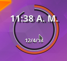
)Note: if when adding the date the text doesn't appear vertically centered, resize it a little until you like their positions.
Want to donate a cup of coffee?
PAYPAL
Liberapay


Ratings & Comments
34 Comments
Please port to KDE Plasma 6!
Will do! but please, have me a little patience. Plasma 6 is not packed in my distribution of choice, so I will have to try perhaps Neon.
Look in here https://www.pling.com/p/2137016/
10 10 the best
10 10 the best
I'm glad there's finally something like this for Plasma5! My only annoyance is there's no way to disable the ugly text shadow for the hour when it's enabled, otherwise it offers many customization options which is a good thing.
go and type "transparent" in the colour fill for shadow.
9 9 excellent
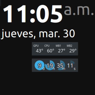
9 9 excellent hi, can you add an option to adjust the digital clock font size? and to hide the digital clock?
looks awesome! Would it be possible to get rid of the background circle of the clock? It says 'No background' so it might or might not be intended? Another nice option to have would be the font size of the time.
Wow, I'm answering 2 months later! Sorry, real world problems (and lack of internet). What you call background is a shadow, to make it more visible on certain backgrounds, but I agree that not always looks good so it can be turned off now. For time font size, current behavior is that it's proportional to plasmoid size. Maybe I should add an option to change between that behavior and a fixed size, to comply with all tastes.
9 9 excellent The only thing I can ask for as I don't see it is to adjust the size of the font for the date that appears on the clock
That's a limitation of the original digital clock. I will look into it.
Well, now you have adjustable date font :)
Cool thank you very much
9 +
9 +Hey. Thanks for this addon! If you don't have anything better to do, I have some non-vital suggestions: 1. Make it so that if I set both (number's) text color and text shadow to transparent, then I can only see the clock-circles. 2. Make the gap between timezone and clock be adjustable (size in pixels). 3. Make the thickness of (each of) the circles be adjustable (size in pixels). 4. Make the gaps between the circles themselves be adjustable (size in pixels). 5. Make the central unused space be adjustable (size in pixels). 6. Unimportant: Ideally there could maybe be a color-choosing popup or dialog. Ideally KDE would have something built-in for this. Similar to this maybe: https://duckduckgo.com/?q=color+picker+krita&t=canonical&iax=images&ia=images&iai=http%3A%2F%2Fcommunity.kde.org%2Fimages.community%2F0%2F0e%2FColor_selector_mockup.png I have a few more ideas, but those are even more niche aesthetic preferences.
I cant delete or edit the comment. The link broke it. I could paste it here again, but you can also read it if you: * use Firefox's Reader view (Ctrl+Alt+R) * read the source code of this website * zoom out with CTRL+zoom
1, 3 and 4 are doable (not hard but give a week or two) 2 and 5 are a little hard mostly because this is a (messy) fork from the original Digital Clock, and I'm not sure what to change to do this properly (entirely my limitation). So no promises. Though, if I understand 5 correctly, I think it could be solved by 3 and 4? 6 there is a color choosing dialog. Just click on "main color" or any of the others, and it will show. Maybe I should make it so the dialog appears when you lick in the text box too? Greetings.
6. Cool! I like the option to type in words as well though. One idea is to maybe add a tiny color-picker icon on the button "main color" (in addition to the text) to indicate that it is a button. Number 5 is very similar to number 4, except it isnt between hours and minutes or minutes and seconds but between hours only. I guess you could maybe implement ideas 3, 4 and 5 entirely by having two adjustable numbers for each of them: starting radius and ending radius. E.g. right now they might be 35-38 40-43 45-48 (I'm excluding shadows right now for simplicity of the explanation). So by setting the inner boundary (or inner radius) of hours, I'm effectively adjusting the size of the central empty area.
can you fix this so it works with latte dock as well? it does not zoom in/out well and does not fit actually in the dock, thanks
I don't see how it will any useful in a panel, as the idea was to have a Beclock on your desktop. To make it work in the panel I think there should be a whole rethink of the look of the clock. Any ideas of how it should look in the panel?
9 +
9 +
9 +