


Please click in this index and also see what is new in the icons theme above!
INDEX
✱ Installing with CLI
***✱ROOT directory (recommended)
***✱HOME directory for GTK
***✱*BSD systems
✱ Changing the folder colour
✱ Changing the alternative icon
***✱Firefox
***✱Other alternative icons
***✱File manager icon
✱ Known bugs
***✱Snap-built apps
***✱AppImage-built apps
***✱Hardcoded application icons with ugly name
***✱Hardcoded tray icons
***✱Unrecognised and ugly icons
✱ Report bug
✱ Contribution
✱ Contributors
✱ Changelog
✱ Credits and Licences
Donation


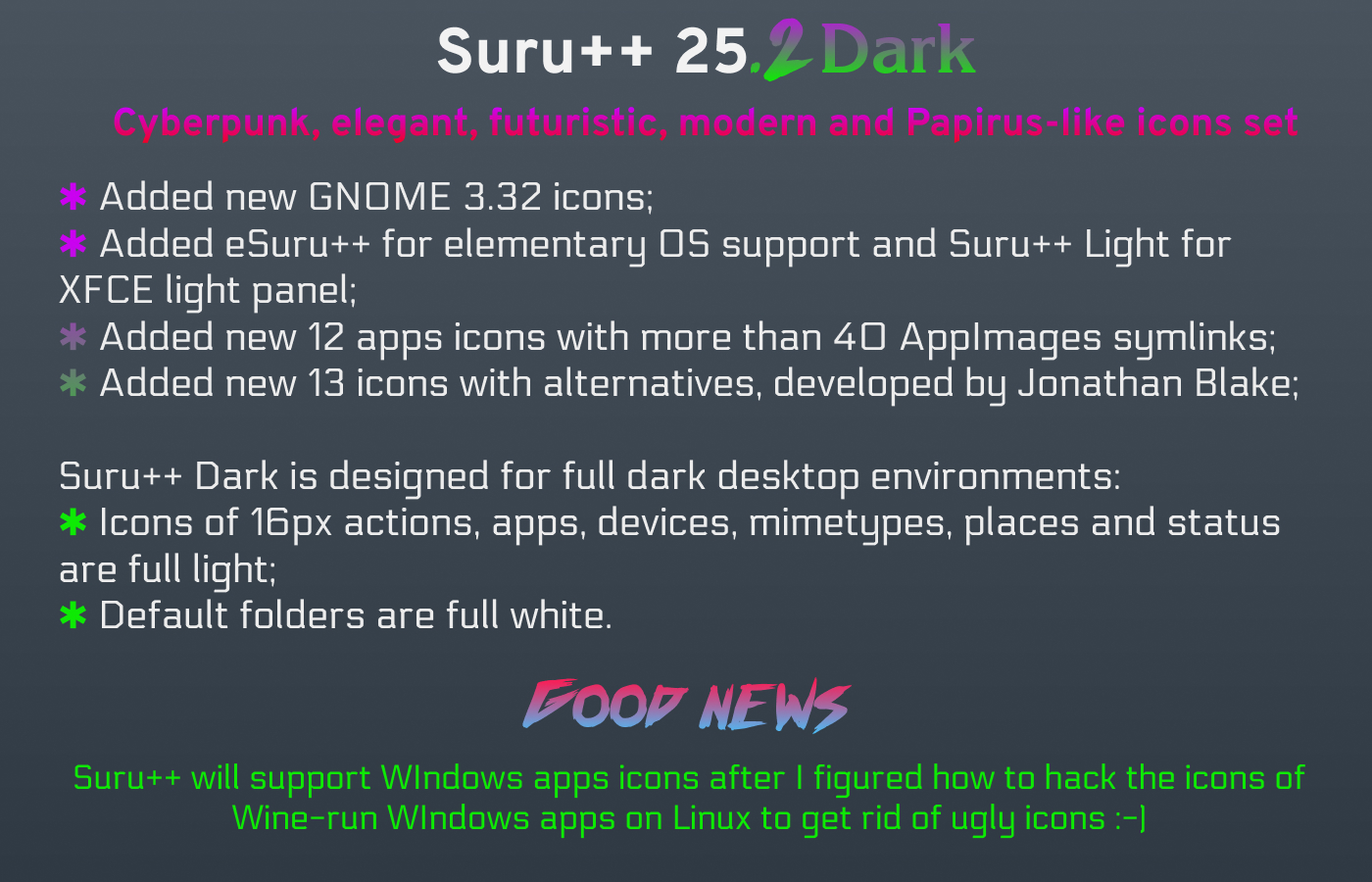
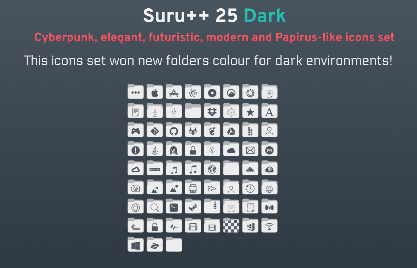
WHAT`S NEW?
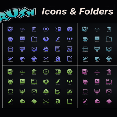
Following Sam Hewitt’s rules of grids, and making less conservative and traditional Magog64’s Suru++ Ubuntu, more than 15k icons have been redesigned, papirusified and improved with new cyberpunk colours and made been compatible with KDE, XFCE and other many environments! Check the new icons:

Folder redesign and 18 folder colours, including the colours of Linux Mint and Manjaro
The new versions has won new colours of folders, based by Alexey Varfolomeev’s Papirus:

Distinction of file managers
The file managers are no longer same, now are different and modern:

Mimetype icons redesign
Almost all mimetype icons have been redesigned with new colours and are based on Numix mimetype icons:

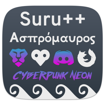
Firefox alternatives
You can choose one of three alternatives of Firefox:

Steam games
Hundreds Steam games icons are supported officially:

New flags icons
New countries flags (in development)!
Oomox
Suru++ is officially compatible with with @actionless's Oomox. You can change any colour of all 16px icons and of all folders once in a while!
With Oomox and Suru++ Colourise supporting new gradient colours, you can change with any colours:

Alternative icons
Redesigned by @darcn181. You can choose one of your favourite alternates:


Ratings & Comments
40 Comments
Absolutely love it and am using it now, a great improvement even over Papirus! It would be greatly appreciated if the set could include an icon for the application KVirc. KVirc is a popular IRC client available on many Linux distributions. I just switched from the Papirus icon theme upon discovering this greatly improved set, however the icon for my IRC client reverts to default.
Icones a mais de um ano sem receber atualização.
9 +
9 +
9 +
9 + Como eu esperei!! Obg
9 + very nice, thank you
9 +
9 Awesome icons. What is the font in 2nd screenshot?
Hi universal, sorry for my absence in this theme, I was more focused on Suru++ 25. But I have just upgraded Suru++ Dark, renaming to Suru++ 25 Dark, from Suru++ 25. I use Electrolize, Overpass, Overpass Mono and Titilium Web, theya re cyberpunk and futuristic fonts.
9 +
9 +
9 +Perfect for Ubuntu 18.04 Yaru Dark theme. Thank you very much for your awesome work!
9 +
9 Thanks buddy ... +++
9 nice work
9 Very nice.
Salut ! Je viens de faire upgrade de Suru++ Dark, en renomment pour Suru++ 25 Dark, venu de Suru++ 25.
Thanks. Very nice and original. Still the applications icons do not follow the same theme and are at odd with the desktop icons. It will be nice if they were. Hopefully you can continue your work. Sadly it is too disparate to use for me. (Manjaro xfce)
Just check out your icons structures. The folders "scalable" contain totally different icons (colored) while the "32, 24,16" (size ?) folders contains the right ones. The desktop use the scalable so that's why it doesn't follow the theme.
Please, can you show me the failed icons? Please tell me that I will fix tomorrow.
Hi, I continue my work and assume responsibility since my owner/manager Magog64 stopped supporting for several distributions and for dark environments. But as you have said, I am really worried. Please, can you show me which you find odd? I have Manjaro, but I use KDE. I will install GNOME with Arc Menu and XFCE on Manjaro to analyse the missed, odd, ugly and wrong icons
Hi, surprise by the fast replies. The problem like I mentioned is why are the icons in the "scalable" folders (coloured square themed) different then the picture above ? I install the icons directly from pamac in Manjaro. After applying the theme, Thunar has the correct white icons but the desktop has square coloured icons for applications. It is easy to see in those folders. Am I missing something ? I tried your file here in Linux Mint 19 and all the home folders are orange rounded-squares, not the white ones you show here. I am not an expert but if I remove the "scalable" folders, will the system used the other ones ? (32, 24 etc)
Hi, somebody wanted an original Andrea Bonanni (@Magog64)'s Suru++ with white monochromatic icons (16, 24 and 32), but to keep the scalable icons to be coloured and orange, for dark environments, and @Magog64 refused to develop it, preferring to offer support only for Ubuntu and for light environment of Ubuntu. It is why he delivered the responsibility of variants of Suru++ to me, since I became his collaborator. If the coloured scalable icons did not appear in Thunar, then it must be my index.theme's bug. I am going to fix it today. If you would like my Suru++ Dark's scalable icons to be fully white and grey, I will add your request to my to-do. Not just it, I will project the variant of Suru++ for Linux Mint and Manjaro, together with circular Suru++.
"If you would like my Suru++ Dark's scalable icons to be fully white and grey, I will add your request to my to-do" Yes please do. The theme has to be consistent all through. That will be great if you can do it. I am not sure how this work but the white icons are already made in the "32/" folder. Can't they be just port to the scalable/ folder ? Appreciate your effort. Thanks