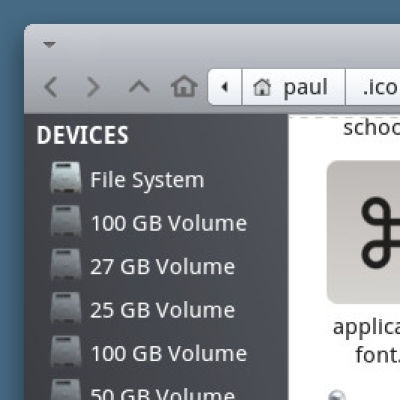
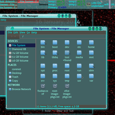
Open larger screenshots in a new tab and enlarge for full view
Made by paulxfce (alias Manjarocinnamonfan, paulubuntu)
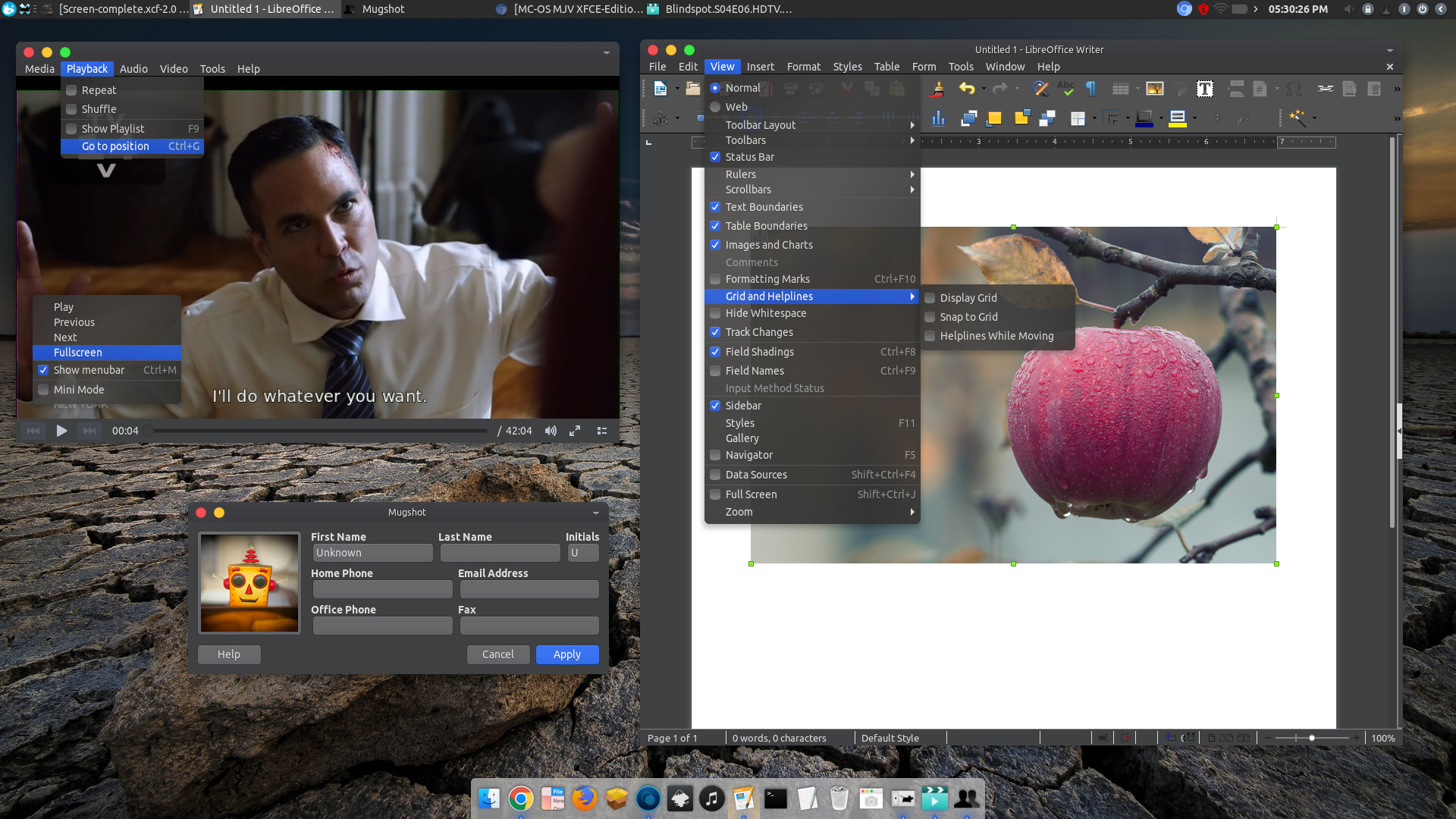
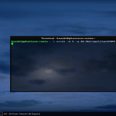
This is a first iteration of the XFCE-cation of my well received McOS-MJV-Dark theme, a gnome-desktop-interpretation of a certain Cupertino-based OS. It is a complex theme, because of the transition to GTK3, XFCE is undergoing changing allong the way, requiring GTK2 and GTK3 working properly together. This theme is build upon- and made to work for Manjaro 17.1.12 and later. This requires a fairly recent XFCE-distro. It is meant to be used with the latest XFCE-development (XFCE 4.13), which has ported much of its components to GTK3. Although it should work, other XFCE-distro's might have problems.
Important: READ THIS!
This theme only works with a compositor enabled !
More and more XFCE-distributions are adding the GTK3-classic/GTK3-mushrooms packages as default in the standard install. This package removes the headerbar-titlebuttons and move them up to an extra- titlebar. And also removes the way gnome draws its windows-shadows-menus. As a result the standard theme looks weird, rounded menu's become straight, ... So, look into your software-manager and see if these packages are installed. if so then download the 'patched' version. If not? then download the normal one.
Important:how to set up:
First the requirements needed:
Thunar 18.0 or above is required.
The standard XFWM-windowmanager is used as the compositor, With the following specific settings in the Window Manager Tweaks: - display compositing enabled. - Synchronize drawing to the vertical blank enabled. - Show shadows under dock windows enabled. Opacity of popup windows is set more to the left (more transparency): this gives the translucency under the drop down-menu's. You can move the layer more to the left for more transparency.
To install:
Download the file and extract. Move the extracted file to your '.themes'-folder in your home-folder (you might have to make the folder first, if you haven't done it already.) Open up the Appearance-app and select the style 'McOS-XFCE-Dark-Edition' To make the titlebar: open up the Window Manager and select again 'McOS-XFCE-Dark-Edition',
To move the buttons to the left ( in Window Manager ) click and drag the button layout so that you have CLOSE/MINIMIZE/MAXIMIZE and TITLE (in that order).
Furthermore: the font just in the screenshot is Ubuntu Regular 10pt in a custom DPI-setting of "100", hinting is slight Under settings in the Appearance-app, images on menu's and buttons are disabled.
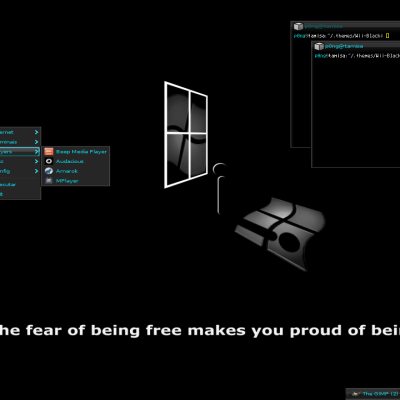
The bottom plank is "plank", the dock used in the screenshot, with a custom background mac-like-dock theme by Mahdi Mohammad Shibli.
Mojave and MacOS ared trademarkes by Apple.Inc.Last changelog:
Added patched version for those who have GTK3-classic -package installed
Added patched version for those who have GTK3-classic -package installed.
9Gnome Calculator looks so cool with MJV-dark theme from Paul :-D Thanks for making the Xfce version. Amazing work!
I wish that PRO-dark was merged with MJV-dark, so that its :dark/darker variant looks as good as MJV-dark theme.
Sorry for the other comment, pressed "Tab" and "Enter" by accident ^^
I tried your light and dark theme. They are both awesome but I just have a problem with the dark one the xfce panel doesn't look the same as the one on the screenshot (I have a blue color for the active window and the "tabs" seem to have rounded corners) I tried to look at the css but too much lines in there and I don't even know if I was looking at the good place. Any ideas ?
Still loving it so much it is my only theme because i install others and delete the crap out of them because they cant hold up to this one but one two small things. I have to use solid color on my panel because pulse audio plugin is different color and also my whisker start button is different color. I am on the latest Gtk.
After running it for a day I have to say this is one hell of a theme. Probably one of the most complete themes I have ever used. Even got crappy mousepad looking great and it does not hurt my performance unlike some themes that I have used with plenty of colors. Just all around really nice. I use the numix-circle icons and use the script to change the folder color to blue and looks awesome. Can't say thanks enough.
I know this is from the author of Arrongin and Telinkrin so I will finally get to ask please make a Xfce edition of Arrongin and Telinkrin themes. Your themes are nice but this is the only one I have ever gotten to enjoy because I use Xce. Two thumbs up for this one though.
Telinkrin is a theme specifically for gnome, because nautilus is easier to change. Thunar is not. Telinkrin 's stronghold is the way nautilus is themed. This I can not reproduce on thunar. Maybe in the future, when the transition of XFCE to GTK3 is complete, I may reconsider.


Ratings & Comments
14 Comments
10 10 the best
10 10 the best!
9 Gnome Calculator looks so cool with MJV-dark theme from Paul :-D Thanks for making the Xfce version. Amazing work! I wish that PRO-dark was merged with MJV-dark, so that its :dark/darker variant looks as good as MJV-dark theme.
10 10 the best
9 +
9 + There are a few syntax errors in gtk-3.0/gtk.css (invalid comment, repeated directive etc). Overall it's very nice.
Sorry for the other comment, pressed "Tab" and "Enter" by accident ^^ I tried your light and dark theme. They are both awesome but I just have a problem with the dark one the xfce panel doesn't look the same as the one on the screenshot (I have a blue color for the active window and the "tabs" seem to have rounded corners) I tried to look at the css but too much lines in there and I don't even know if I was looking at the good place. Any ideas ?
I tried your light and dark theme. They are both awesome but I just have
Still loving it so much it is my only theme because i install others and delete the crap out of them because they cant hold up to this one but one two small things. I have to use solid color on my panel because pulse audio plugin is different color and also my whisker start button is different color. I am on the latest Gtk.
After running it for a day I have to say this is one hell of a theme. Probably one of the most complete themes I have ever used. Even got crappy mousepad looking great and it does not hurt my performance unlike some themes that I have used with plenty of colors. Just all around really nice. I use the numix-circle icons and use the script to change the folder color to blue and looks awesome. Can't say thanks enough.
I know this is from the author of Arrongin and Telinkrin so I will finally get to ask please make a Xfce edition of Arrongin and Telinkrin themes. Your themes are nice but this is the only one I have ever gotten to enjoy because I use Xce. Two thumbs up for this one though.
Telinkrin is a theme specifically for gnome, because nautilus is easier to change. Thunar is not. Telinkrin 's stronghold is the way nautilus is themed. This I can not reproduce on thunar. Maybe in the future, when the transition of XFCE to GTK3 is complete, I may reconsider.
9 +Cool theme.Thanks for the xfce support. We get left out of sometimes.
9 +